


In this post we are going to learn How to use switch button in android and apply custom style for switch button
Let's start
Step 1: Create a new project in Android Studio, go to File ⇒ New Project and fill all required details to create a new project
Step 2: Create Required resourses
customswitchselector.xml file
<?xml version="1.0" encoding="utf-8"?>
<selector xmlns:android="https://schemas.android.com/apk/res/android">
    <item android:state_checked="true">
        <shape android:dither="true" android:shape="rectangle" android:useLevel="false" android:visible="true">
            <corners android:radius="25dp" />
            <gradient android:angle="270" android:endColor="#07E910" android:startColor="#06850B" />
            <size android:width="38dp" android:height="38dp" />
            <stroke android:width="2dp" android:color="#fff" />
        </shape>
    </item>
    <item android:state_checked="false">
        <shape android:dither="true" android:shape="rectangle" android:useLevel="false" android:visible="true">
            <corners android:radius="25dp" />
            <gradient android:angle="270" android:endColor="#D62315" android:startColor="#C20E05" />
            <size android:width="38dp" android:height="38dp" />
            <stroke android:width="2dp" android:color="#FFF" />
        </shape>
    </item>
</selector>
|
custom_track.xml file
<?xml version="1.0" encoding="utf-8"?>
<shape xmlns:android="https://schemas.android.com/apk/res/android"
       android:shape="rectangle"
       android:visible="true"
       android:dither="true"
       android:useLevel="false">
    <gradient
            android:startColor="#9C27B0"
            android:endColor="#673AB7"
            android:angle="270"/>
    <corners
            android:radius="30dp"/>
    <size
            android:width="80dp"
            android:height="40dp" />
</shape>
|
Step 3: Update activity xml file withe below code
<?xml version="1.0" encoding="utf-8"?>
<RelativeLayout xmlns:android="https://schemas.android.com/apk/res/android"
xmlns:tools="https://schemas.android.com/tools"
android:layout_width="match_parent"
android:layout_height="match_parent"
android:padding="4dp"
android:id="@+id/relativeLayout"
tools:context=".MainActivity">
<Switch
android:id="@+id/switchBtn"
android:layout_width="wrap_content"
android:layout_height="wrap_content"
android:textOn="ON"
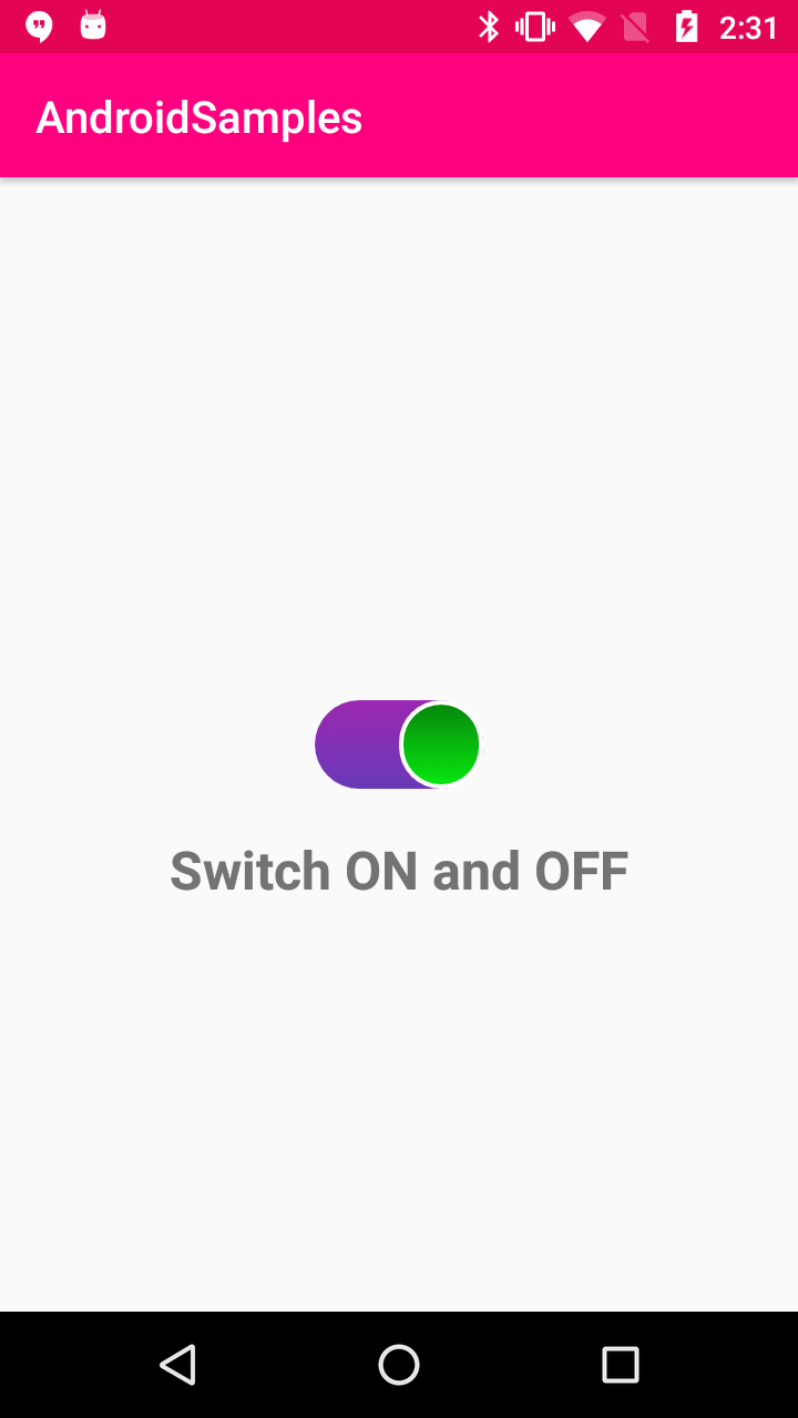
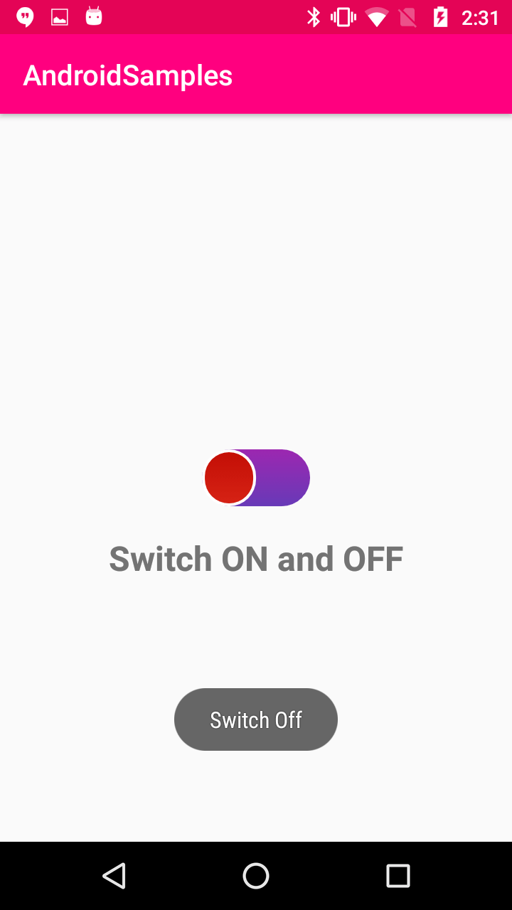
android:thumb="@drawable/customswitchselector"
android:track="@drawable/custom_track"
android:layout_centerInParent="true"
android:textOff="OFF"/>
<TextView
android:layout_width="match_parent"
android:layout_height="wrap_content"
android:layout_below="@id/switchBtn"
android:layout_marginTop="20dp"
android:text="Switch ON and OFF"
android:textSize="24sp"
android:textAlignment="center"
android:textStyle="bold"/>
</RelativeLayout>
|
set custom drawable for Switch component with above created resourse files
|
android:thumb="@drawable/customswitchselector" |
Step 4: Update Activity code with below code
Step 5: Run application
|
Article Contributed By :
|
|

|
|
|
2580 Views |
|