


We know that Tabs are UI widgets which will use to navigates the user by different routes. In this chapter we will learn about Flutter TabBar and how to display Tabs in Horizontally and make onclick/ontap event corresponds to the selected tab.
What we will cover
TabBar constructor
|
TabBar({ super.key, required this.tabs, this.controller, this.isScrollable = false, this.padding, this.indicatorColor, this.automaticIndicatorColorAdjustment = true, this.indicatorWeight = 2.0, this.indicatorPadding = EdgeInsets.zero, this.indicator, this.indicatorSize, this.labelColor, this.labelStyle, this.labelPadding, this.unselectedLabelColor, this.unselectedLabelStyle, this.dragStartBehavior = DragStartBehavior.start, this.overlayColor, this.mouseCursor, this.enableFeedback, this.onTap, this.physics, this.splashFactory, this.splashBorderRadius, }) |
Flutter provides a convenient and easy way to use the Material library to create a TAB layout. Generally, to create a TAB layout in Flutter, the following steps we need to be implemented:
There are two ways use TabBar in flutter
|
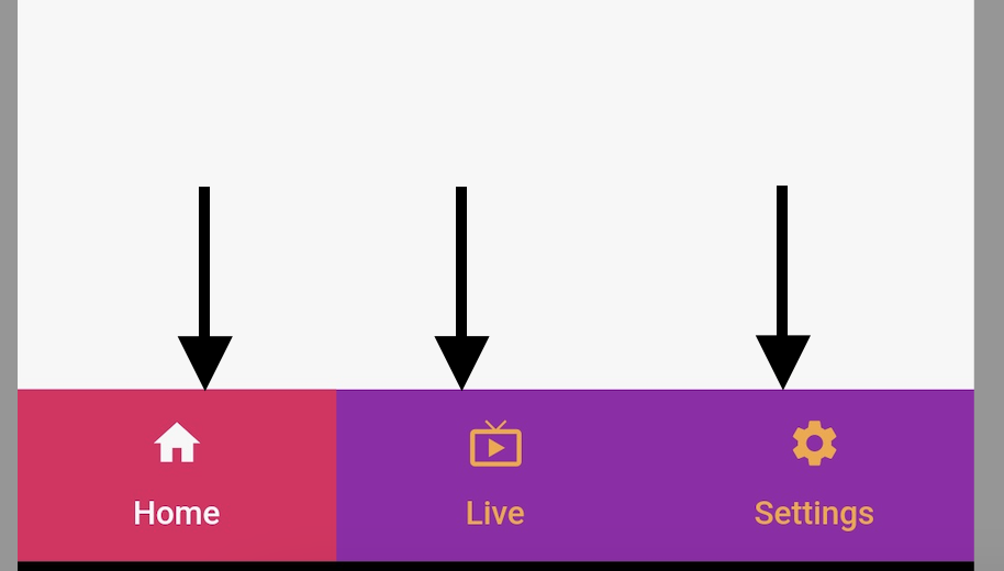
Scaffold( bottomNavigationBar: TabBar(tabs: ), ) |
|
AppBar(title: Text("TabBar with GridView"), bottom: TabBar(tabs: )
|
TabBar Properties
tabs: Will shows the tabs which will add.
TabBar(tabs:
Tab(),
Tab(),)
Each Tab we can add child,Icon,text
labelColor: Set the color for the labels of tab.
isScrollable: We can make scrollable TabBar with making this property true.
indicatorColor: Set the Indicator Color
indicatorSize: Set the Indicator Size(TabBarIndicatorSize.tab,TabBarIndicatorSize.lable)
controller: Will asign the TabController to the TabBar to handle the tab events.
TabController controller=TabController(length: 4, vsync: this,initialIndex: _currentIndex);
TabController
For the TAB layout to work properly, the selected Tab needs to be synchronized with its content, which is TabController
Can be created manually TabController, or use available Widgets (called DefaultTabController) to support some common functionality.
|
TabController({ int initialIndex = 0, Duration? animationDuration, required this.length, required TickerProvider vsync}) |
DefaultTabController
|
DefaultTabController( // The number of tabs / content sections to display. length: 3, child: // Complete this code in the next step. ); |
2. Tab bar
TabBar: It can help us create Tab, as shown in the following example, TabBar contains three sub-Tabs
|
TabBar(tabs: [ const Tab(icon: Icon(Icons.home),text: "Home",), const Tab(icon: Icon(Icons.live_tv),text: "Live",), const Tab(icon: Icon(Icons.settings),text: "Settings",), ], ) |
 |
3. TabBarView
Can be used to TabBarView: contain TabBar content corresponding to each Tab above.
|
TabBarView ( children: [ Icon(Icons.directions_car), Icon(Icons.directions_transit), Icon(Icons.directions_bike), ], ); |
Let write simple flutter example to display Tabs as Horizontal direction using TabBar and bottomNavigationBar
|
void main() { runApp(const MyApp()); }
class MyApp extends StatelessWidget { const MyApp({super.key});
// This widget is the root of your application. @override Widget build(BuildContext context) { return MaterialApp( title: 'Flutter Demo', theme: ThemeData( primarySwatch: Colors.blue, ), home: const MyHomePage(), ); } }
class MyHomePage extends StatefulWidget { const MyHomePage({super.key});
@override State<MyHomePage> createState() => _MyHomePageState(); }
class _MyHomePageState extends State<MyHomePage> with TickerProviderStateMixin { List<Widget> myTabs = [ const Tab(icon: Icon(Icons.home),text: "Home",), const Tab(icon: Icon(Icons.live_tv),text: "Live",), const Tab(icon: Icon(Icons.settings),text: "Settings",), ]; TabController? tabController; @override void initState() { // TODO: implement initState super.initState(); if (mounted) tabController= TabController( length: myTabs.length, vsync: this); }
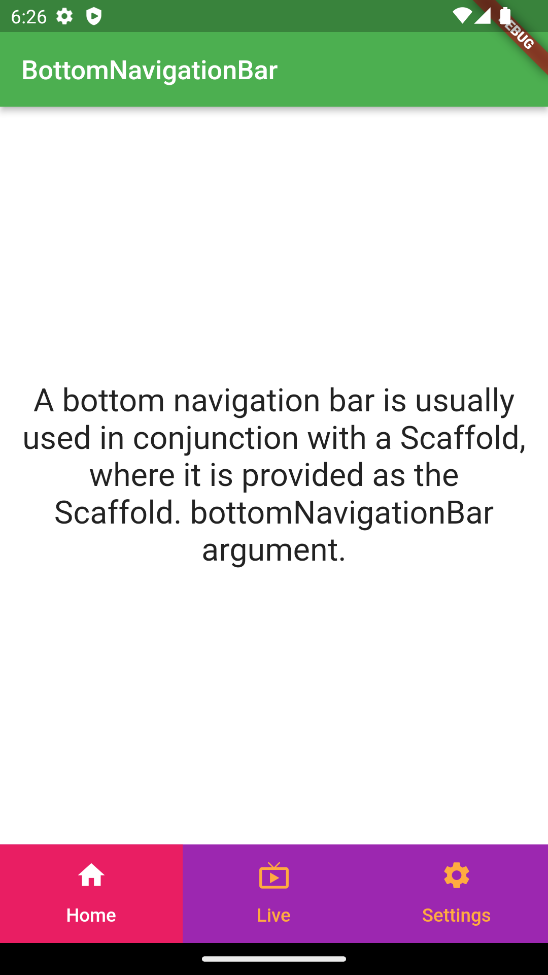
@override Widget build(BuildContext context) { return Scaffold( appBar: AppBar( backgroundColor: Colors.green, title: const Text("BottomNavigationBar", style: TextStyle(
),), ), bottomNavigationBar: TabBar( labelColor: Colors.white, unselectedLabelColor: Colors.orangeAccent, controller: tabController, indicatorSize: TabBarIndicatorSize.tab, indicator: const BoxDecoration(color: Colors.pink), tabs: myTabs, ), backgroundColor: Colors.purple, body: Flex(
direction: Axis.vertical, children: [ Expanded( flex: 1, child: Container( color: Colors.white, child: const Center(child: Padding( padding: EdgeInsets.all(16.0), child: Text( "A bottom navigation bar is usually used in conjunction with a Scaffold, where it is provided as the Scaffold. bottomNavigationBar argument." , style: TextStyle( fontSize: 20, ), textAlign: TextAlign.center, textScaleFactor: 1.2,), ),), ))
],
), );
} } |
To scroll the TabBar items we need to set isScrollable property to true;
|
TabBar( isScrollable:true, [ const Tab(icon: Icon(Icons.home),text: "Home",), const Tab(icon: Icon(Icons.live_tv),text: "Live",), const Tab(icon: Icon(Icons.settings),text: "Settings",), const Tab(icon: Icon(Icons.home),text: "Home",), const Tab(icon: Icon(Icons.live_tv),text: "Live",), const Tab(icon: Icon(Icons.settings),text: "Settings",), ] |
To set the TabBar indicator color we will use the indicatorColor Property. This Property allows you to specify the color of the underline of the currently selected tab. indicator, This attribute will be ignored if specified
If we want to set the Indicator to fill the Entire Tab we will use the below code
|
TabBar( indicator: const BoxDecoration(color: Colors.pink), ) |
labelColor
labelColor: The attribute is used to specify the font color for the label of the currently selected Tab
unselectedLabelColor
unselectedLabelColor Tab Property is used to specify font color for unselected tabs
onTap
onTap is a callback function that is invoked when the user clicks a Tab on the TabBar
|
TabBar( onTap: (index){
}, ) |
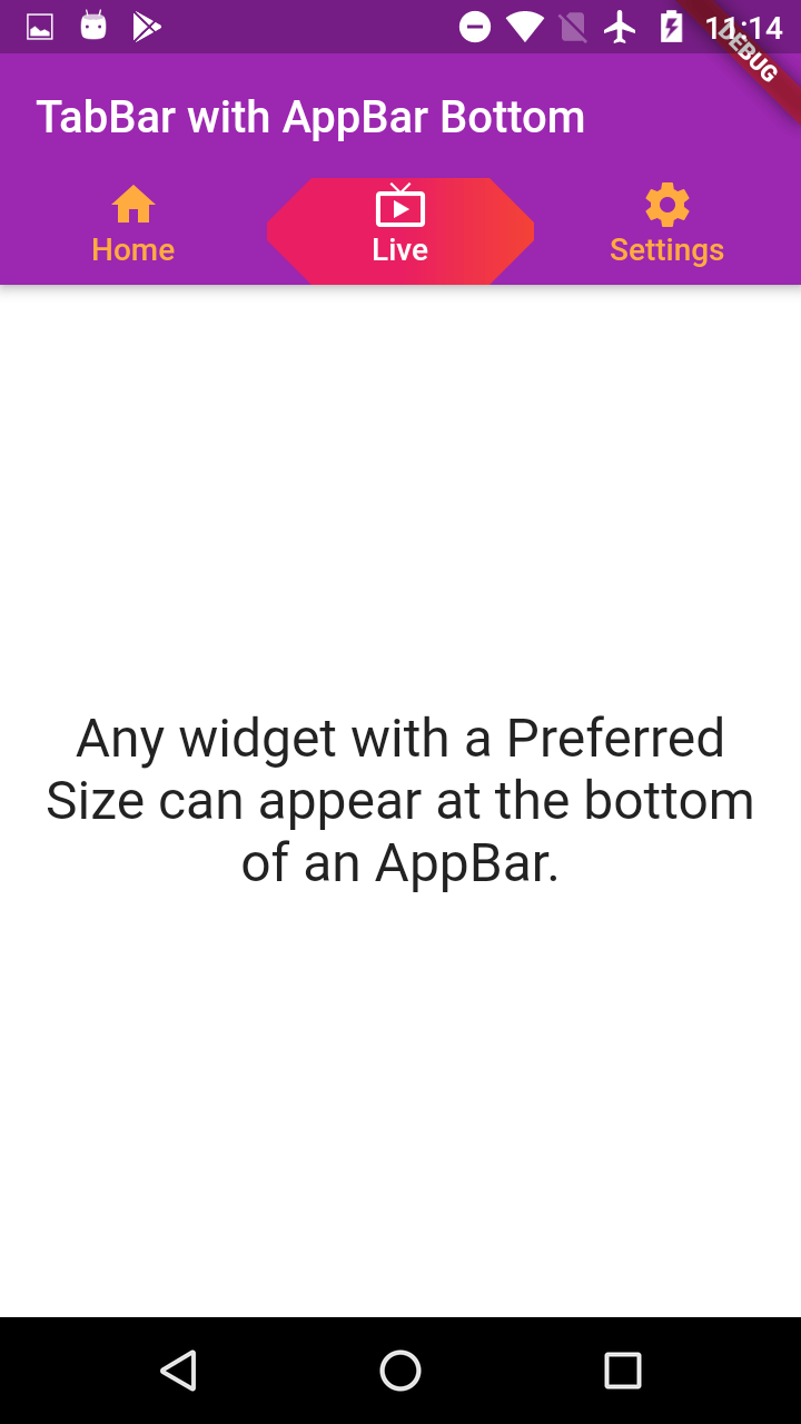
In the above example we created TabBar without AppBar, now we are creating the TabBar with AppBar.
|
class TabwithAppBar extends StatefulWidget{ @override State<TabwithAppBar> createState() => _TabwithAppBarState(); }
class _TabwithAppBarState extends State<TabwithAppBar> with TickerProviderStateMixin { @override Widget build(BuildContext context) { final List<Widget> myTabs = [ Tab(child:Column(children: [ Icon(Icons.home),Text("Home")],)), Tab(child:Column(children: [ Icon(Icons.live_tv),Text("Live")],)), Tab(child:Column(children: [ Icon(Icons.settings),Text("Settings")],)),
]; TabController controller= TabController(length: myTabs.length, vsync: this);
return MaterialApp(
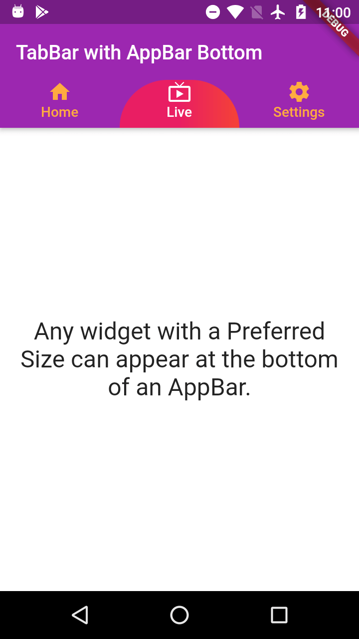
home: Scaffold( appBar: AppBar( backgroundColor: Colors.purple, title: Text("TabBar with AppBar Bottom",style: TextStyle(
fontFamily: 'mont' ),), bottom: TabBar( labelColor: Colors.white, unselectedLabelColor: Colors.orangeAccent, controller: controller, indicatorSize: TabBarIndicatorSize.tab, indicator: ShapeDecoration(
gradient: LinearGradient(colors: [Colors.pink,Colors.pink,Colors.red]), shape: BeveledRectangleBorder( borderRadius: BorderRadius.circular(20),
)) , tabs: myTabs, ), ),
body: Flex(
direction: Axis.vertical, children: [ Expanded( flex: 1, child: Container( color: Colors.white, child: Center(child: Padding( padding: const EdgeInsets.all(16.0), child: Text("Any widget with a Preferred Size can appear at the bottom of an AppBar." ,style: TextStyle( fontSize: 20, fontFamily: 'mont' ),textAlign: TextAlign.center,textScaleFactor: 1.2,), ),), ))
],
), ), ); } } |
|
bottom: TabBar( tabs: myTabs, |
|
bottom: TabBar( tabs: myTabs, |
|
bottom: TabBar( labelColor: Colors.white, unselectedLabelColor: Colors.orangeAccent, controller: TabController(length: myTabs.length, vsync: AnimatedListState()), indicatorSize: TabBarIndicatorSize.tab, indicator: ShapeDecoration(
gradient: LinearGradient(colors: [Colors.pink,Colors.pink,Colors.red]), shape: BeveledRectangleBorder( borderRadius: BorderRadius.circular(20),
)), tabs: myTabs, ), |
 |
Conclusion: In this Flutter tutorial section we learned how to use TabBar and TabBarView with DefaultTabController. How to set color to the TabBar Indicator.
|
Article Contributed By :
|
|

|
|
|
5281 Views |
|