Bootstrap’s Navbar is similar to Navs & tabs that contain features of navigating on to the next page like branding, or any other page. The major difference is that Navbar enables the usage of the Collapse plugin.
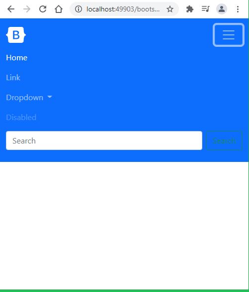
Navbar consists of navigation tabs, search bar, additional disabled feature, dropdowns, and a list of items. It can be added in class using a wrap feature via adding .nav with .nav-expand to add the collapse plugin. Navbars use either horizontal or vertical containers to store and display the contents.
Additionally, you can add color schemes, other styling textures to get a better view. Navbar has the flexibility to align proper spacing. To align proper spacing, use flex and space utilities. The accessibility of the Navbar component is only through the nav tag element. Any additional, features can be enabled using the JavaScript collapse plugin.
In case, you can use Navbar by tagging role= navigation inside the div tag. Navbar supports built-in content for better view.
Some supported contents include .navbar-nav for complete alignment of navigation tabs, .navbar-brand for heading company’s brand and projects, .navbar-toggler to initiate a collapse plugin, .navbar-text for settling the vertically aligned texts. Also, if long contents are added then .navbar-scroll.
For Example,
<nav class="navbar navbar-expand-lg"> <div class="container-fluid"> <a class="navbar-brand" href="#">Navbar Brand</a> <div class="collapse navbar-collapse" id="navbarCollapse"> <ul class="navbar-nav"> <li class="nav-item"> <a class="nav-link activated" aria-current="page" href="#">Homepage</a> </li> <li class="nav-item"> <a class="nav-link" href="#">Link item</a> </li> <li class="nav-item dropdown"> <a class="nav-link dropdown-toggle" href="#" id="navbarDropdown" role="button" data-bs-toggle="dropdown" aria-expanded="false"> Dropdown </a> <ul class="dropdown-menu" aria-labelledby="navbarDropdown"> <li><a class="dropdown-item" href="#">List 1</a></li> <li><a class="dropdown-item" href="#">List 2</a></li> </ul> </li> </ul> </div> </div> </nav> |
Responsive navigation Menu with bootstrap5 example