How to add charts to Google Sheets
Visualize your data with ease by adding charts to Google Sheets. Create and use charts to represent your data in this step-by-step guide at rrtutors.com.
Scrolling through enormous amounts of data in Google Sheet spreadsheets may be tedious and time-consuming. Furthermore, you may fail to comprehend and analyze the facts. Visualizing Data is always the greatest approach to make your data more fascinating and capture the reader's attention. This post will show you how to create these charts in Google Sheets.
How to add charts to Google Sheets
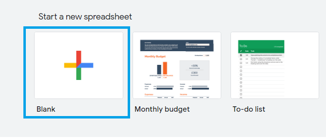
Step 1: Open a new or an existing Google sheets
 |
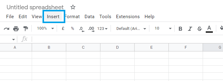
Step 2: On the Google sheets menu, go to “Insert”
 |
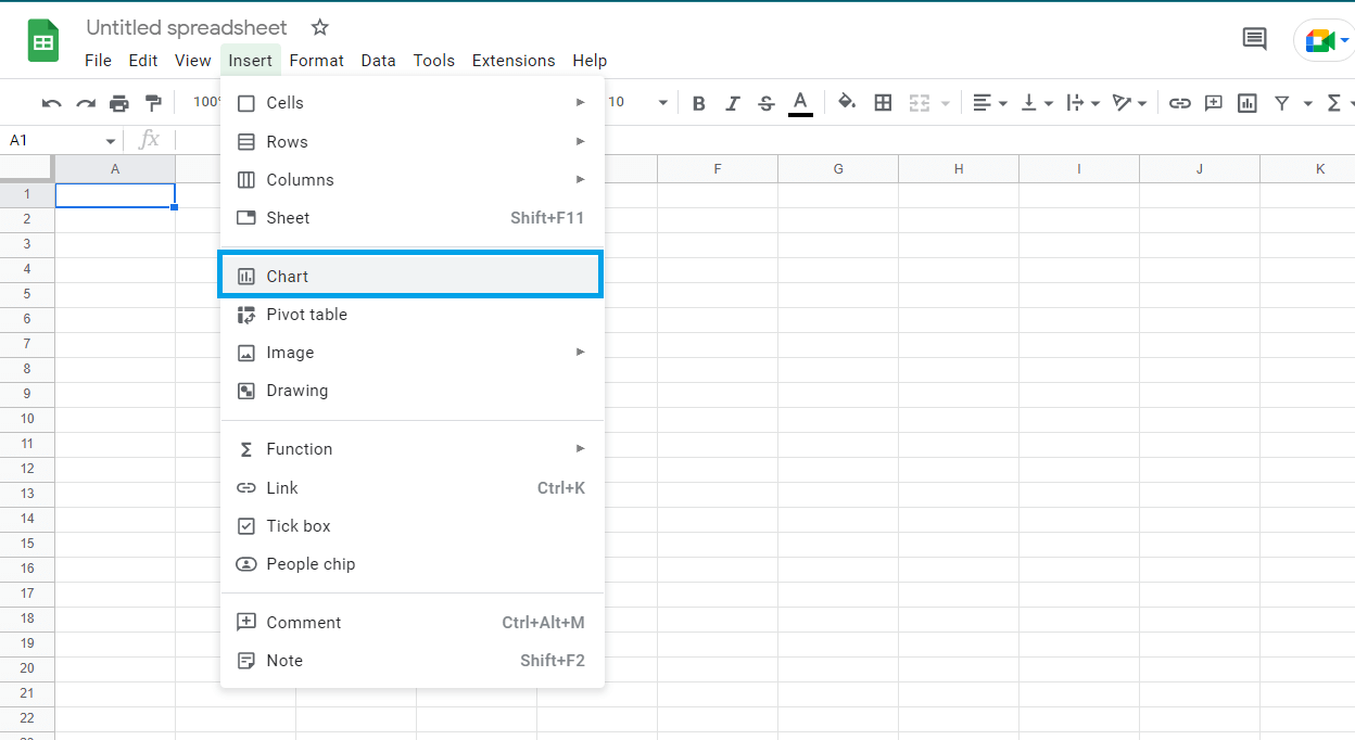
Step 3: From the “Insert” submenu, click on the chart
 |
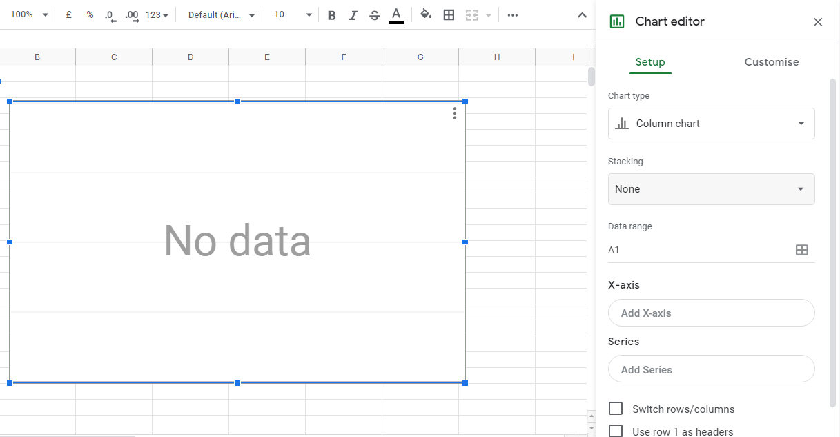
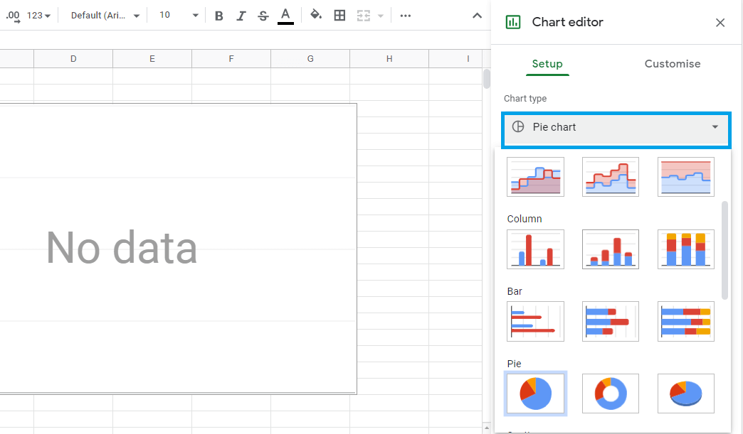
Step 5: Now, a chart editor will allow you to select the chart type, add data, and customize the charts.
 |
In this case, we will select the "Pie chart."
 |
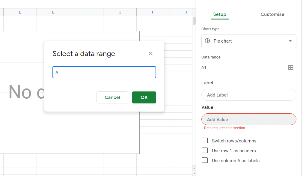
Now select a data range
 |
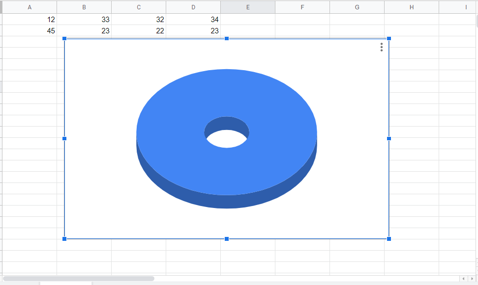
After customization and adding values, the pie chart will be displayed on your screen.
 |
Conclusion
In conclusion, Google Sheets has a range of graph alternatives, so if you want to represent portions of a whole, a pie chart is a good choice, but if you want to compare data, a bar graph is a better choice
Keywords: Google Docs, Google Sheet, add charts to Google Sheets