TextFied are general usage widget in any flutter application. Normal TextField will not show any border, it will just show the under line with text. If we want to add placeholder text to the textfield we need to use InputDecoration property. We can also set styles for Textfield with InputDecoration property. It has below properties To set the color for OutlineInputBorder , there are five different ways to set the InputBorder to InputDecoration. Check the code for these InputDecoration properties
const InputDecoration({
  this.icon,
  this.labelText,
  this.labelStyle,
  this.helperText,
  this.helperStyle,
  this.helperMaxLines,
  this.hintText,
  this.hintStyle,
  this.hintTextDirection,
  this.hintMaxLines,
  this.errorText,
  this.errorStyle,
  this.errorMaxLines,
  @Deprecated(
    'Use floatingLabelBehavior instead. '
    'This feature was deprecated after v1.13.2.',
  )
  this.hasFloatingPlaceholder = true,
  this.floatingLabelBehavior,
  this.isCollapsed = false,
  this.isDense,
  this.contentPadding,
  this.prefixIcon,
  this.prefixIconConstraints,
  this.prefix,
  this.prefixText,
  this.prefixStyle,
  this.suffixIcon,
  this.suffix,
  this.suffixText,
  this.suffixStyle,
  this.suffixIconConstraints,
  this.counter,
  this.counterText,
  this.counterStyle,
  this.filled,
  this.fillColor,
  this.focusColor,
  this.hoverColor,
  this.errorBorder,
  this.focusedBorder,
  this.focusedErrorBorder,
  this.disabledBorder,
  this.enabledBorder,
  this.border,
  this.enabled = true,
  this.semanticCounterText,
  this.alignLabelWithHint,
})
errorBorder
focusedBorder
focusedErrorBorder
disabledBorder
enabledBorder
import 'package:flutter/material.dart';
void main()
{
runApp(MaterialApp(
home:TextfiledProperties()
));
}
class TextfiledProperties extends StatelessWidget{
@override
Widget build(BuildContext context) {
return Scaffold(
appBar: AppBar(),
body: SingleChildScrollView(
child: Padding(
padding: const EdgeInsets.all(8.0),
child: Column(
children: [
TextField(
decoration: InputDecoration(
hintText: "Normal Textfiled"
),
),
SizedBox(height: 5,),
TextField(
keyboardType: TextInputType.number,
decoration: InputDecoration(
hintText: "Number Textfiled",
),
),
SizedBox(height: 5,),
TextField(
keyboardType: TextInputType.number,
decoration: InputDecoration(
hintText: "Textfiled with Border",
border: const OutlineInputBorder(),
),
),
SizedBox(height: 5,),
TextField(
keyboardType: TextInputType.number,
decoration: InputDecoration(
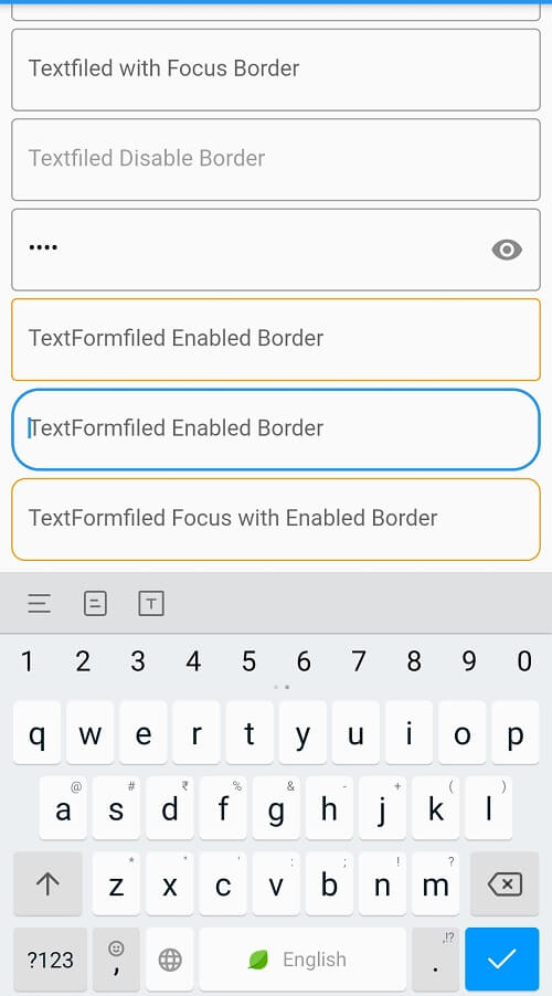
hintText: "Textfiled with Focus Border",
border: const OutlineInputBorder(),
focusedBorder: const OutlineInputBorder(
borderSide: BorderSide(color: Colors.red, width: 1.0),
),
),
), SizedBox(height: 5,),
TextField(
keyboardType: TextInputType.number,
enabled: false,
decoration: InputDecoration(
hintText: "Textfiled Disable Border",
border: const OutlineInputBorder(),
disabledBorder: const OutlineInputBorder(
borderSide: const BorderSide(color: Colors.grey, width: 1.0),
),
),
),
SizedBox(height: 5,),
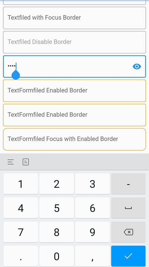
TextField(
keyboardType: TextInputType.number,
obscureText: true,
decoration: InputDecoration(
suffixIcon: Icon(Icons.remove_red_eye_rounded),
hintText: "Textfiled Disable Border",
border: const OutlineInputBorder(),
disabledBorder: const OutlineInputBorder(
borderSide: const BorderSide(color: Colors.grey, width: 1.0),
),
),
),
SizedBox(height: 5,),
TextFormField(
decoration: InputDecoration(
enabled: true,
hintText: "TextFormfiled Enabled Border",
enabledBorder: const OutlineInputBorder(
borderSide: const BorderSide(color: Colors.orange),
) ,
border: OutlineInputBorder(
)
),
),
SizedBox(height: 5,),
TextFormField(
decoration: InputDecoration(
hintText: "TextFormfiled Enabled Border",
enabledBorder: const OutlineInputBorder(
borderSide: const BorderSide(color: Colors.orange),
) ,
border: OutlineInputBorder(
borderRadius: BorderRadius.circular(20)
)
),
),SizedBox(height: 5,),
TextFormField(
decoration: InputDecoration(
hintText: "TextFormfiled Focus with Enabled Border",
enabledBorder: OutlineInputBorder(
borderRadius: BorderRadius.circular(10),
borderSide: const BorderSide(color: Colors.orange),
) ,
focusedBorder: OutlineInputBorder(
borderRadius: BorderRadius.circular(20),
borderSide: const BorderSide(color: Colors.red),
) ,
),
)
],
),
),
),
);
}
}
How to set the TextFormField/TextField border color
Fix MediaQuery.of() Error in Flutter with RRutors Guide
How do I open a web browser (URL) from my Flutter code?
How to make a widget Center vertically inside a SingleChildScrollView
How do i change the OutlineInputBorder color?
How to copy text from Text Widget flutter?
Flutter Questions and Answers
How to convert a String value to double in flutter?
How to make shadow for Container widget Flutter?
Fix Flutter Null Safety Issue with RRutors
Fix Flutter Bottom Overflowed Error in Your App - RRutors
How to handle the code after showDialog is dismissed in Flutter?
How do we save the data in browser's cookies using the Flutter web?
How can i use hexadecimal color code in Flutter?
OS Error: A required privilege is not held by the client errno = 1314
How to Close Flutter application Programmatically?
Fix MissingPluginException Error in Flutter with RRutors
How to place a listview inside a SingleChildScrollView but prevent them from scrolling separately?
How do i make TextButton full width in flutter?
How to remove debug banner in flutter?
Vertical Divider is Not Showing in my Flutter Application
How to display snackbar infinite duration in a flutter application
How do i make CachedNetwork image as rounded circle in flutter?
How to create Toast in Flutter?
Fix Navigator Context Issue in Flutter with RRutors
What is Flutter?
How to change package name in flutter?
Flutter - Vertical Divider - How to add Vertical Divider?
Fix Scaffold.of() Called Without Scaffold Exception - RRutors
How to check the given value is a number or not in dart?
Can we use Container color and decoration properties at once?
How can i get document id in Flutter Firestore?
How do I supply/set an initial value to a text field in Flutter ?
How to deactivate back button in flutter?
What corresponds to Intent in Flutter?
How do i make circular icon Inside Button ?
How to find the Screen orientation in flutter
How to navigate to new screen without back screen
How does Flutter load images?
How to create Gradient background for AppBar in Flutter