How do i create Percentage Circular Progress Bar in HTML
Create circular percentage progress bar with css html and javascript. Make animation while display the progress
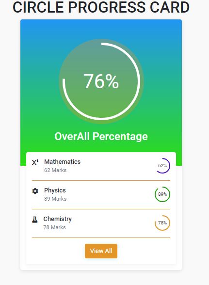
In this Html tutorial we will create Circular Progress Bar using Html,bootstrap, and Javascript. Generally we will use Circular Percentge Progress Bar to display dashboards, progress of the work, marks report.
 |
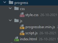
This circle progress bar examples consist of below files
- Index.html
- style.css
- script.js
- progressbar.min
The folder structure will be like below
 |
Let's create respected files
index.html
Create html file to show progress bar using html and bootstrap
<!DOCTYPE html> <html lang="en"> <head> <meta charset="UTF-8"> <title>Circular Progress Bar using HTML CSS Bootstrap5 and Javascript</title> <meta content="width=device-width, initial-scale=1, maximum-scale=1, user-scalable=no" name="viewport"> <link href="https://cdn.jsdelivr.net/npm/bootstrap@5.0.2/dist/css/bootstrap.min.css" rel="stylesheet" integrity="sha384-EVSTQN3/azprG1Anm3QDgpJLIm9Nao0Yz1ztcQTwFspd3yD65VohhpuuCOmLASjC" crossorigin="anonymous"> <link rel="stylesheet" href="https://cdnjs.cloudflare.com/ajax/libs/font-awesome/6.0.0-beta2/css/all.min.css" /> <link rel="stylesheet" type="text/css" href="css/style.css"> </head> <body> <section class="main-content"> <div class="container"> <h1 class="text-center text-uppercase">Circle Progress Card</h1> <div class="row"> <div class="col-sm-4 offset-sm-4"> <div class="box course-progress-card"> <div class="course-progress-card_top"> <div class="progress-circle-outer"> <div class="progress-circle" id="circle-container"> <div class="inner"> 76% </div> </div> </div> <h3 class="text-center mt-3">OverAll Percentage</h3> </div> <div class="course-progress-card_courses"> <div class="course-list"> <div class="course-card"> <div class="d-flex"> <div class="course-card__img"> <div class="icon-d"><i class="fas fa-superscript"></i></div> </div> <div class="course-card__text"> <h6 class="mb-0"><a href="#!" class="text-dark">Mathematics</a></h6> <p class="text-muted mb-0"><small>62 Marks</small></p> </div> </div> <div class="course-card__progress"> <div class="progress-circle progress-circle--small" id="small-container1"> <div class="inner"> 62% </div> </div> </div> </div> <div class="course-card"> <div class="d-flex"> <div class="course-card__img"> <div class="icon-d"><i class="fas fa-atom"></i></div> </div> <div class="course-card__text"> <h6 class="mb-0"><a href="#!" class="text-dark">Physics</a></h6> <p class="text-muted mb-0"><small>89 Marks</small></p> </div> </div> <div class="course-card__progress"> <div class="progress-circle progress-circle--small" id="small-container2"> <div class="inner"> 89% </div> </div> </div> </div> <div class="course-card"> <div class="d-flex"> <div class="course-card__img"> <div class="icon-d"><i class="fa fa-flask" aria-hidden="true"></i> </div> </div> <div class="course-card__text"> <h6 class="mb-0"><a href="#!" class="text-dark">Chemistry</a></h6> <p class="text-muted mb-0"><small>78 Marks</small></p> </div> </div> <div class="course-card__progress"> <div class="progress-circle progress-circle--small" id="small-container3"> <div class="inner"> 78% </div> </div> </div> </div> <div class="text-center"> <button class="btn btn-primary btn-block">View All</button> </div> </div> </div> </div> </div> </div> </div> </section> <!-- jQuery first, then Popper.js, then Bootstrap JS --> <script src="https://code.jquery.com/jquery-3.2.1.slim.min.js"></script> <script src="https://cdnjs.cloudflare.com/ajax/libs/popper.js/1.12.9/umd/popper.min.js"></script> <script src="https://cdn.jsdelivr.net/npm/bootstrap@5.0.2/dist/js/bootstrap.bundle.min.js" integrity="sha384-MrcW6ZMFYlzcLA8Nl+NtUVF0sA7MsXsP1UyJoMp4YLEuNSfAP+JcXn/tWtIaxVXM" crossorigin="anonymous"></script> <script src="js/progressbar.min.js"></script> <script src="js/script.js"></script> </body> </html> |
script.js
This javascript file contains the code show progress status and animate the circle progress bar with given time duration.
let commonSmallInput1 = {
  color: "#4b0fb7",
  strokeWidth: 6,
  duration: 2000, // milliseconds
  easing: "easeInOut",
}

let commonSmallInput2 = {
  color: "#1d9f0b",
  strokeWidth: 6,
  duration: 2000, // milliseconds
  easing: "easeInOut",
}

let commonSmallInput3 = {
  color: "#e39627",
  strokeWidth: 6,
  duration: 2000, // milliseconds
  easing: "easeInOut",
}

window.onload = function onLoad() {
  var progressBar = new ProgressBar.Circle("#circle-container", {
    color: "white",
    strokeWidth: 3,
    duration: 2000, // milliseconds
    easing: "easeInOut",
  });

  var progressBarSmall1 = new ProgressBar.Circle("#small-container1", commonSmallInput1);

  var progressBarSmall2 = new ProgressBar.Circle("#small-container2", commonSmallInput2);

  var progressBarSmall3 = new ProgressBar.Circle("#small-container3", commonSmallInput3);


  progressBar.animate(0.76); // percent
  progressBarSmall1.animate(0.62); // percent
  progressBarSmall2.animate(0.89); // percent
  progressBarSmall3.animate(0.78); // percent

};
|
style.css
This css file will use to design the circle progress bar and make necessary colors and make responsive circle progress bar.
@import url("https://fonts.googleapis.com/css?family=Roboto:300,400,500,700&display=swap"); body { background: #f9f9f9; font-family: "Roboto", sans-serif; } a { text-decoration: none; } .main-content { padding-top: 100px; padding-bottom: 100px; } .box { background: #fff; margin-bottom: 25px; border-radius: 5px; overflow: hidden; box-shadow: 0 2px 10px rgba(0, 0, 0, 0.1); transition: all 0.2s; } #circle-container { position: relative; } .small-container { height: 40px; width: 40px; } .course-progress-card_top { padding: 50px; background: #ffb347; /* fallback for old browsers */ background: -webkit-linear-gradient(to bottom, #ffcc33, #df8505); /* Chrome 10-25, Safari 5.1-6 */ background: linear-gradient(to bottom, #2196f3, #2bdf11); /* W3C, IE 10+/ Edge, Firefox 16+, Chrome 26+, Opera 12+, Safari 7+ */ color: #fff; } .course-progress-card_courses { padding: 15px; } .course-progress-card_courses .course-list { background: #fff; padding: 15px; border-radius: 5px; margin-top: -50px; box-shadow: 0 2px 10px rgba(0, 0, 0, 0.06); } .course-card { margin-bottom: 15px; padding-bottom: 15px; display: flex; justify-content: space-between; border-bottom: 1px solid #e39627; } .course-card__img { margin-right: 15px; } .course-card__img img { height: 40px; width: 40px; border-radius: 5px; } .icon-d .fa-java{ font-size: 43px; color: #0d84ff; font-weight: 500; } .icon-d .fa-html5{ font-size: 43px; color: #f05a03; font-weight: 500; } .icon-d .fa-css3-alt{ font-size: 43px; color: #f8c405; font-weight: 500; } .icon-d .fa-react{ font-size: 43px; color: #73cbff; font-weight: 500; } .progress-circle-outer { width: 220px; height: 220px; margin: 0 auto; border-radius: 50%; box-shadow: 0 2px 10px rgba(3, 169, 244, 0.2); background: rgb(227 150 39 / 32%); display: flex; align-items: center; justify-content: center; } .progress-circle { width: 200px; height: 200px; position: relative; display: flex; align-items: center; justify-content: center; } .progress-circle > .inner { position: absolute; color: #fff; font-size: 50px; } .progress-circle > svg { height: 100%; display: block; } .progress-circle--small { width: 40px; height: 40px; } .progress-circle--small > .inner { font-size: 12px; color: #333; } .btn.btn-primary { background: #e39627; border-color: #e39627; box-shadow: 0 2px 10px rgba(3, 169, 244, 0.2); } .btn.btn-primary:hover { background: #ffcc33; border-color: #ffcc33; } @media only screen and (max-width: 600px) { .progress-circle { width: 120px; height: 120px; position: relative; display: flex; align-items: center; justify-content: center; } .progress-circle-outer { width: 150px; height: 150px; margin: 0 auto; border-radius: 50%; background: rgb(227 150 39 / 32%); display: flex; align-items: center; justify-content: center; } .progress-circle > .inner { font-size: 35px; } .course-card__img img { height: 55px; width: 55px; border-radius: 5px; } .progress-circle--small { width: 40px; height: 40px; } .progress-circle--small > .inner { font-size: 12px; color: #333; } } |
Conclusion: In this Html tutorial we covered create a responsive Circular progress bar with css and javascript and make circular percentage progress animation while display the progress percentage.