Flutter Buttons - What are the different Types of Buttons in Flutter
We can’t imagine a programming language without click events. Similarly other languages flutter provided buttons to handle click events. The Material component library provides a variety of button components such as ElevatedButton, TextButton, OutlineButton and so on. They are all directly or indirectly customized to the packaging of the RawMaterialButton component, so most of their properties are the RawMaterialButton same. When introducing each button, we first introduce its default appearance, and the appearance of most buttons can be customized through attributes. We will introduce these attributes uniformly later. Additionally, all buttons in the Material library have the following in common:
- When pressed, there will be "water wave animation" (also known as "ripple animation", which means that when the button is clicked, the animation of water wave spreading will appear on the button).
- There is a
onPressedproperty to set the click callback, which will be executed when the button is pressed. If the callback is not provided, the button will be in a disabled state, and the disabled state will not respond to user clicks
We have different types of buttons in flutter
- FlatButton (Removed, Replaced with TextButton)
- RaisedButton (Removed, Replaced with ElevatedButton)
- IconButton
- OutlinedButton
- DropdownButton
- BackButton
- CloseButton
- FloatingActionButton
- MaterialButton
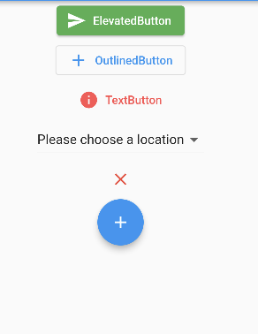
ElevatedButton
ElevatedButton That is the "floating" button, which has a shadow and a gray background by default. After pressing, the shadow will become larger
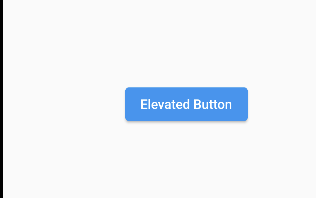 |
ElevatedButton It is very simple to use , such as
ElevatedButton(
  child: Text("Elevated Button"),
  onPressed: () {},
)
|
TextButtons
TextButton That is, the text button, the default background is transparent without shadow. After pressing, there will be a background color
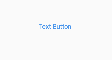 |
Using TextButton is also very simple, the code is as follows
TextButton(
  child: Text("Text Button"),
  onPressed: () {},
)
|
OutlinedButton
OutlinedButton By default there is a border, no shadow and a transparent background. After pressing, the border color will become brighter, and the background and shadow (weaker) will appear at the same time, as shown in
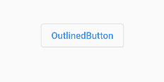 |
OutlinedButton It is also very simple to use , the code is as follows
OutlinedButton(
  child: Text("OutlinedButton"),
  onPressed: () {},
),
|
IconButton
IconButton It is a clickable Icon, which does not include text and has no background by default. After clicking, the background will appear, as shown
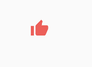 |
IconButton(
  icon: Icon( Icons.thumb_up,size: 40,
    color: Colors.redAccent,),
  onPressed: () {},
)
|
MaterialButton
MaterialButton(onPressed: (){},child: Text("Material Button",style: TextStyle(color: Colors.redAccent)),),
|
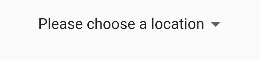
DropDownButton
DropdownButton(


  items:list.map((value){

    return DropdownMenuItem(child: Text(value),value: value);

  }).toList(),

  hint: Text("Please choose a location"),

  value: selected_item,

  onChanged: (value){

    selected_item=value!;

    setState(() {

    });

    debugPrint('Changed: ${value}');

  },

)
|
 |
CloseButton
An IconButton setup for use as a close button to close modals (or any other closeable content). Flashes background circle when clicked on
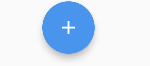
FloatingActionButton
It is a Material widget button, A button that hovers in a layer above content
 |
Buttons with Icons - Flutter Add Icon to Button
ElevatedButton, TextButton, and OutlinedButton have a icon constructor, through which you can easily create a button with an icon, as shown
ElevatedButton.icon(
  style: ButtonStyle(backgroundColor: MaterialStateProperty.all(Colors.green)),
  icon: Icon(Icons.send,color: Colors.white),
  label: Text("ElevatedButton"),
  onPressed: (){},
),
OutlinedButton.icon(
  icon: Icon(Icons.add),
  label: Text("OutlinedButton"),
  onPressed: (){},
),
TextButton.icon(


  icon: Icon(Icons.info,color: Colors.redAccent,),
  label: Text("TextButton",style: TextStyle(color: Colors.redAccent)),
  onPressed: (){},
),
|
 |
All Flutter Button Example code
void main() {
  runApp( MyHomePage(title: 'Flutter Buttons and Style'));
}

class MyHomePage extends StatefulWidget {
  const MyHomePage({super.key, required this.title});

  final String title;

  @override
  State<MyHomePage> createState() => _MyHomePageState();
}

class _MyHomePageState extends State<MyHomePage> {
  int moveAction = MotionEvent.actionUp;

   List<String>list=[

     "Please choose a location",

     "Item One",

     "Item Two",

     "Item Three",

     "Item Four",

   ];
  var selected_item="Please choose a location";
@override
  void initState() {
    // TODO: implement initState
    super.initState();


}

  @override
  Widget build(BuildContext context) {
     return MaterialApp(
      home: Scaffold(
        appBar: AppBar(
          // Here we take the value from the MyHomePage object that was created by
          // the App.build method, and use it to set our appbar title.
          title: Text(widget.title),
        ),
        body: Center(
          child: Column(
            children: [
              ElevatedButton.icon(
                style: ButtonStyle(backgroundColor: MaterialStateProperty.all(Colors.green)),
                icon: Icon(Icons.send,color: Colors.white),
                label: Text("ElevatedButton"),
                onPressed: (){},
              ),
              OutlinedButton.icon(
                icon: Icon(Icons.add),
                label: Text("OutlinedButton"),
                onPressed: (){},
              ),
              TextButton.icon(


                icon: Icon(Icons.info,color: Colors.redAccent,),
                label: Text("TextButton",style: TextStyle(color: Colors.redAccent)),
                onPressed: (){},
              ),
              DropdownButton(


                items:list.map((value){

                  return DropdownMenuItem(child: Text(value),value: value);

                }).toList(),

                hint: Text("Please choose a location"),

                value: selected_item,

                onChanged: (value){

                  selected_item=value!;

                  setState(() {

                  });

                  debugPrint('Changed: ${value}');

                },

              ),
              CloseButton(
                color: Colors.red,
                onPressed: (){

                },

              ),
              FloatingActionButton(child: Icon(Icons.add),
                  onPressed: (){})

            ],
          )
        )


         // This trailing comma makes auto-formatting nicer for build methods.
      ),
    );
  }
}
|