Flutter Icon and Images - How to set Image from Assets and Network image
In flutter to load and display images using Image component and Imagethe data sources can be assets, files, memory, and networks
ImageProvider It is an abstract class that mainly defines the interface for load image data acquisition. Obtaining images from different data sources requires different implementations. For example AssetImage, NetworkImage. AssetImage,it implements the ImageProvider that loads images from Assets and NetworkImage, implements the ImageProvider that loads images from the network.
Image widget has a mandatory imageparameter, which corresponds to an ImageProvider. Let's demonstrate how to load images from asset and network respectively
Image Constructor
Image({
  super.key,
  required this.image,
  this.frameBuilder,
  this.loadingBuilder,
  this.errorBuilder,
  this.semanticLabel,
  this.excludeFromSemantics = false,
  this.width,
  this.height,
  this.color,
  this.opacity,
  this.colorBlendMode,
  this.fit,
  this.alignment = Alignment.center,
  this.repeat = ImageRepeat.noRepeat,
  this.centerSlice,
  this.matchTextDirection = false,
  this.gaplessPlayback = false,
  this.isAntiAlias = false,
  this.filterQuality = FilterQuality.low,
})
|
Load Pictures from Asset folder
1. To load images from assets folder, we need to create on folder under project root directory and add any image inside that folder.
2. To access these images inside application we need to declare them inside pubspec.yaml file
|
Note: Since the yaml file is strict on indentation, it must be indented strictly according to the method of two spaces at each level, here there should be two spaces in front of assets.
3. Load the image inside application
Now its time to load image in the ui where we want to show. example
Image(
image: AssetImage("speaker2.png"),
    width: 100.0
)
|
Image also provides a shortcut constructor Image.asset for loading and displaying images from assets:
Image.asset("speaker2.png",
  width: 100.0,
)
|
Load Image from Network Using NetworkImage widget
To load image from network we will use ImageNetwork widget.
|
Image also provides a shortcut constructor Image.network for loading and displaying images from the network
Image.network( "https://www.stockvault.net/data/2020/01/18/272608/thumb16.jpg", width: 100.0, ) |
 |
Image Attributes
There is a series of parameters are defined when displaying images, through which we can control the display appearance, size, mixing effect, etc. of images. Let's take a look at the main parameters of Image
|
-
width,height: It is used to set the width and height of the picture. When the width and height are not specified, the picture will display its original size as much as possible according to the limitation of the current parent container. If only one of , and is setwidth,heightthe other property will be pressed by default scaling, but thefitadaptation rules can be specified through the properties described below. -
fit: This attribute is used to specify the adaptation mode of the picture when the display space of the picture is different from the size of the picture itself. The adaptation mode isBoxFitdefined in , which is an enumerated type with the following values:fill: It will be stretched to fill the display space, the aspect ratio of the picture itself will change, and the picture will be deformed.cover: The image will be enlarged according to the aspect ratio and then centered to fill the display space. The image will not be deformed, and the part exceeding the display space will be clipped.contain: This is the default adaptation rule for the picture. The picture will be scaled to fit the current display space while keeping the aspect ratio of the picture itself unchanged, and the picture will not be deformed.fitWidth: The width of the picture will be scaled to the width of the display space, and the height will be scaled proportionally, and then displayed in the center, the picture will not be deformed, and the part beyond the display space will be clipped.fitHeight: The height of the picture will be scaled to the height of the display space, the width will be scaled proportionally, and then displayed in the center, the picture will not be deformed, and the part exceeding the display space will be clipped.none: There is no adaptation strategy for the picture, and the picture will be displayed in the display space. If the picture is larger than the display space, only the middle part of the picture will be displayed in the display space
colorAndcolorBlendMode: Color mixing can be performed on each pixel when the picture is drawn,colorspecify the mixed color, andcolorBlendModespecify the mixed mode
Image.asset("speaker2.png",
  width: 100.0,
  color: Colors.green,
  colorBlendMode: BlendMode.colorDodge, )
|
repeat: When the size of the picture itself is smaller than the display space, specify the repetition rule of the picture
Image(
image: AssetImage("speaker2.png"),
      width: 100.0,
  height: 200.0,
  repeat: ImageRepeat.repeatY ,
)
|
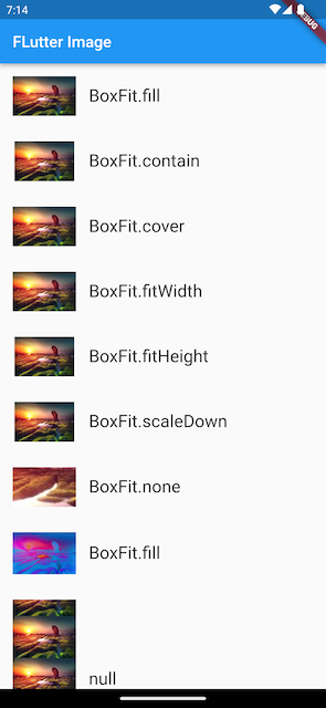 |
Complte example code for Flutter Images with different scale type options
import 'package:flutter/material.dart';

void main() {
  runApp( ImageAndIconRoute());
}

class ImageAndIconRoute extends StatelessWidget {
  @override
  Widget build(BuildContext context) {
    var img=NetworkImage(
        "https://www.stockvault.net/data/2020/01/18/272608/thumb16.jpg");

    return MaterialApp(
      home: Scaffold(
        appBar: AppBar(title: Text("FLutter Image"),),
        body: SingleChildScrollView(
          child: Column(
              children: <Image>[
                Image(
                  image: img,
                  height: 50.0,
                  width: 100.0,
                  fit: BoxFit.fill,
                ),
                Image(
                  image: img,
                  height: 50,
                  width: 50.0,
                  fit: BoxFit.contain,
                ),
                Image(
                  image: img,
                  width: 100.0,
                  height: 50.0,
                  fit: BoxFit.cover,
                ),
                Image(
                  image: img,
                  width: 100.0,
                  height: 50.0,
                  fit: BoxFit.fitWidth,
                ),
                Image(
                  image: img,
                  width: 100.0,
                  height: 50.0,
                  fit: BoxFit.fitHeight,
                ),
                Image(
                  image: img,
                  width: 100.0,
                  height: 50.0,
                  fit: BoxFit.scaleDown,
                ),
                Image(
                  image: img,
                  height: 50.0,
                  width: 100.0,
                  fit: BoxFit.none,
                ),
                Image(
                  image: img,
                  width: 100.0,
                  color: Colors.blue,
                  colorBlendMode: BlendMode.difference,
                  fit: BoxFit.fill,
                ),
                Image(
                  image: img,
                  width: 100.0,
                  height: 200.0,
                  repeat: ImageRepeat.repeatY ,
                )
              ].map((e){
                return Row(
                  children: <Widget>[
                    Padding(
                      padding: EdgeInsets.all(16.0),
                      child: SizedBox(
                        width: 80,
                        child: e,
                      ),
                    ),
                    Text(e.fit.toString(),style: TextStyle(fontSize: 22),)
                  ],
                );
              }).toList()
          ),
        ),
      ),
    );
  }
}
|
Cache the Photos in Flutter
The Flutter framework has a cache (memory) for the loaded images, we will discuss this feature in coming chapters.
Icons in Flutter
In Flutter, we can use iconfont like web development, iconfont is "font icon", which is to make the icon into a font file, and then display different pictures by specifying different characters
In the font file, each character corresponds to a bit code, and each bit code corresponds to a display glyph. Different fonts mean that the glyphs are different, that is, the glyphs corresponding to the characters are different. In iconfont, only the glyph corresponding to the bitcode is made into an icon, so different characters will eventually be rendered into different icons
Advantages of Icons over Images in Flutter
- Small size: It can reduce the size of the installation package.
- Vector: iconfonts are all vector icons, and zooming in will not affect their clarity.
- Text styles can be applied: font icons can be changed in color, size alignment, etc. just like text.
- Can be mixed with text via TextSpan
Material Design Font Icons
Flutter includes a set of Material Design font icons by default. To use this icons we need to configure them in pubspec.yaml file
|
Sample flutter Icon example
String icons = "";
// accessible: 0xe03e
    icons += "\n \uE03e";
// error:  0xe237
    icons += " \n \uE237";
// fingerprint: 0xe287
    icons += " \n \uE287";
Text(
  icons,
  style: TextStyle(
    fontFamily: "MaterialIcons",
    fontSize: 24.0,
    color: Colors.red,
  ),
);
|
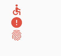 |
As you can see from this example, using icons is like using text, but this method requires us to provide the code point of each icon, which is not friendly to developers. Therefore, Flutter encapsulates IconData and Icon to specifically display font icons. We can implement above example like below
 Column(
  children: [
    Icon(Icons.accessible,color: Colors.red,size: 48,),
    Icon(Icons.error,color: Colors.red,size: 48),
    Icon(Icons.fingerprint,color: Colors.red,size: 48),
  ],
)
|
Flutter custom font icon
We can also use custom font icons. There are a lot of font icon materials on iconfont.cn. We can choose the icons we need and download them. After that, some font files in different formats will be generated. In Flutter, we can use the ttf format.
Assuming that we need to use a book icon and WeChat icon in our project, we package and download it and import it:
-
Import the font icon file; this step is the same as importing the font file, assuming our font icon file is saved in the project root directory, the path is "fonts/iconfont.ttf"
|
For ease of use, we define a MyIcons class with the same function Icons as the class: define all icons in the font file as static variables
|
class MyIcons{ |
3. Add fonts in the UI
|
Row( |