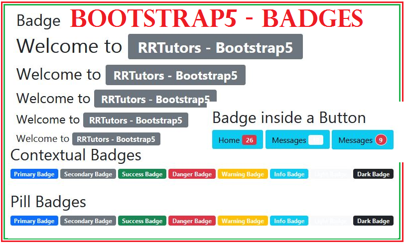
Badges are small buttons that are used to promote particular content. It is the small count and labeling component that are mostly used in documentation or built-in website. Badges are formed with a suitable size that matches the immediate parent element using relevant em units along with font size.
|
According to Bootstrap v5, there are no longer hovering styles for badges. These badges can be used along with different components like buttons, links, etc. The reason behind using the buttons is to grant a counter. It depends upon developers how to use badges because sometimes it might be confusing for the users to identify as a screen reader or assistive techniques.
To define badges, it is particularly a component for visualizing the contents that depict its purpose. You can modify the position of badges using an extension of the .badge. You can set up its position at the corner of the button or link.
There are more functionalities for using badges like replacing the .badge along with the class to get flexibility for using more utilities. Badges can be substituted for background colors as well. For setting up a badge along with a background color, you can use the utility class functionality.
There are variants as well through which badges can be applied. You can use .round-pill class to round out the badges, with a larger radius.
For Example,
<h1>Example of Badges header <span class="badge bg-secondary">New</span></h1> <h2>Example of Badges header <span class="badge bg-secondary">New</span></h2> <h3>Example heading <span class="badge bg-secondary">New</span></h3> |
Bootstrap5 Badge example code with different type
Create differnt buttons with bootstrap
Create Grouped buttons and nested groups