- Index
- React Native Tutorial
- React Native - Overview
- React Native - Environment Setup
- React Native - App.js
- React Native - State
- React Native Props
- React Native - Styling
- React Native - View
- React Native - ListView - FlatList
- React Native - Text Input
- React Native - ScrollView
- React Native - Images
- React Native Button
- React Native Touchable
- React Native - Text
- React Native Safe Area
- React Native Alert
- React Native Modal
- React Native Picker
- React Native Switch
- React Native Slider
- React Native WebView
- React Native - Status Bar
React Native Touchable
As we know to perform click event we will use Button in ReactNative, but button doesn't support style props. to Make style with Click event we will Touchable Component.
In this chapter we will learn about Tochable and how to use Touchable component in ReactNative
We have 4 types of Different Touchable in React NAtive
| S. No. | Touchable | Available For |
|---|---|---|
| 1. | TouchableNativeFeedback | Only For Android |
| 2. | TouchableHighlight | Android/IOS Both |
| 3. | TouchableOpacity | Android/IOS Both |
| 4. | TouchableWithoutFeedback | Android/IOS Both |
TouchableNativeFeedback
This component uses native state drawable to display touch feedback. This will work only in Android .
Syntax
|
Props
| Props | Type | Required | Description |
|---|---|---|---|
| background | backgroundPropType | no | It determines the background drawable that is going to be displayed as feedback. |
| useForeground | bool | no | It adds the ripple effect to the foreground of the view, instead of the background. |
TouchableHighlight
On key down, the opacity of the wrapped view is decreased, which allows the underlying color to show through, darkening or tinting the view
|
Props
| Props | Type | Required | Platform | Description |
|---|---|---|---|---|
| activeOpacity | number | no | Determines the opacity of wrapped view when it is touched. | |
| onHideUnderlay | function | no | Calls instantly after the underlay is hidden. | |
| onShowUnderlay | function | no | Calls instantly after the underlay is shown. | |
| style | View.style | no | ||
| underlayColor | color | no | Show the underlay color when the touch is active. | |
| hasTVPreferredFocus | bool | no | iOS | It focuses TV preferred, work only for iOS. |
| tvParallaxProperties | object | no | iOS | It is an object with properties which control the Apple TV parallax effects. |
TouchableOpacity
On key down, the opacity of the wrapped view is decreased. It allows background to be seen while the user press down. The opacity of button will be controlled by wrapping the children in an Animation
|
Props
| Props | Type | Required | Platform | Description |
|---|---|---|---|---|
| activeOpacity | number | no | It determines the opacity of wrapped view when it is touched. | |
| tvParallaxProperties | object | no | iOS | It is an object with property which is used to control the Apple TV parallax effects. |
| hasTVPreferredFocus | bool | no | iOS | It focuses TV preferred, it works on Apple TV only. |
TouchableWithoutFeedback
The TouchableWithoutFeedback is used when the user wants to handle the tap functionality but doesn't want to display any feedback
|
Props
| Props | Type | Required | Description |
|---|---|---|---|
| hitSlop | object | no | This defines how far your touch can start away from the button. |
| onAccessibilityTap | function | no | If accessible is set to true, the system invokes this function when the user performs accessibility tap gesture. |
| accessibilityHint | string | no | It helps user to understand what will happen when they perform an action on the accessibility element. |
| accessibilityLabel | node | no | It overrides the text, which is read by the screen reader when users interact with the element. |
| delayLongPress | number | no | It delays the onLongPress in milli-second calling onPressIn. |
Example
|
import React, {Component} from 'react'; import { Alert, Platform, StyleSheet, Text, TouchableHighlight, TouchableOpacity, TouchableNativeFeedback, TouchableWithoutFeedback, View, ScrollView, } from 'react-native';
export default class Touchables extends Component { _onPressButton() { Alert.alert('You tapped the button!'); }
_onLongPressButton() { Alert.alert('You long-pressed the button!'); }
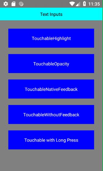
render() { return ( <View style={styles.container}> <View style={styles.header}> <Text>Text Inputs</Text> </View> <View style={styles.body}> <ScrollView> <TouchableHighlight onPress={this._onPressButton} underlayColor="white"> <View style={styles.button}> <Text style={styles.buttonText}>TouchableHighlight</Text> </View> </TouchableHighlight> <TouchableOpacity onPress={this._onPressButton}> <View style={styles.button}> <Text style={styles.buttonText}>TouchableOpacity</Text> </View> </TouchableOpacity> <TouchableNativeFeedback onPress={this._onPressButton} background={ Platform.OS === 'android' ? TouchableNativeFeedback.SelectableBackground() : '' }> <View style={styles.button}> <Text style={styles.buttonText}>TouchableNativeFeedback</Text> </View> </TouchableNativeFeedback> <TouchableWithoutFeedback onPress={this._onPressButton}> <View style={styles.button}> <Text style={styles.buttonText}>TouchableWithoutFeedback</Text> </View> </TouchableWithoutFeedback> <TouchableHighlight onPress={this._onPressButton} onLongPress={this._onLongPressButton} underlayColor="white"> <View style={styles.button}> <Text style={styles.buttonText}>Touchable with Long Press</Text> </View> </TouchableHighlight> </ScrollView> </View> </View> ); } }
const styles = StyleSheet.create({ container: { backgroundColor: '#FAFAFA', flex: 1, }, button: { margin: 10,
alignItems: 'center', backgroundColor: 'blue', }, buttonText: { padding: 20, color: 'white', fontSize: 14, }, body: { backgroundColor: 'grey', padding: 16, flex: 1, }, header: { alignItems: 'center', width: '100%', padding: 10, backgroundColor: 'cyan', }, });
|
Output
Subscribe For Daily Updates
-
Ruby program to add two integer numbers
-
how to create an array with Array.[](*args) in Ruby ?
-
What are the various Ruby runtimes, and how are they different?
-
Ruby program to check whether the given number is prime or not
-
Ruby program to reverse a string
-
Ruby program to check whether the given number is palindrome
-
Ruby program to print Fibonacci series
-
How to Replace array elements in Ruby?
-
Ruby program to print an array
-
Ruby program to check whether the given number is Armstrong
- What is the difference between a lambda, a block and a proc?
-
Program to Print Triangle of Numbers in Ruby
-
How to add/remove elements to Array in Ruby?
-
How to shuffle an array in Ruby?
-
Creating Array with Array.new(size, obj) in Ruby
-
Ruby program to generate random numbers
-
Ruby program to Calculate the factorial of given number
-
What are #method_missing and #send? Why are they useful?
-
How to Sort Array in Ruby?
-
How to get index of array element in Ruby
- What are some of your favorite gems? What are their alternatives?
-
How to Get Input with Gets in Ruby
-
How to create two dimensional array in ruby?
-
Reat Native Google Maps integration