Flutter Carousel - Swiper Banners
Flutter Swiper, How to create Carousel swiper in Flutter. Create Banners with Swiper. Swipe Banners Left to right and right to left.
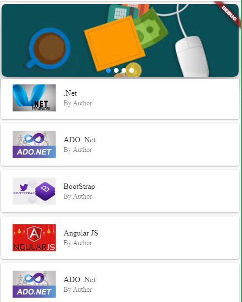
Hi Guys, Today we are going to learn how to show Carousel Banners in Flutter
Table of contents
1. Integrated flutter_swiper
2. Add Swiper3. Properties
4. Page indicator
5. Control button
6. Full code
7. Flutter run
Integrated flutter_swiper
Add flutter_swiper: ^ 1.1.6 and synchronize flutter packages get.
Add references import 'package: flutter_swiper / flutter_swiper.dart' in the corresponding .dart files
|
flutter_swiper: ^1.1.6 |
Add Swiper to widget
You can set the scrolling direction to Axis.vertical if you need to scroll vertically. Multiple layout methods, unlimited carousel, Android and IOS dual-end adaptation
|
Swiper( |
Properties
| Parameter | Defaults | Description |
| scrollDirection | Axis.horizontal | Scroll direction, set to Axis.vertical if you need to scroll vertically |
| loop | true | Unlimited carousel mode switch |
| index | 0 | Index position at the beginning |
| autoplay | false | Auto play switch |
| onIndexChanged | void onIndexChanged(int index) | Invoked when the user changes the index by manual dragging or autoplay |
| onTap | void onTap(int index) | Called when the user clicks on a carousel |
| duration | 300.0 | Animation time in milliseconds |
| pagination | null | Setting new SwiperPagination()Display default paging indicator |
| control | null | Setting new SwiperControl()Display default paging buttons |
Page indicator
Inherited from the paging indicator SwiperPlugin, SwiperPluginto Swiperprovide an additional interface. Set to new SwiperPagination()show the default tab
| Parameter | Defaults | Description | |
| alignment |
|
If you want to put the paging indicator in another position, you can modify this parameter | |
| margin | const EdgeInsets.all(10.0) | Distance between page indicator and container border | |
| builder | SwiperPagination.dots |
Now defines two default paging indicator style:
SwiperPagination.dots, , SwiperPagination.fractioncan be further customized |
Control button
Control button component is inherited from SwiperPlugin, is set new SwiperControl()to show the default controls
| Parameter | Defaults | Description |
| iconPrevious | Icons.arrow_back_ios | IconData on the previous page |
| iconNext | Icons.arrow_forward_ios | IconData on the next page |
| color | Theme.of(context).primaryColor | Control button color |
| size | 30.0 | Control button size |
Full code
import 'package:flutter/material.dart';
import 'package:flutter_swiper/flutter_swiper.dart';

import 'cource_data.dart';

void main() => runApp(MyApp());

class MyApp extends StatelessWidget {
  // This widget is the root of your application.
  @override
  Widget build(BuildContext context) {
    return MaterialApp(
      title: 'Flutter Demo',

      home: Carasole(),
    );
  }
}
class Carasole extends StatelessWidget{
  ListdataList=CourceData.getList();
  ListdataBanners=CourceData.getBanners();
  SwiperController _swiperController=SwiperController();

  @override
  Widget build(BuildContext context) {
    // TODO: implement build
    return SafeArea(

      child: Scaffold(
        backgroundColor: Color.fromARGB(0, 1, 221, 245),
        body: Column(
          children: [
            Card(
              elevation: 10,margin: EdgeInsets.all(5),
              shape: RoundedRectangleBorder
(borderRadius: BorderRadius.circular(10.0)),

              child: Container(
                height: 180,
                child: Swiper(
                  itemWidth: 250,
                  controller: _swiperController,
                  outer: false,
                  itemBuilder: (c, i) {
                    if(dataBanners!=null){
                      return Container(
                        child: Image.asset(dataBanners[i].img,fit: BoxFit.cover,
height: 120,),
                      );
                    }
                  },
                  pagination:
                  new SwiperPagination(builder: DotSwiperPaginationBuilder(
activeColor: Colors.pink,size: 5,activeSize: 8,
color: Colors.grey),
                      margin: new EdgeInsets.all(5.0)),
                  itemCount: dataBanners == null ? 0 : dataBanners.length,
                  layout: SwiperLayout.STACK,
                ),
              ),
            ),
            Expanded(
              child: ListView.builder(
                itemCount: dataList.length,
                  itemBuilder: (ctx,index){
                return Card(
                  child: Padding(
                    padding: const EdgeInsets.all(8.0),
                    child: ListTile(
                        title: Text(dataList[index].name),
                        subtitle: Text("By Author"),
                        leading:Image.asset(dataList[index].img)
                    ),
                  ),
                );
              }),
            )
          ],
        ),
      ),
    );
  }


}
|
Flutter run