Flutter Create Custom Reusable Widget
Flutter Create reusable widgets. In Any application we require to design some buttons which may similar themes, for that we can create single widget then reuse them in multiple pages.
Flutter is all about widgets and everything is a widget in Flutter So, In today's tutorial, we will see how we can build a custom widget in Flutter.
Building custom widgets can reduce boilerplate code and the same widget can be used in different places which makes our application lighter.
Let's Start
Step 1: Create a new Flutter Application.
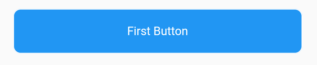
Step 2: Now for this tutorial, we will be building a custom button widget as buttons are used everywhere in mobile apps. So, inside our body first, create a button using Container and different widgets for example
|
Container( margin: const EdgeInsets.symmetric(horizontal: 20), decoration: BoxDecoration( color: Colors.blue, border: Border.all(color: Colors.white), borderRadius: BorderRadius.circular(borderRadius ?? 0)), child: Material( color: Colors.transparent, child: InkWell( onTap: (){}, child: Container( padding: const EdgeInsets.all(20), child: Center( child: Text( 'first button', style: TextStyle( color: Colors.white, fontSize: 16, fontWeight: FontWeight.w400), ), ), ), ), ), ); |
 |
Step 3: Once you have your button widget Right-Click on the top-level Container/widget and choose Extract as Widget Option, when you click on it you will be asked to name it, and once done you will have a new stateless widget created.
Now Declare Variables that you want to change and add it the constructor
|
CustomButton({ required this.onTap, this.borderRadius, this.buttonColor, this.textColor, this.borderColor, required this.buttonText, Key? key, }) : super(key: key);
VoidCallback onTap; Color? buttonColor; double? borderRadius; Color? textColor; String buttonText; Color? borderColor; |
Now you can use these properties in your custom button to change the look and behavior of the button for example:
|
import 'package:flutter/material.dart';
class CustomButton extends StatelessWidget { CustomButton({ required this.onTap, this.borderRadius, this.buttonColor, this.textColor, this.borderColor, required this.buttonText, Key? key, }) : super(key: key);
VoidCallback onTap; Color? buttonColor; double? borderRadius; Color? textColor; String buttonText; Color? borderColor;
@override Widget build(BuildContext context) { return Container( margin: const EdgeInsets.symmetric(horizontal: 20), decoration: BoxDecoration( color: buttonColor ?? Colors.white, border: Border.all(color: borderColor ?? Colors.white), borderRadius: BorderRadius.circular(borderRadius ?? 0)), child: Material( color: Colors.transparent, child: InkWell( onTap: onTap, child: Container( padding: const EdgeInsets.all(20), child: Center( child: Text( buttonText, style: TextStyle( color: textColor, fontSize: 16, fontWeight: FontWeight.w400), ), ), ), ), ), ); } }
|
Step 4: Now we can use this Widget as a custom button widget where we want a button in our application. Simply call the CustomWidget and give the properties that you want for example:
|
CustomButton( onTap: () {}, buttonText: 'New Button', textColor: Colors.white, borderRadius: 10, buttonColor: Colors.black, borderColor: Colors.white, ), |
Complete Source Code to create custom reusable widget in flutter
|
import 'package:flutter/cupertino.dart'; import 'package:flutter/material.dart'; import 'package:flutter_custom_widget_demo/widget/custom_button.dart';
class DemoApp extends StatelessWidget { const DemoApp({Key? key}) : super(key: key);
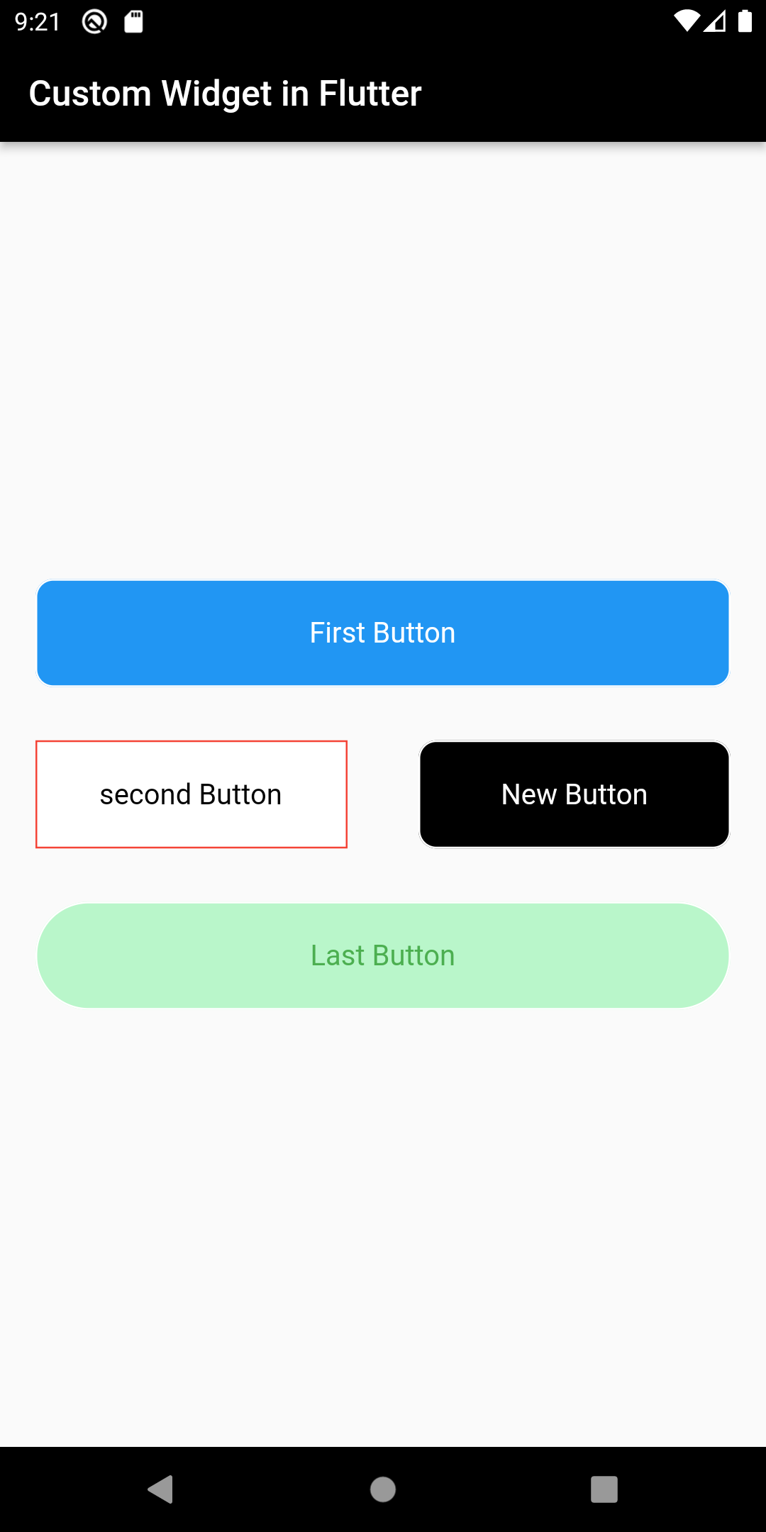
@override Widget build(BuildContext context) { return Scaffold( appBar: AppBar( backgroundColor: Colors.black, title: const Text('Custom Widget in Flutter'), ), body: Column( mainAxisAlignment: MainAxisAlignment.center, children: [ CustomButton( onTap: () {}, buttonText: 'First Button', buttonColor: Colors.blue, textColor: Colors.white, borderRadius: 10, ), const SizedBox( height: 30, ), Row( children: [ Expanded( child: CustomButton( onTap: () {}, buttonText: 'second Button', textColor: Colors.black, borderRadius: 0, borderColor: Colors.red, ), ), Expanded( child: CustomButton( onTap: () {}, buttonText: 'New Button', textColor: Colors.white, borderRadius: 10, buttonColor: Colors.black, borderColor: Colors.white, ), ) ], ), const SizedBox( height: 30, ), CustomButton( onTap: () {}, buttonText: 'Last Button', textColor: Colors.green, buttonColor: Colors.greenAccent.shade100, borderRadius: 30, ) ], ), ); } }
|
Output:
 |
Conclusion: In this way, we have learned how we can create a custom reusable widget in Flutter.