Flutter - Dashboard App | RRTutors
Simple Flutter Dashboard UI| Create a clean Flutter dashboard UI with GridView. Learn step-by-step design techniques for dashboards on rrtutors.com.
Hellow guys, Today we are going to create simple dashboard app with flutter.
Widgets used in the application :
MaterialApp
Scaffold
Stack
CustomPaint
GridView
Card
InkWell
Let's look into code.
Create a class ShapesPainter wich extends from CustomPainter.
Which will create Traingle shape with given height and width.
class ShapesPainter extends CustomPainter {
  @override
  void paint(Canvas canvas, Size size) {
    final paint = Paint();
    // set the paint color to be white
    paint.color = Colors.white;
    // Create a rectangle with size and width same as the canvas
    var rect = Rect.fromLTWH(0, 0, size.width, size.height);
    // draw the rectangle using the paint
    canvas.drawRect(rect, paint);
    paint.color = Colors.greenAccent[400];
    // create a path
    var path = Path();
    path.lineTo(0, size.height);
    path.lineTo(size.width, 0);
    // close the path to form a bounded shape
    path.close();
    canvas.drawPath(path, paint);
   /* // set the color property of the paint
    paint.color = Colors.deepOrange;
    // center of the canvas is (x,y) => (width/2, height/2)
    var center = Offset(size.width / 2, size.height / 2);
    // draw the circle with center having radius 75.0
    canvas.drawCircle(center, 75.0, paint);*/
  }
  @override
  bool shouldRepaint(CustomPainter oldDelegate) => false;
}
|
Now Let's create GrideView items
Widget createGridItem(int position)
  {
    var color=Colors.white;
    var icondata=Icons.add;

    switch(position)
    {

      case 0:
        color=Colors.cyan;
        icondata=Icons.map;
        break;
      case 1:
        color=Colors.deepPurple;

        icondata=Icons.add_location;
        break;
      case 2:
        color=Colors.orange[300];
        icondata=Icons.library_books;
        break;
      case 3:
        color=Colors.pinkAccent;
        icondata=Icons.access_time;
        break;
      case 4:
        color=Colors.teal[900];
        icondata=Icons.add_shopping_cart;
        break;
      case 5:
        color=Colors.green[600];
        icondata=Icons.list;
        break;
    }


   return Builder(builder: (context)
   {
     return Padding(
       padding: const EdgeInsets.only(left:10.0,right: 10,bottom: 5,top: 5),
       child: Card(
         elevation: 10,
         color: color,
         shape: RoundedRectangleBorder(
             borderRadius: BorderRadius.all(Radius.circular(10)),
             side: BorderSide(
                 color: Colors.white
             ),

         ),
         child: InkWell(
           onTap: () {
             Scaffold.of(context).showSnackBar(
                 SnackBar(content: Text("Selected Item $position"))
             );
           },
           child: Center(
             child: Column(
               mainAxisSize: MainAxisSize.min,
               children: [
                 Icon(icondata,size:40,
                 color: Colors.white,),
                 Padding(
                   padding: const EdgeInsets.all(8.0),
                   child: Text("Add",style: TextStyle(color: Colors.white),),
                 )
               ],
             ),
           ),
         ),
       ),
     );;
   }
   );

  }
}
|
Here i have created a function which will returns the Widget with Card and Icons.
For OnClick event i have used InkWell widget .
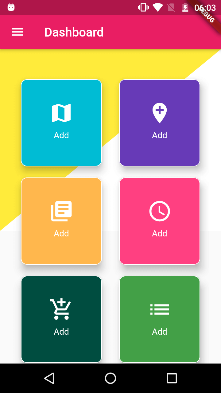
Now create DashBord widget which will looks like below
class DashBoard extends StatelessWidget {
  Size size;

  @override
  Widget build(BuildContext context) {
    size = MediaQuery.of(context).size;
    return MaterialApp(
      title: 'Flutter Demo',
      theme: ThemeData(
        primarySwatch: Colors.blue,
      ),
      home: Scaffold(
        appBar: AppBar(
          backgroundColor: Colors.pink,
          leading: Icon(Icons.menu),
          title: Text(
            "Dashboard",
            textAlign: TextAlign.center,
          ),
        ),
        body: Stack(
          children: [
            Container(
              child: CustomPaint(
                painter: ShapesPainter(),
                child: Container(
                  height: size.height / 2,
                ),
              ),
            ),
            Container(
              margin: EdgeInsets.only(top: 40),
              child: Padding(
                padding: const EdgeInsets.only(left: 20, right: 20),
                child: GridView.count(
                  crossAxisCount: 2,
                  children: [
                    createGridItem(0),
                    createGridItem(1),
                    createGridItem(2),
                    createGridItem(3),
                    createGridItem(4),
                    createGridItem(5),
                  ],
                ),
              ),
            )
          ],
        ),
      ),
    );
  }
|
Now just run the app, you will get the design like above Image.
Check the complet code at my github account rrtutors
Flutter SQFlite CRUD operions example