Responsive Carousel Slider Bootstrap 5 Example
Create responsive carousel slider with Bootstrap 5, featuring touch swipe navigation and full mobile support for seamless product and video display - RRTutors.
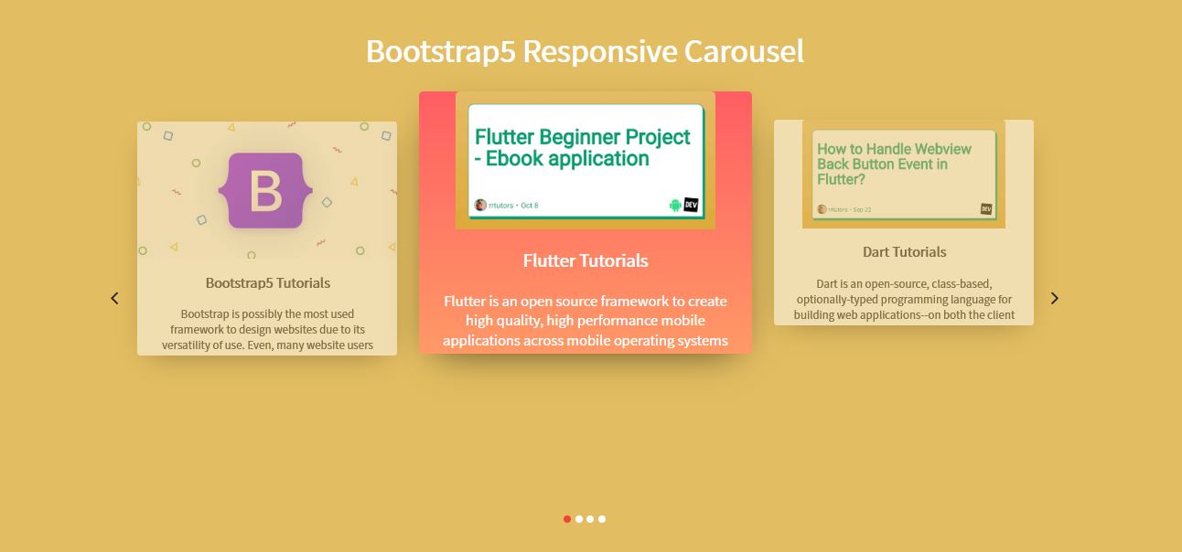
In this bootstrap5 example we will create a simple responsive carousel slider with bootstrap5. This Responsive Carousel Slider is fully highly customizable and Carousel Slider. We can use this carousel to display products on our website, YouTube or Vimeo videos which will help to display video galleries on our web pages.
This simple Responsive carousel slider consist this features like
- Fully Customizable
- Touch swipes navigation
- Infinity loop to slides navigation
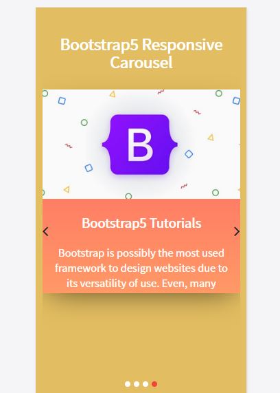
- Fully Responsive
- Mobile Supported
Let's see the code for Carousel Slider with bootstrap5
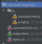
We have this below folder structure for this bootstrap sample
 |
 |
index.html file code
<!doctype html> <html> <head> <meta charset="utf-8"> <title>Responsive Carousel | Free Download</title> <meta content="width=device-width, initial-scale=1, maximum-scale=1, user-scalable=no" name="viewport"> <link href="https://cdn.jsdelivr.net/npm/bootstrap@5.0.2/dist/css/bootstrap.min.css" rel="stylesheet"> <link rel="stylesheet" href="https://cdnjs.cloudflare.com/ajax/libs/font-awesome/4.7.0/css/font-awesome.min.css"> <link rel="stylesheet" type="text/css" href="carousel.min.css"> <link rel="stylesheet" type="text/css" href="style.css"> </head> <body> <section id="slider" class="pt-5"> <div class="container"> <h1 class="text-center"><b>Bootstrap5 Responsive Carousel</b></h1> <div class="slider"> <div class="owl-carousel"> <div class="slider-card"> <div class="d-flex justify-content-center align-items-center mb-4"> <a href="https://rrtutors.com/language/Flutter"><img src="https://encrypted-tbn0.gstatic.com/images?q=tbn:ANd9GcRVLok3wTCoxYK-3iA8jKctAxS3yB0RnaZKeA&usqp=CAU" alt="" ></a> </div> <h5 class="mb-0 text-center"><b>Flutter Tutorials</b></h5> <p class="text-center p-4"> Flutter is an open source framework to create high quality, high performance mobile applications across mobile operating systems </p> </div> <div class="slider-card"> <div class="d-flex justify-content-center align-items-center mb-4"> <a href="https://rrtutors.com/Dart"> <img src="https://encrypted-tbn0.gstatic.com/images?q=tbn:ANd9GcTbeoD7R8t-VfbljVCnxD6gZe0pCl2xFVQeXg&usqp=CAU" alt="" > </a></div> <h5 class="mb-0 text-center"><b>Dart Tutorials</b></h5> <p class="text-center p-4"> Dart is an open-source, class-based, optionally-typed programming language for building web applications--on both the client and server--created by Google.\ </p> </div> <div class="slider-card"> <div class="d-flex justify-content-center align-items-center mb-4"> <a href="https://rrtutors.com/c/"><img src="https://rrtutors.com/uploads/langpostimg/c-bms.png" alt="" ></a> </div> <h5 class="mb-0 text-center"><b>C Projects Tutorials</b></h5> <p class="text-center p-4"> Programming is exciting and interesting if you have the right logic. As technology moves forward, you must get familiarized with the coding part. C language is suitable for system programming, it was invented by Dennis Ritchie</p> </div> <div class="slider-card"> <div class="d-flex justify-content-center align-items-center mb-4"> <a href="https://rrtutors.com/bootstrap5"><img src="https://rrtutors.com/uploads/langpostimg/bootstrap-logo.JPG" alt="" > </a></div> <h5 class="mb-0 text-center"><b>Bootstrap5 Tutorials</b></h5> <p class="text-center p-4"> Bootstrap is possibly the most used framework to design websites due to its versatility of use. Even, many website users have already replaced the CSS and JS of Bootstrap 5 obtaining </p> </div> </div> </div> </div> </section> <script src="https://code.jquery.com/jquery-3.2.1.min.js"></script> <script src="https://cdn.jsdelivr.net/npm/@popperjs/core@2.9.2/dist/umd/popper.min.js" ></script> <script src="https://cdn.jsdelivr.net/npm/bootstrap@5.0.2/dist/js/bootstrap.min.js" ></script> <script src="js/carousel.min.js"></script> <script src="js/script.js"></script> </body> </html> |
style.css
@import url('https://fonts.googleapis.com/css2?family=Noto+Sans+HK&display=swap'); html { scroll-behavior: smooth; } body { font-family: 'Noto Sans HK', sans-serif; background: #e3bd61; } .slider { margin-bottom: 30px; position: relative; } h1{ color: #FFF;} .slider .owl-item.active.center .slider-card { transform: scale(1.15); opacity: 1; background: #ff9966; /* fallback for old browsers */ background: -webkit-linear-gradient(to bottom, #ff5e62, #ff9966); /* Chrome 10-25, Safari 5.1-6 */ background: linear-gradient(to bottom, #ff5e62, #ff9966); /* W3C, IE 10+/ Edge, Firefox 16+, Chrome 26+, Opera 12+, Safari 7+ */ color: #fff; } .slider-card { background: #fff; padding: 0px 0px; margin: 50px 15px 90px 15px; border-radius: 5px; box-shadow: 0 15px 45px -20px rgb(0 0 0 / 73%); transform: scale(0.9); opacity: 0.5; transition: all 0.3s; } .slider-card img { border-radius: 5px 5px 0px 0px; } .owl-nav .owl-prev { position: absolute; top: calc(50% - 25px); left: 0; opacity: 1; font-size: 30px !important; z-index: 1; } .owl-nav .owl-next { position: absolute; top: calc(50% - 25px); right: 0; opacity: 1; font-size: 30px !important; z-index: 1; } .owl-dots { text-align: center; } .owl-dots .owl-dot { height: 10px; width: 10px; border-radius: 10px; background: #fff !important; margin-left: 3px; margin-right: 3px; outline: none; } .owl-dots .owl-dot.active { background: #f44336 !important; } .text-center{ overflow: hidden; text-overflow: ellipsis; display: -webkit-box; /* fallback */ max-height: 100px; /* fallback */ -webkit-line-clamp: 4; /* number of lines to show */ -webkit-box-orient: vertical; } |
script.js
// Owlcarousel $(document).ready(function(){ $(".owl-carousel").owlCarousel({ loop:true, margin:10, nav:true, autoplay:true, autoplayTimeout:3000, autoplayHoverPause:true, center: true, navText: [ "<i class='fa fa-angle-left'></i>", "<i class='fa fa-angle-right'></i>" ], responsive:{ 0:{ items:1 }, 600:{ items:1 }, 1000:{ items:3 } } }); }); |
 |
Conclusion: In this bootstrap5 tutorial we created responsive highly customizable carousel slider with infinite loop navigate slides.