Flutter Text and Text Style Tutorial
TextIt is used to display simple style text, it contains some properties to control the text display style, a simple example is as follows.
Text("Hello world",
     textAlign: TextAlign.left,
   );

   Text("Hello world! Here RRTutors. "*4,
   maxLines: 1,
   overflow: TextOverflow.ellipsis,
 );

  Text("Hello world",
  textScaleFactor: 1.5,
);
|
textAlign: The alignment of the text; we can choose left alignment, right alignment or centering. Note that the frame of reference for alignment is the Text widget itself. Although the center alignment is specified in this example, because the width of the text content is less than one line, and the width of the text is equal to the length of the text content, it is meaningless to specify the alignment at this time. This property is only specified when the width of the text is greater than the length of the text content only makes sense. Below we specify a longer string
|
 |
After running the above code the output will be like below
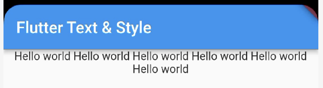
If the string content exceeds one line, the Text width is equal to the screen width, and the second line of text will be displayed in the center.
maxLines,overflow: Specifies the maximum number of lines displayed by the text. By default, the text is automatically wrapped. If this parameter is specified, the text will not exceed the specified line at most. If there is extra text, you can useoverflowto specify the truncation method. The default is direct truncation. The truncation method specified in this exampleTextOverflow.ellipsiswill truncate the excess text and then represent it with an ellipsis "..."; for other truncation methods of TextOverflow, please refer to SDK documentation.textScaleFactor: Represents the zoom factor of the text relative to the current font size , which is a shortcut to adjust the font size relative to setting the stylestyleattribute of the text.fontSizeThe default value of this property can beMediaQueryData.textScaleFactorobtained by , if notMediaQuery, then the default value will be 1.0
TextStyle
TextStyleIt is used to specify the style of text display such as color, font, thickness, background, etc. Let's look at an example
Text("Hello Text Widget",
  style: TextStyle(
      color: Colors.white,
      fontSize: 18.0,
      height: 1.2,
      fontFamily: "Courier",
      background: Paint()..color=Colors.red,
      decoration:TextDecoration.underline,
      decorationStyle: TextDecorationStyle.dashed
  ),
)
|
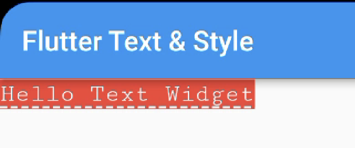 |
This example only shows some properties of TextStyle, and it has some other properties. The property names are basically self-explanatory, so I won't go into details here. Readers can refer to the SDK documentation. It is worth noting that:
-
height: This attribute is used to specify the row height, but it is not an absolute value, but a factor, and the specific row height is equal tofontSize*height. -
fontFamily: Since different platforms support different font sets by default, you must test on different platforms before manually specifying fonts. -
fontSize: Both this property and Text'stextScaleFactorare used to control the font size. But there are two main differences:fontSizeFont sizes can be specified precisely, buttextScaleFactoronly controlled by scaling.textScaleFactorIt is mainly used for global adjustment of the Flutter application font when the system font size setting is changed, but itfontSizeis usually used for a single text, and the font size will not follow the change of the system font size
TextSpan
In the above example, all the text content of Text can only be in the same style. If we need to display different parts of a Text content in different styles, then we can use TextSpanit, which represents a "fragment" of the text. Let's look at the definition of TextSpan
TextSpan({
  TextStyle style,
  Sting text,
  List<TextSpan> children,
  GestureRecognizer recognizer,
})
|
The stylea nd text attributes represent the style and content of the text fragment. children is an TextSpan array of one, that is to say TextSpan can include others TextSpan. It is recognizer used to perform gesture recognition processing on the text segment.
Text.rich(TextSpan(
    children: [
      TextSpan(
          text: "Home: "
      ),
      TextSpan(
          text: "https://rrtutors.com",
          style: TextStyle(
              color: Colors.blue
          ),
recognizer: _tapRecognizer
      ),
    ]
))
|
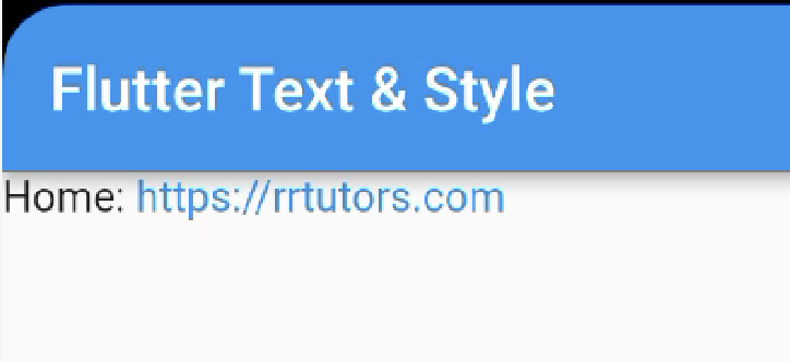 |
- In the above code, we implement a basic text fragment and a link fragment through TextSpan, and then add them to Text through the
Text.richmethod . TheTextSpanreason why this is possible is that Text is actually a wrapper of RichText, and RichText can display a variety of Styled (rich text) widget. _tapRecognizer, which is a processor after clicking a link , and we will introduce more about gesture recognition later
DefaultTextStyle
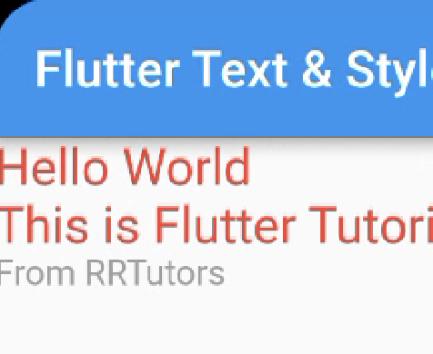
In the Widget tree, the style of the text can be inherited by default (the subclass text class component can use the default style set by the parent in the Widget tree when no specific style is specified), so if you set at a node in the Widget tree A default text style, then all text in the subtree of this node will use this style by default, and DefaultTextStyle it is used to set the default text style. Let's look at an example:
In the above code, we first set a default text style, that is, the font is 20 pixels (logical pixels), and the color is red. Then it is DefaultTextStyle set to the Column node of the subtree, so that all descendants of Column Text will inherit this style by default, unless the Text display specifies not to inherit the style, as in Note 2 in the code. The example operation effect is shown in below
 |
Fonts - How to add Custom fonts to Flutter Text
Different fonts can be used in Flutter applications. For example, we may use custom fonts created by designers, or other third-party fonts such as Google Fonts font in . This section describes how to configure fonts for your Flutter app and use them when rendering text.
Using fonts in Flutter is done in two steps. Declare them in the first pubspec.yaml to ensure they will be packaged into the application. then pass TextStyle property to use font.
#1. Declare in asset
To package a font file into an application, like any other resource, it must first pubspec.yaml be declared in . Then copy the font files to pubspec.yaml the location specified in, like
flutter:
  fonts:
    - family: Raleway
      fonts:
        - asset: assets/fonts/Raleway-Regular.ttf
        - asset: assets/fonts/Raleway-Medium.ttf
          weight: 500
        - asset: assets/fonts/Raleway-SemiBold.ttf
          weight: 600
    - family: AbrilFatface
      fonts:
        - asset: assets/fonts/abrilfatface/AbrilFatface-Regular.ttf
|
Use fonts
textStyle = const TextStyle(
    fontFamily: 'Raleway',
  )


  var buttonText = const Text(
  "Use the font for this text",
  style: textStyle,
);
|
Fonts in Package
To use a font defined in a Package, an argument must be provided package . For example, assume the font declaration above is in a my_packagepackage. Then the process of creating TextStyle is as follows:
const textStyle = const TextStyle( fontFamily: 'Raleway', package: 'my_package', ); |
If a package uses its own defined font inside the package, it should also specify package parameters when creating text styles, as shown in the above example.
A package can also just provide font files without declaring them in pubspec.yaml. These files should be placed in the package's lib/folder. Font files are not automatically bundled into applications, and applications can selectively use these fonts when declaring them. Suppose there is a font file in a package named my_package
lib/fonts/Raleway-Medium.ttf |
An application can then declare a font, as shown in the following example:
flutter:
  fonts:
    - family: Raleway
      fonts:
        - asset: assets/fonts/Raleway-Regular.ttf
        - asset: packages/my_package/fonts/Raleway-Medium.ttf
          weight: 500
|
lib/is implicit, so it should not be included in the asset path.
In this case, since the font is defined locally by the application, it is not necessary to specify package parameters when creating the TextStyle
const textStyle = const TextStyle( fontFamily: 'Raleway', ); |