Flutter Custom Buttons - How to Create Custom Buttons in Flutter?
Create custom buttons in Flutter with ease. Learn how to design and implement fully customized widgets in Flutter with this step-by-step guide on rrtutors.com.
In this post we will learn about how to create Customized Buttons in Flutter. As we all knows that Flutter is Cross Plaform development framework. So this Custom Widget will works for both Android and Ios
Sime times we may require to create Custom Button with Loading Indicator, to show the loading progress
Let's get started
Step 1: Create new Flutter Project
Step 2: Now we will create a custom class called custom_button.dart which will have the custom button code.
This Custom Class contain a constructor
CustomButton({@required this.onPressed});final GestureTapCallback onPressed; |
To handle the tap events we will use the GestureTapCallback
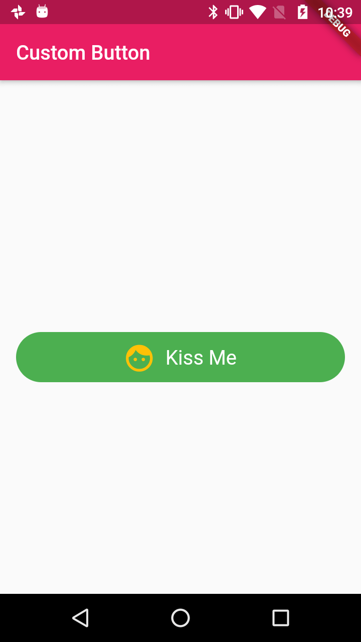
After that we will create a Row widget with adding childs Text and Icon
Text(
                      "Kiss Me",
                      maxLines: 1,
                      style: TextStyle(color: Colors.white,fontSize: 20),
                    ),
|
Complete Custom Button Example code is here
void main() => runApp(MyApp());

class MyApp extends StatelessWidget{
  @override
  Widget build(BuildContext context) {
    // TODO: implement build
    return MaterialApp(
      home: CustomButton(),
    );
  }

}
class CustomButton extends StatelessWidget {
@override
Widget build(BuildContext context) {
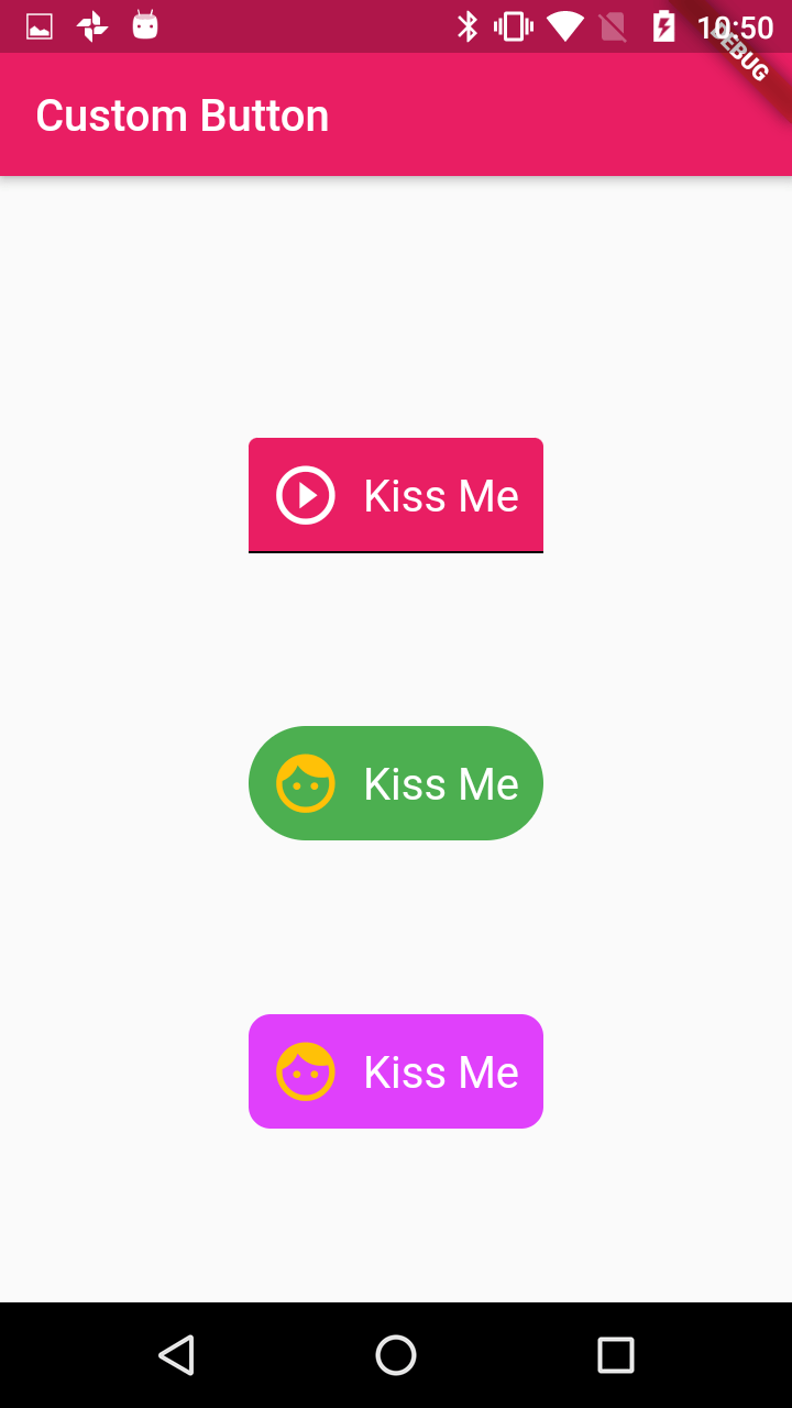
return Scaffold(appBar:AppBar(title: Text("Custom Button",),backgroundColor: Colors.pink,),body: Center(child: buildLoginButtonWidget(context)));
}
Widget buildLoginButtonWidget(context) {
return Container(
margin: EdgeInsets.only(top: 40, left: 16, right: 16),
width: MediaQuery.of(context).size.width - 32,
child: Column(
mainAxisSize: MainAxisSize.max,
crossAxisAlignment: CrossAxisAlignment.center,
mainAxisAlignment: MainAxisAlignment.spaceEvenly,
children: [
RawMaterialButton(
fillColor: Colors.pink,
splashColor: Colors.purple,
child: Padding(
padding: EdgeInsets.all(10.0),
child: Row(
mainAxisSize: MainAxisSize.min,
children: const [
Icon(
Icons.play_circle_outline,
color: Colors.white,
size: 32,
),
SizedBox(
width: 10.0,
),
Text(
"Kiss Me",
maxLines: 1,
style: TextStyle(color: Colors.white,fontSize: 20),
),
],
),
),
shape: const UnderlineInputBorder(),
),
RawMaterialButton(
fillColor: Colors.green,
splashColor: Colors.greenAccent,
child: Padding(
padding: EdgeInsets.all(10.0),
child: Row(
mainAxisSize: MainAxisSize.min,
children: const [
Icon(
Icons.face,
color: Colors.amber,
size: 32,
),
SizedBox(
width: 10.0,
),
Text(
"Kiss Me",
maxLines: 1,
style: TextStyle(color: Colors.white,fontSize: 20),
),
],
),
),
shape: const StadiumBorder(),
),
RawMaterialButton(
fillColor: Colors.purpleAccent,
splashColor: Colors.lightGreen,
child: Padding(
padding: EdgeInsets.all(10.0),
child: Row(
mainAxisSize: MainAxisSize.min,
children: const [
Icon(
Icons.face,
color: Colors.amber,
size: 32,
),
SizedBox(
width: 10.0,
),
Text(
"Kiss Me",
maxLines: 1,
style: TextStyle(color: Colors.white,fontSize: 20),
),
],
),
),
shape: RoundedRectangleBorder(
borderRadius: BorderRadius.circular(10)
),
),
],
));
}
}
|
Other Flutter Examples