How do i create an Accordian with css bootstrap
Create an accordian we will use the bootstrap5 accordian class. we can open, collapse items by collapse property
In this bootstrap5 example we will create an accordian using accordion classes. Accordion is one of the components in Bootstrap5, it’s preferred as a better UX technique to increase user attraction. Usually, developers prefer the component to display only the required content that the user wants to know. Rest for more detailed information, the user can expand that particular collapsible section
In this example to create an accordian we will include bootstrap5 css and js files inside our html file
To create first add a div with " accordion" claass
<div class="accordion" id="accordionExample"> </div> |
Now to add child items inside the div create other div and add class as
<div class="accordion-item"> </div> |
Now add header to accordian item
<div class="accordion-item">
<h2 class="accordion-header" id="headingOne">
  <button class="accordion-button" type="button" data-bs-toggle="collapse" data-bs-target="#collapseOne" aria-expanded="true" aria-controls="collapseOne">
    Accordion Item #1
  </button>
</h2>
</div>
|
Now open file in browser it will show show an accordian with Header, till now we didn't added any items to accordian. Let's add child items to accordin
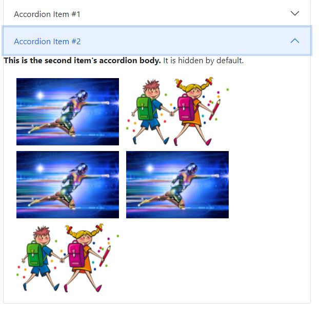
Here we are adding the multiple images inside the child item
<div id="collapseOne" class="accordion-collapse collapse show" aria-labelledby="headingOne" data-bs-parent="#accordionExample"> <h2>Accordian Item 1 default collapse mode</h2> <div class="accordion-body"> <img width="200" style="margin:5px;" src="https://cdn.pixabay.com/photo/2014/11/16/23/39/superhero-534120_960_720.jpg"/> <img width="200" style="margin:5px;" src="https://cdn.pixabay.com/photo/2013/07/13/12/43/kids-160168_960_720.png"/> <img width="200" style="margin:5px;" src="https://cdn.pixabay.com/photo/2014/11/16/23/39/superhero-534120_960_720.jpg"/> <img width="200" style="margin:5px;" src="https://cdn.pixabay.com/photo/2014/11/16/23/39/superhero-534120_960_720.jpg"/> <img width="200" style="margin:5px;" src="https://cdn.pixabay.com/photo/2013/07/13/12/43/kids-160168_960_720.png"/> </div> </div> |
 |
Here we added child items witht the class name accordion-collapse collapse show, that means it alway collapse the accordian and display the child items.
If we want to close the accordian just remove the show from the class class="accordion-collapse collapse".
To remove the default color from the accordian we will use the class accordion-flush .
<div class="accordion accordion-flush " id="accordionExample"> |
How do i open all items from accordian when other header opens?
To do this we just need to remove data-bs-parent="" the class attribute from the accordian-collapse.
Simple accordian example code
<html lang = "en"> <head> <!-- Meta tags --> <meta charset = "utf-8"> <meta name = "viewport" content = "width = device-width, initial-scale = 1, shrink-to-fit = no"> <!-- Bootstrap CSS --> <link href="https://cdn.jsdelivr.net/npm/bootstrap@5.0.2/dist/css/bootstrap.min.css" rel="stylesheet" integrity="sha384-EVSTQN3/azprG1Anm3QDgpJLIm9Nao0Yz1ztcQTwFspd3yD65VohhpuuCOmLASjC" crossorigin="anonymous"> <title>Bootstrap 5 Alert Example</title> </head> <body > <div style=" display: flex; align-items: center; justify-content: center;"> <div style="width:600px;"> <div class="accordion accordion-flush " id="accordionExample"> <div class="accordion-item"> <h2 class="accordion-header" id="headingOne"> <button class="accordion-button" type="button" data-bs-toggle="collapse" data-bs-target="#collapseOne" aria-expanded="true" aria-controls="collapseOne"> Accordion Item #1 </button> </h2> <div id="collapseOne" class="accordion-collapse collapse show" aria-labelledby="headingOne" data-bs-parent="#accordionExample"> <h2>Accordian Item 1 default collapse mode</h2> <div class="accordion-body"> <img width="200" style="margin:5px;" src="https://cdn.pixabay.com/photo/2014/11/16/23/39/superhero-534120_960_720.jpg"/> <img width="200" style="margin:5px;" src="https://cdn.pixabay.com/photo/2013/07/13/12/43/kids-160168_960_720.png"/> <img width="200" style="margin:5px;" src="https://cdn.pixabay.com/photo/2014/11/16/23/39/superhero-534120_960_720.jpg"/> <img width="200" style="margin:5px;" src="https://cdn.pixabay.com/photo/2014/11/16/23/39/superhero-534120_960_720.jpg"/> <img width="200" style="margin:5px;" src="https://cdn.pixabay.com/photo/2013/07/13/12/43/kids-160168_960_720.png"/> </div> </div> </div> <div class="accordion-item"> <h2 class="accordion-header" id="headingTwo"> <button class="accordion-button collapsed" type="button" data-bs-toggle="collapse" data-bs-target="#collapseTwo" aria-expanded="false" aria-controls="collapseTwo"> Accordion Item #2 </button> </h2> <div id="collapseTwo" class="accordion-collapse collapse" aria-labelledby="headingTwo" data-bs-parent="#accordionExample"> <strong>This is the second item's accordion body.</strong> It is hidden by default. <div class="accordion-body"> <img width="200" style="margin:5px;" src="https://cdn.pixabay.com/photo/2014/11/16/23/39/superhero-534120_960_720.jpg"/> <img width="200" style="margin:5px;" src="https://cdn.pixabay.com/photo/2013/07/13/12/43/kids-160168_960_720.png"/> <img width="200" style="margin:5px;" src="https://cdn.pixabay.com/photo/2014/11/16/23/39/superhero-534120_960_720.jpg"/> <img width="200" style="margin:5px;" src="https://cdn.pixabay.com/photo/2014/11/16/23/39/superhero-534120_960_720.jpg"/> <img width="200" style="margin:5px;" src="https://cdn.pixabay.com/photo/2013/07/13/12/43/kids-160168_960_720.png"/> </div> </div> </div> </div> </div> </div> <!-- jQuery first, then Popper.js, then Bootstrap JS --> <script src="https://cdn.jsdelivr.net/npm/bootstrap@5.0.2/dist/js/bootstrap.bundle.min.js" integrity="sha384-MrcW6ZMFYlzcLA8Nl+NtUVF0sA7MsXsP1UyJoMp4YLEuNSfAP+JcXn/tWtIaxVXM" crossorigin="anonymous"></script> </body> </html> |
Conclusion: Accordion works via applying the collapse functionality that turns it collapsible internally. To provide accordion so that users can expand, we need to add.