Create Buttons in Bootstrap5: RRutors Guide
Explore Bootstrap 5 button styles, including outline, active/disabled states, and button tags. Get a complete styling guide now on rrtutors.com.
In this bootstrap5 example tutorial we will cover what is button and how to create button with Bootstrap5. As we all know that bootstrap5 is the major change for bootstrap with adding more features compare to the previous versions. Buttons are the clickable component when tap on it, will execute some functionality. Bootstrap provided predefined button classes to make great user experience on the screen.
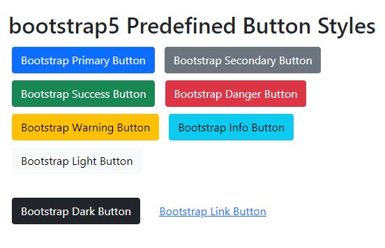
These are the few predefined butto classes
- btn-primary
- btn-secondary
- btn-success
- btn-danger
- btn-warning
- btn-info
- btn-light
- btn-dark
- btn-link
Let's create a simple buttons with predefined bootstrap button classes
<!DOCTYPE html> <html lang="en"> <head> <meta charset="UTF-8"> <title>Title</title> </head> <body> <html lang = "en"> <head> <!-- Meta tags --> <meta charset = "utf-8"> <meta name = "viewport" content = "width = device-width, initial-scale = 1, shrink-to-fit = no"> <!-- Bootstrap CSS --> <link href="https://cdn.jsdelivr.net/npm/bootstrap@5.0.2/dist/css/bootstrap.min.css" rel="stylesheet" integrity="sha384-EVSTQN3/azprG1Anm3QDgpJLIm9Nao0Yz1ztcQTwFspd3yD65VohhpuuCOmLASjC" crossorigin="anonymous"> <title>Bootstrap 5 Button Example</title> <style> .btn{ margin:5px;} </style> </head> <body style="padding:20px;"> <div style=" display: flex; align-items: center; justify-content: center;"> <div style="width:600px;"> <div class="container"> <h2>bootstrap5 Predefined Button Styles</h2> <button type = "button" class = "btn btn-primary">Bootstrap Primary Button</button> <button type = "button" class = "btn btn-secondary">Bootstrap Secondary Button</button> <button type = "button" class = "btn btn-success">Bootstrap Success Button</button> <button type = "button" class = "btn btn-danger">Bootstrap Danger Button</button> <button type = "button" class = "btn btn-warning">Bootstrap Warning Button</button> <button type = "button" class = "btn btn-info">Bootstrap Info Button</button> <button type = "button" class = "btn btn-light">Bootstrap Light Button</button><br><br> <button type = "button" class = "btn btn-dark">Bootstrap Dark Button</button> <button type = "button" class = "btn btn-link">Bootstrap Link Button</button> </div> <!-- jQuery first, then Popper.js, then Bootstrap JS --> <script src="https://cdn.jsdelivr.net/npm/bootstrap@5.0.2/dist/js/bootstrap.bundle.min.js" integrity="sha384-MrcW6ZMFYlzcLA8Nl+NtUVF0sA7MsXsP1UyJoMp4YLEuNSfAP+JcXn/tWtIaxVXM" crossorigin="anonymous"></script> </div></div> </body> </html> </body> </html> |
 |
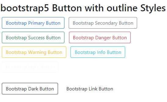
How to create outline buttons in bootstrap
In the above example we created filled buttons, let's create button with outline by adding the class btn-outline
<!DOCTYPE html> <html lang="en"> <head> <meta charset="UTF-8"> <title>Title</title> </head> <body> <html lang = "en"> <head> <!-- Meta tags --> <meta charset = "utf-8"> <meta name = "viewport" content = "width = device-width, initial-scale = 1, shrink-to-fit = no"> <!-- Bootstrap CSS --> <link href="https://cdn.jsdelivr.net/npm/bootstrap@5.0.2/dist/css/bootstrap.min.css" rel="stylesheet" integrity="sha384-EVSTQN3/azprG1Anm3QDgpJLIm9Nao0Yz1ztcQTwFspd3yD65VohhpuuCOmLASjC" crossorigin="anonymous"> <title>Bootstrap 5 Button Example</title> <style> .btn{ margin:5px;} </style> </head> <body style="padding:20px;"> <div style=" display: flex; align-items: center; justify-content: center;"> <div style="width:600px;"> <div class="container"> <h2>bootstrap5 Button with outline Styles</h2> <button type = "button" class = "btn btn-outline-primary">Bootstrap Primary Button</button> <button type = "button" class = "btn btn-outline-secondary">Bootstrap Secondary Button</button> <button type = "button" class = "btn btn-outline-success">Bootstrap Success Button</button> <button type = "button" class = "btn btn-outline-danger">Bootstrap Danger Button</button> <button type = "button" class = "btn btn-outline-warning">Bootstrap Warning Button</button> <button type = "button" class = "btn btn-outline-info">Bootstrap Info Button</button> <button type = "button" class = "btn btn-outline-light">Bootstrap Light Button</button><br><br> <button type = "button" class = "btn btn-outline-dark">Bootstrap Dark Button</button> <button type = "button" class = "btn btn-outline-link">Bootstrap Link Button</button> </div> <!-- jQuery first, then Popper.js, then Bootstrap JS --> <script src="https://cdn.jsdelivr.net/npm/bootstrap@5.0.2/dist/js/bootstrap.bundle.min.js" integrity="sha384-MrcW6ZMFYlzcLA8Nl+NtUVF0sA7MsXsP1UyJoMp4YLEuNSfAP+JcXn/tWtIaxVXM" crossorigin="anonymous"></script> </div></div> </body> </html> </body> </html> |
 |
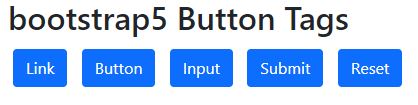
Button tags
Create button with different tags, in bootstrap5 we have different types of tags for button to handle different functionality like button act as a tag, but act as form submit...
Let's see simple example with different button tags
<!DOCTYPE html> <html lang="en"> <head> <meta charset="UTF-8"> <title>Title</title> </head> <body> <html lang = "en"> <head> <!-- Meta tags --> <meta charset = "utf-8"> <meta name = "viewport" content = "width = device-width, initial-scale = 1, shrink-to-fit = no"> <!-- Bootstrap CSS --> <link href="https://cdn.jsdelivr.net/npm/bootstrap@5.0.2/dist/css/bootstrap.min.css" rel="stylesheet" integrity="sha384-EVSTQN3/azprG1Anm3QDgpJLIm9Nao0Yz1ztcQTwFspd3yD65VohhpuuCOmLASjC" crossorigin="anonymous"> <title>Bootstrap 5 Button Example</title> <style> .btn{ margin:5px;} </style> </head> <body style="padding:20px;"> <div style=" display: flex; align-items: center; justify-content: center;"> <div style="width:600px;"> <div class="container"> <h2>bootstrap5 Button Tags</h2> <a class="btn btn-primary" href="#" role="button">Link</a> <button class="btn btn-primary" type="submit">Button</button> <input class="btn btn-primary" type="button" value="Input"> <input class="btn btn-primary" type="submit" value="Submit"> <input class="btn btn-primary" type="reset" value="Reset"> </div> <!-- jQuery first, then Popper.js, then Bootstrap JS --> <script src="https://cdn.jsdelivr.net/npm/bootstrap@5.0.2/dist/js/bootstrap.bundle.min.js" integrity="sha384-MrcW6ZMFYlzcLA8Nl+NtUVF0sA7MsXsP1UyJoMp4YLEuNSfAP+JcXn/tWtIaxVXM" crossorigin="anonymous"></script> </div></div> </body> </html> </body> </html> |
 |
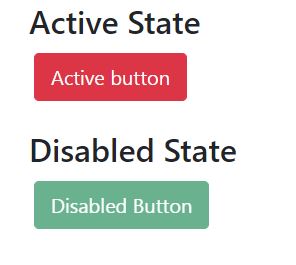
How do we make button active or inactive
To make button active or disable mode we will use active , disabled classes on the button
<!DOCTYPE html> <html lang="en"> <head> <meta charset="UTF-8"> <title>Title</title> </head> <body> <html lang = "en"> <head> <!-- Meta tags --> <meta charset = "utf-8"> <meta name = "viewport" content = "width = device-width, initial-scale = 1, shrink-to-fit = no"> <!-- Bootstrap CSS --> <link href="https://cdn.jsdelivr.net/npm/bootstrap@5.0.2/dist/css/bootstrap.min.css" rel="stylesheet" integrity="sha384-EVSTQN3/azprG1Anm3QDgpJLIm9Nao0Yz1ztcQTwFspd3yD65VohhpuuCOmLASjC" crossorigin="anonymous"> <title>Bootstrap 5 Button Example</title> <style> .btn{ margin:5px;} </style> </head> <body style="padding:20px;"> <div style=" display: flex; align-items: center; justify-content: center;"> <div style="width:600px;"> <div class="container"> <h2>Active State</h2> <button type = "button" class = "btn btn-lg btn-danger" active> Active button </button> <br> <br> <h2>Disabled State</h2> <button type = "button" class = "btn btn-success btn-lg" disabled> Disabled Button </button> </div> <!-- jQuery first, then Popper.js, then Bootstrap JS --> <script src="https://cdn.jsdelivr.net/npm/bootstrap@5.0.2/dist/js/bootstrap.bundle.min.js" integrity="sha384-MrcW6ZMFYlzcLA8Nl+NtUVF0sA7MsXsP1UyJoMp4YLEuNSfAP+JcXn/tWtIaxVXM" crossorigin="anonymous"></script> </div></div> </body> </html> </body> </html> |
 |
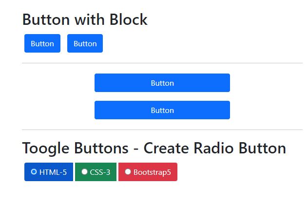
How to create Radio buttons in bootstrap
Below example code will show how to create radio buttons
<!DOCTYPE html> <html lang="en"> <head> <meta charset="UTF-8"> <title>Title</title> </head> <body> <html lang = "en"> <head> <!-- Meta tags --> <meta charset = "utf-8"> <meta name = "viewport" content = "width = device-width, initial-scale = 1, shrink-to-fit = no"> <!-- Bootstrap CSS --> <link href="https://cdn.jsdelivr.net/npm/bootstrap@5.0.2/dist/css/bootstrap.min.css" rel="stylesheet" integrity="sha384-EVSTQN3/azprG1Anm3QDgpJLIm9Nao0Yz1ztcQTwFspd3yD65VohhpuuCOmLASjC" crossorigin="anonymous"> <title>Bootstrap 5 Button Example</title> <style> .btn{ margin:5px;} </style> </head> <body style="padding:20px;"> <div style=" display: flex; align-items: center; justify-content: center;"> <div style="width:600px;"> <div class="container"> <h2>Button with Block</h2> <div class="d-grid gap-2 d-md-block"> <button class="btn btn-primary" type="button">Button</button> <button class="btn btn-primary" type="button">Button</button> </div> <hr> <div class="d-grid gap-2 col-6 mx-auto"> <button class="btn btn-primary" type="button">Button</button> <button class="btn btn-primary" type="button">Button</button> </div> <hr> <h2>Toogle Buttons - Create Radio Button</h2> <div class = "btn-group btn-group-toggle" data-toggle = "buttons"> <label class = "btn btn-primary active"> <input type = "radio" name = "options" id = "option1" autocomplete = "off" checked> HTML-5 </label> <label class = "btn btn-success"> <input type = "radio" name = "options" id = "option2" autocomplete = "off"> CSS-3 </label> <label class = "btn btn-danger"> <input type = "radio" name = "options" id = "option3" autocomplete = "off"> Bootstrap5 </label> </div> </div> <!-- jQuery first, then Popper.js, then Bootstrap JS --> <script src="https://cdn.jsdelivr.net/npm/bootstrap@5.0.2/dist/js/bootstrap.bundle.min.js" integrity="sha384-MrcW6ZMFYlzcLA8Nl+NtUVF0sA7MsXsP1UyJoMp4YLEuNSfAP+JcXn/tWtIaxVXM" crossorigin="anonymous"></script> </div></div> </body> </html> </body> </html> |
 |
Conclusion: In this bootstrap5 example tutorials we covered what is button , how to create different buttons with bootstrap and create radio buttons and active/disable buttons