How do i create Responsive Navigation Menu with Bootstrap5
Upload images from a Flutter app to Firebase Storage on Android and iOS. Learn secure and efficient file handling with this tutorial on rrtutors.com.
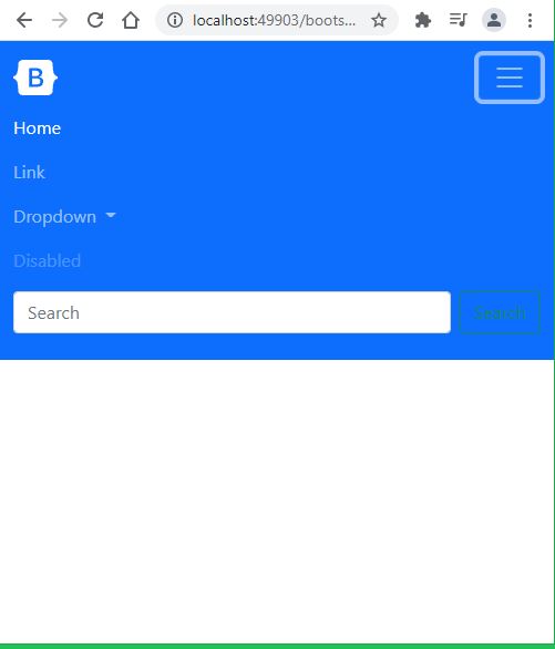
In this Bootstrap5 tutorial example we will create simple responsive navigation bar with bootstrap5. With the following code we can implement a basic bootstrap navigation menu which will work for as responsive layout on all screen sizes.
Let's get started
Read how to setup bootstrap5
To create responsive navigation we will use class="navbar" class
Let's check the complete code
<html lang = "en"> <head> <!-- Meta tags --> <meta charset = "utf-8"> <meta name = "viewport" content = "width = device-width, initial-scale = 1, shrink-to-fit = no"> <!-- Bootstrap CSS --> <link href="https://cdn.jsdelivr.net/npm/bootstrap@5.0.2/dist/css/bootstrap.min.css" rel="stylesheet" integrity="sha384-EVSTQN3/azprG1Anm3QDgpJLIm9Nao0Yz1ztcQTwFspd3yD65VohhpuuCOmLASjC" crossorigin="anonymous"> <title>Bootstrap 5 Responsive navigation bar</title> </head> <body> <nav class="navbar navbar-expand-lg navbar-dark bg-primary"> <div class="container-fluid"> <a class="navbar-brand" href="#"> <svg xmlns="http://www.w3.org/2000/svg" width="40" height="32" class="d-block my-1" viewBox="0 0 118 94" role="img"><title>Bootstrap</title><path fill-rule="evenodd" clip-rule="evenodd" d="M24.509 0c-6.733 0-11.715 5.893-11.492 12.284.214 6.14-.064 14.092-2.066 20.577C8.943 39.365 5.547 43.485 0 44.014v5.972c5.547.529 8.943 4.649 10.951 11.153 2.002 6.485 2.28 14.437 2.066 20.577C12.794 88.106 17.776 94 24.51 94H93.5c6.733 0 11.714-5.893 11.491-12.284-.214-6.14.064-14.092 2.066-20.577 2.009-6.504 5.396-10.624 10.943-11.153v-5.972c-5.547-.529-8.934-4.649-10.943-11.153-2.002-6.484-2.28-14.437-2.066-20.577C105.214 5.894 100.233 0 93.5 0H24.508zM80 57.863C80 66.663 73.436 72 62.543 72H44a2 2 0 01-2-2V24a2 2 0 012-2h18.437c9.083 0 15.044 4.92 15.044 12.474 0 5.302-4.01 10.049-9.119 10.88v.277C75.317 46.394 80 51.21 80 57.863zM60.521 28.34H49.948v14.934h8.905c6.884 0 10.68-2.772 10.68-7.727 0-4.643-3.264-7.207-9.012-7.207zM49.948 49.2v16.458H60.91c7.167 0 10.964-2.876 10.964-8.281 0-5.406-3.903-8.178-11.425-8.178H49.948z" fill="currentColor"></path></svg> </a> <button class="navbar-toggler" type="button" data-bs-toggle="collapse" data-bs-target="#navbarSupportedContent" aria-controls="navbarSupportedContent" aria-expanded="false" aria-label="Toggle navigation"> <span class="navbar-toggler-icon"></span> </button> <div class="collapse navbar-collapse" id="navbarSupportedContent"> <ul class="navbar-nav me-auto mb-2 mb-lg-0"> <li class="nav-item"> <a class="nav-link active" aria-current="page" href="#" >Home</a> </li> <li class="nav-item"> <a class="nav-link" href="#">Link</a> </li> <li class="nav-item dropdown"> <a class="nav-link dropdown-toggle" href="#" id="navbarDropdown" role="button" data-bs-toggle="dropdown" aria-expanded="false"> Dropdown </a> <ul class="dropdown-menu" aria-labelledby="navbarDropdown"> <li><a class="dropdown-item" href="#">Action 1</a></li> <li><a class="dropdown-item" href="#">Action 2</a></li> <li><hr class="dropdown-divider"></li> <li><a class="dropdown-item" href="#">Action 3</a></li> </ul> </li> <li class="nav-item"> <a class="nav-link disabled" href="#" tabindex="-1" aria-disabled="true">Disabled</a> </li> </ul> <form class="d-flex"> <input class="form-control me-2" type="search" placeholder="Search" aria-label="Search"> <button class="btn btn-outline-success" type="submit">Search</button> </form> </div> </div> </nav> <!-- jQuery first, then Popper.js, then Bootstrap JS --> <script src="https://cdn.jsdelivr.net/npm/bootstrap@5.0.2/dist/js/bootstrap.bundle.min.js" integrity="sha384-MrcW6ZMFYlzcLA8Nl+NtUVF0sA7MsXsP1UyJoMp4YLEuNSfAP+JcXn/tWtIaxVXM" crossorigin="anonymous"></script> </body> </html> |
After open this file in any browser we will see the below out for both mobile and desktop screens
 |
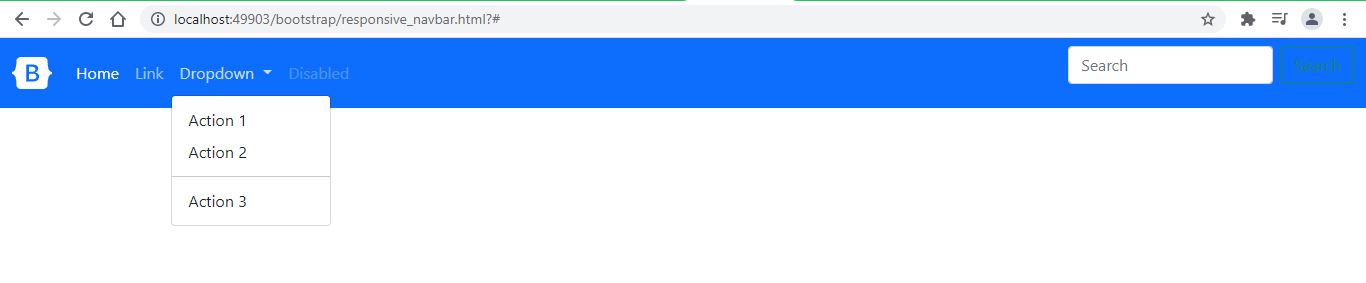 |
Conclusion: In this bootstrap5 tutorial we created simple responsive navigationbar with different menu items like action buttons, dropdown buttons, link items...