In this Jetpack compose tutorial we will learn how to show create Card with Jetpack Compose in Android application.
Card is the equivalent of a CardView in Compose
Let's get started
Step 1: Create android application in android studio
Step 2: Follow step for setup Jetpack Compose with Android Studio
Step 3: When it comes to displaying a Card composable, we can do so by using the provided composable function, along with the minimal required arguments.
A simple example looks like:
@Composable()
fun CardDemo() {
Card {
Text("Welcome to jet pack compose card tutorial")
}
}
|
Lets add some padding so in the content of the card
|
Card(
modifier = Modifier
.fillMaxWidth()
.padding(16.dp),
content = {
Text("Card with content and modifier arguments", modifier = Modifier.padding(16.dp))
}
)
|
Styling The Card
The card compsable have some arguments which can be used to control the look and feel of the card ,lets try them one by one.
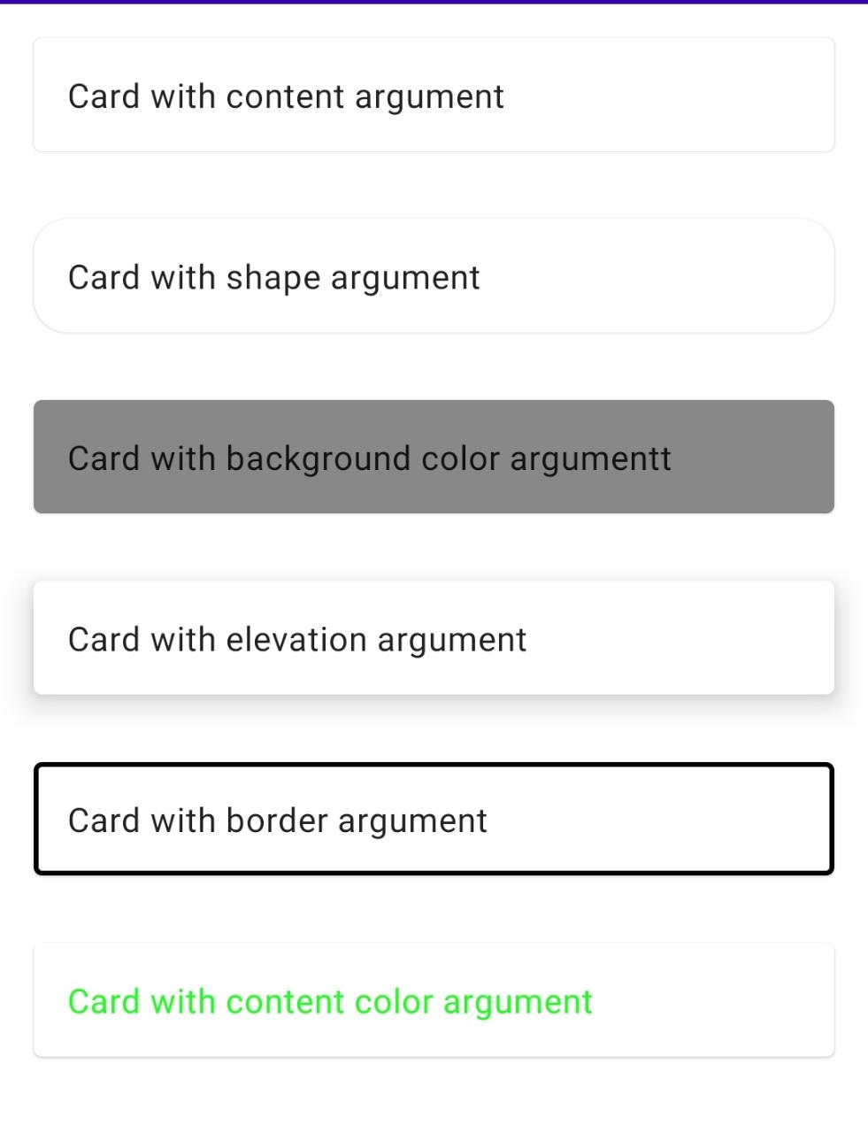
set shape of the card
Defines the card's shape as well its shadow. A shadow is only displayed if the elevation is greater than zero.
We can set the shape of the card by using the shape argument
|
Card(
modifier = Modifier
.fillMaxWidth()
.padding(16.dp),
//set shape of the card
shape = RoundedCornerShape(16.dp),
content = {
Text("Card with shape argument", modifier = Modifier.padding(16.dp))
}
)
|
set background color for the card
We can set the color of the card by using the backgroundColor argument
|
Card(
modifier = Modifier
.fillMaxWidth()
.padding(16.dp),
//set background color of the card
backgroundColor = Color.Gray,
content = {
Text("Card with background color argumentt", modifier = Modifier.padding(16.dp))
}
)
|
set elevation for the card
The z-coordinate at which to place this card. This controls the size of the shadow below the card.
|
Card(
modifier = Modifier
.fillMaxWidth()
.padding(16.dp),
//set elevation of the card
elevation = 10.dp,
content = {
Text("Card with elevation argument", modifier = Modifier.padding(16.dp))
}
)
|
set border for the card
We can add a border to the card by using the border argument and providing a dp value.
|
Card(
modifier = Modifier
.fillMaxWidth()
.padding(16.dp),
border = BorderStroke(2.dp, Color.Black),
content = {
Text("Card with border argument", modifier = Modifier.padding(16.dp))
}
)
|
set content color of the card
The preferred content color provided by this card to its children. Defaults to either the matching content color for backgroundColor, or if backgroundColor is not a color from the theme, this will keep the same value set above this card.
|
Card(
modifier = Modifier
.fillMaxWidth()
.padding(16.dp),
contentColor = Color.Green,
content = {
Text("Card with content color argument", modifier = Modifier.padding(16.dp))
}
)
|
Full code
|
package com.example.jetpack.widget
import androidx.compose.foundation.BorderStroke
import androidx.compose.foundation.layout.Column
import androidx.compose.foundation.layout.fillMaxSize
import androidx.compose.foundation.layout.fillMaxWidth
import androidx.compose.foundation.layout.padding
import androidx.compose.foundation.shape.RoundedCornerShape
import androidx.compose.material.Card
import androidx.compose.material.Text
import androidx.compose.runtime.Composable
import androidx.compose.ui.Modifier
import androidx.compose.ui.graphics.Color
import androidx.compose.ui.unit.dp
@Composable()
fun CardDemo() {
Column(
modifier = Modifier.fillMaxSize(),
) {
Card(
modifier = Modifier
.fillMaxWidth()
.padding(16.dp),
content = {
Text("Card with content argument", modifier = Modifier.padding(16.dp))
}
)
Card(
modifier = Modifier
.fillMaxWidth()
.padding(16.dp),
//set shape of the card
shape = RoundedCornerShape(16.dp),
content = {
Text("Card with shape argument", modifier = Modifier.padding(16.dp))
}
)
Card(
modifier = Modifier
.fillMaxWidth()
.padding(16.dp),
//set background color of the card
backgroundColor = Color.Gray,
content = {
Text("Card with background color argumentt", modifier = Modifier.padding(16.dp))
}
)
Card(
modifier = Modifier
.fillMaxWidth()
.padding(16.dp),
//set elevation of the card
elevation = 10.dp,
content = {
Text("Card with elevation argument", modifier = Modifier.padding(16.dp))
}
)
Card(
modifier = Modifier
.fillMaxWidth()
.padding(16.dp),
border = BorderStroke(2.dp, Color.Black),
content = {
Text("Card with border argument", modifier = Modifier.padding(16.dp))
}
)
Card(
modifier = Modifier
.fillMaxWidth()
.padding(16.dp),
contentColor = Color.Green,
content = {
Text("Card with content color argument", modifier = Modifier.padding(16.dp))
}
)
}
}
|
Image
Conclusion: In this compose tutorial we covered how to create a card and how to set color for card