How to create bottom navigation with Jetpack compose?
Get a step-by-step tutorial on Jetpack Compose Bottom NavigationBar example with RRTutors. Master the process of creating navigation in Jetpack Compose apps.
In this Jetpack compose tutorial we will learn How to create bottom navigation in Android application using Jetpack Compose.
Bottom navigation allow user to switch between different screen very easily.
To create a bottom navigation we are going to use Scaffold. Scaffold basically provides API that will combine different material components to make our layout.
Let's get started
Step 1: Create android application in android studio
Step 2: Follow step for setup Jetpack Compose with Android Studio
Lets add simple example of Scaffold with bottom app bar
JetPackTheme(
    darkTheme = true,
) {
    Scaffold(
        modifier = Modifier.fillMaxSize(),
        content = {
            //here we are going to show each screen layout
        },
        bottomBar = {
           //here we are going to add bottom app bar
        }
    )
}
|
We are going to display 3 menu basically Home, Contacts and Settings
val bottomNavigationScreens = listOf(
    BottomNavigationBarScreen.Home,
    BottomNavigationBarScreen.Contact,
    BottomNavigationBarScreen.Settings
)
|
Lets create a sealed class (where Sealed class is basically restricted class hierarchies which gives more control over inheritance)
which will contain route,title ,icon and screen to load on selecting particular menu.
sealed class BottomNavigationBarScreen(
    val route: String,
    val title: String,
    val screenToLoad: @Composable () -> Unit,
    val icon: ImageVector
) {
    object Home : BottomNavigationBarScreen("home", "Home", {
        HomeScreenForBottomNavigationBar()
    }, Icons.Default.Home)

    object Settings : BottomNavigationBarScreen("settings", "Settings", {
        SettingsScreenForBottomNavigationBar()
    }, Icons.Default.Settings)

    object Contact : BottomNavigationBarScreen("contacts", "Contacts", {
        ContactScreenForBottomNavigationBar()
    }, Icons.Default.Contacts)
}
|
Let's create 3 screens
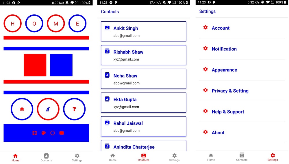
Home Screen
@Composable
fun HomeScreenForBottomNavigationBar() {
    Column(
        content = {
            Spacer(modifier = Modifier.padding(20.dp))
            Row() {
                Box(
                    content = {
                        Text(
                            text = "H",
                            fontSize = 24.sp,
                            color = Color.Red
                        )
                    }, modifier = Modifier
                        .padding(start = 16.dp)
                        .size(80.dp)
                        .border(width = 6.dp, color = Color.Red, shape = CircleShape),
                    contentAlignment = Alignment.Center
                )
                Box(
                    content = {
                        Text(
                            text = "O",
                            fontSize = 24.sp,
                            color = Color.Red
                        )
                    }, modifier = Modifier
                        .padding(start = 16.dp)
                        .size(80.dp)
                        .border(width = 6.dp, color = Color.Blue, shape = CircleShape),
                    contentAlignment = Alignment.Center
                )
                Box(
                    content = {
                        Text(
                            text = "M",
                            fontSize = 24.sp,
                            color = Color.Red
                        )
                    }, modifier = Modifier
                        .padding(start = 16.dp)
                        .size(80.dp)
                        .border(width = 6.dp, color = Color.Red, shape = CircleShape),
                    contentAlignment = Alignment.Center
                )
                Box(
                    content = {
                        Text(
                            text = "E",
                            fontSize = 24.sp,
                            color = Color.Red
                        )
                    }, modifier = Modifier
                        .padding(start = 16.dp)
                        .size(80.dp)
                        .border(width = 6.dp, color = Color.Blue, shape = CircleShape),
                    contentAlignment = Alignment.Center
                )
            }
            Box(
                content = {
                }, modifier = Modifier
                    .padding(16.dp)
                    .fillMaxWidth()
                    .height(16.dp)
                    .background(color = Color.Red)
            )
            Box(
                content = {
                }, modifier = Modifier
                    .padding(16.dp)
                    .fillMaxWidth()
                    .height(16.dp)
                    .background(color = Color.Blue)
            )
            Row(horizontalArrangement = Arrangement.Center, modifier = Modifier.fillMaxWidth()) {
                Box(
                    content = {
                    }, modifier = Modifier
                        .padding(start = 16.dp)
                        .size(100.dp)
                        .background(color = Color.Red)
                        .border(width = 0.dp, color = Color.Red, shape = RectangleShape),
                    contentAlignment = Alignment.Center
                )
                Box(
                    content = {
                    }, modifier = Modifier
                        .padding(start = 16.dp)
                        .size(100.dp)
                        .background(color = Color.Blue)
                        .border(width = 0.dp, color = Color.Blue, shape = RectangleShape),
                    contentAlignment = Alignment.Center
                )
            }

            Box(
                content = {
                }, modifier = Modifier
                    .padding(16.dp)
                    .fillMaxWidth()
                    .height(16.dp)
                    .background(color = Color.Red)
            )
            Box(
                content = {
                }, modifier = Modifier
                    .padding(16.dp)
                    .fillMaxWidth()
                    .height(16.dp)
                    .background(color = Color.Blue)
            )

            Row(horizontalArrangement = Arrangement.Center, modifier = Modifier.fillMaxWidth()) {
                Box(
                    content = {
                        Icon(Icons.Default.Home, "", tint = Color.Red)
                    }, modifier = Modifier
                        .padding(start = 16.dp)
                        .size(100.dp)
                        .border(width = 6.dp, color = Color.Blue, shape = CircleShape),
                    contentAlignment = Alignment.Center
                )
                Box(
                    content = {
                        Icon(Icons.Default.Hail, "", tint = Color.Blue)
                    }, modifier = Modifier
                        .padding(start = 16.dp)
                        .size(100.dp)
                        .border(width = 6.dp, color = Color.Red, shape = CircleShape),
                    contentAlignment = Alignment.Center
                )
                Box(
                    content = {
                        Icon(Icons.Default.Hardware, "", tint = Color.Red)
                    }, modifier = Modifier
                        .padding(start = 16.dp)
                        .size(100.dp)
                        .border(width = 6.dp, color = Color.Blue, shape = CircleShape),
                    contentAlignment = Alignment.Center
                )
            }
            Box(
                content = {
                    Row(content = {
                        Icon(
                            Icons.Default.Pages, "", tint = Color.Red, modifier = Modifier
                                .padding(start = 16.dp)
                        )
                        Icon(
                            Icons.Default.Palette, "", tint = Color.Red, modifier = Modifier
                                .padding(start = 16.dp)
                        )
                        Icon(
                            Icons.Default.PanoramaFishEye, "", tint = Color.Red, modifier = Modifier
                                .padding(start = 16.dp)
                        )
                        Icon(
                            Icons.Default.PanoramaWideAngleSelect,
                            "",
                            tint = Color.Red,
                            modifier = Modifier
                                .padding(start = 16.dp)
                        )
                    })
                }, modifier = Modifier
                    .padding(16.dp)
                    .height(80.dp)
                    .fillMaxWidth()
                    .background(color = Color.Blue),
                contentAlignment = Alignment.Center
            )
        }, modifier = Modifier
            .fillMaxSize()
    )
}
|
Contacts Screen
data class Contact(val id: String, val name: String, val emailId: String)
@Composable
fun ContactScreenForBottomNavigationBar() {
    val contacts = listOf(
        Contact(id = "1", name = "Ankit Singh", emailId = "abc@gmail.com"),
        Contact(id = "2", name = "Rishabh Shaw", emailId = "xyz@gmail.com"),
        Contact(id = "3", name = "Neha Shaw", emailId = "abc@gmail.com"),
        Contact(id = "4", name = "Ekta Gupta", emailId = "xyz@gmail.com"),
        Contact(id = "5", name = "Rahul Jaiswal", emailId = "abc@gmail.com"),
        Contact(id = "6", name = "Anindita Chatterjee", emailId = "xyz@gmail.com"),
        Contact(id = "7", name = "Aakash Raj", emailId = "abc@gmail.com"),
        Contact(id = "8", name = "Arpita Ghosh", emailId = "xyz@gmail.com"),
        Contact(id = "9", name = "Arvind Patel", emailId = "abc@gmail.com"),
        Contact(id = "10", name = "Akash Tiwari", emailId = "xyz@gmail.com")
    )
    Scaffold(
        content = {
            LazyColumn(
                contentPadding = PaddingValues(
                    bottom = 100.dp,
                    start = 16.dp,
                    end = 16.dp
                )
            ) {
                items(
                    items = contacts,
                    itemContent = {
                        ContactListItem(contact = it)
                    })
            }
        },
        topBar = {
            TopAppBar(
                title = { Text("Contacts") },
                backgroundColor = Color.White,
                contentColor = Color.Blue
            )
        },
    )
}


@Composable
fun ContactListItem(contact: Contact) {
    Card(
        modifier = Modifier
            .padding(top = 16.dp)
            .fillMaxWidth(),
        elevation = 4.dp,
        border = BorderStroke(width = 1.2.dp, Color.Blue)
    ) {
        Row(content = {
            Icon(
                Icons.Default.Contacts,
                "",
                tint = Color.Blue,
                modifier = Modifier
                    .padding(start = 16.dp, top = 16.dp)
            )
            Column(modifier = Modifier.padding(16.dp)) {
                Text(
                    text = contact.name,
                    style = TextStyle(
                        color = Color.Blue,
                        fontSize = 21.sp,
                        fontWeight = FontWeight.Bold
                    )
                )
                Text(text = contact.emailId, modifier = Modifier.padding(top = 8.dp))
            }
        })

    }

}
|
Settings Screen
data class Setting(val title: String)

@Composable
fun SettingsScreenForBottomNavigationBar() {
    val settings = listOf(
        Setting(title = "Account"),
        Setting(title = "Notification"),
        Setting(title = "Appearance"),
        Setting(title = "Privacy & Setting"),
        Setting(title = "Help & Support"),
        Setting(title = "About")
    )
    Scaffold(
        content = {
            LazyColumn(
                contentPadding = PaddingValues(
                    bottom = 100.dp,
                    start = 16.dp,
                    end = 16.dp
                )
            ) {
                items(
                    items = settings,
                    itemContent = {
                        SettingListItem(setting = it)
                    })
            }
        },
        topBar = {
            TopAppBar(
                title = { Text("Settings") },
                backgroundColor = Color.White,
                contentColor = Color.Blue
            )
        },
    )
}

@Composable
fun SettingListItem(setting: Setting) {
    Column() {
        Spacer(modifier = Modifier.padding(16.dp))
        Row(content = {
            Icon(
                Icons.Default.Settings,
                "",
                tint = Color.Red,
                modifier = Modifier
                    .padding(start = 16.dp)
            )
            Text(
                text = setting.title,
                style = TextStyle(
                    color = Color.Blue,
                    fontSize = 21.sp,
                    fontWeight = FontWeight.Bold
                ), modifier = Modifier
                    .padding(start = 16.dp)
            )
        }, modifier = Modifier.fillMaxWidth())
        Spacer(modifier = Modifier.padding(16.dp))
        Spacer(
            modifier = Modifier
                .height(height = 1.2.dp)
                .fillMaxWidth()
                .background(color = Color.Gray)
        )

    }

}
|
Add Bottom Navigation Code
@Composable
fun BottomNavigationDemo() {
    val currentScreen =
        remember { mutableStateOf(BottomNavigationBarScreen.Home) }

    JetPackTheme(
    ) {
        Scaffold(
            modifier = Modifier.fillMaxSize(),
            content = {
                currentScreen.value.screenToLoad()
            },
            bottomBar = {
                BottomNavigation(content = {
                    bottomNavigationScreens.forEach { bottomNavigationBarScreen: BottomNavigationBarScreen ->
                        BottomNavigationItem(
                            selected = currentScreen.value.route == bottomNavigationBarScreen.route,
                            label = {
                                Text(text = bottomNavigationBarScreen.title)
                            },
                            onClick = {
                                currentScreen.value = bottomNavigationBarScreen
                            },
                            icon = {
                                Icon(bottomNavigationBarScreen.icon, "")
                            },
                            selectedContentColor = Color.Red,
                            unselectedContentColor = Color.Gray
                        )
                    }
                }, backgroundColor = Color.White)
            }
        )
    }
}
|
Call BottomNavigationDemo() function from MainActivity.kt
|
package com.example.jetpack

import android.os.Bundle
import android.view.WindowManager
import androidx.activity.ComponentActivity
import androidx.activity.compose.setContent
import androidx.compose.foundation.ExperimentalFoundationApi
import androidx.compose.runtime.*
import androidx.compose.ui.tooling.preview.Preview
import com.example.jetpack.widget.BottomNavigationDemo

class MainActivity : ComponentActivity() {

    @ExperimentalFoundationApi
    override fun onCreate(savedInstanceState: Bundle?) {
        super.onCreate(savedInstanceState)
        window.setSoftInputMode(WindowManager.LayoutParams.SOFT_INPUT_ADJUST_RESIZE)
        setContent {
            BottomNavigationDemo()
        }
    }
}
|
Images
 |