Charts in Jetpack compose - Jetpack Compose Bar Chart Tutorial: Build Animated Charts with Code Examples
how to create Bar Chart using Jetpack Compose. Jetpack Compose is a cutting-edge toolkit for creating native Android user interfaces.It simplifies and accelerates UI development on Android by using minimal code, powerful tools, and explicit Kotlin APIs
Jetpack Compose has revolutionized Android UI development with its declarative approach to building user interfaces. This tutorial will guide you through building a bar chart using Jetpack Compose, a modern toolkit for crafting beautiful and responsive user interfaces in Android. We will see how to create Bar Chart using Jetpack Compose. Jetpack Compose is a cutting-edge toolkit for creating native Android user interfaces.It simplifies and accelerates UI development on Android by using minimal code, powerful tools, and explicit Kotlin APIs. Compose supports material design ideas. Many of its UI elements are built with material design in mind right out of the box.
A bar chart, also known as a bar graph, is a type of chart or graph that uses rectangular bars with heights or lengths proportional to the values they represent to display categorical data.
Animated Barchart Table of Contents
- Introduction
- Basic Bar Chart Implementation
- Adding Customization Options
- Implementing Animations
- Advanced Features
- Best Practices
- Complete Example
1. Introduction
Bar charts are essential visualization tools that help users understand and compare data. With Jetpack Compose, we can create beautiful, responsive bar charts that seamlessly integrate with modern Android applications.
2. Basic Bar Chart Implementation
Let's start with a basic implementation of a bar chart. First, we'll define our data model:
| data class BarChartData( val label: String, val value: Float, val color: Color = Color.Blue ) |
Now, let's create our basic bar chart composable:
|
@Composable data.forEachIndexed { index, item -> drawRect( |
3. Adding Customization Options
| @Composable fun CustomizableBarChart( data: List<BarChartData>, modifier: Modifier = Modifier, barWidth: Float = 40f, barSpacing: Float = 20f, maxHeight: Float = 300f, showLabels: Boolean = true, showValues: Boolean = true ) { Box( modifier = modifier .fillMaxWidth() .height(maxHeight.dp + 60.dp) ) { // Bar Chart Implementation Canvas(/* ... */) // Labels and Values Row(/* ... */) } } |
4. Implementing Animations
Adding animations makes our bar chart more engaging:
| @Composable fun AnimatedBarChart( data: List<BarChartData>, modifier: Modifier = Modifier ) { var animatedData by remember { mutableStateOf(data.map { it.copy(value = 0f) }) } LaunchedEffect(data) { animate( initialValue = 0f, targetValue = 1f, animationSpec = tween( durationMillis = 1000, easing = FastOutSlowInEasing ) ) { value, _ -> animatedData = data.map { it.copy(value = it.value * value) } } } CustomizableBarChart( data = animatedData, modifier = modifier ) } |
5. Advanced Features
5.1 Interactive Tooltips
Add tooltips to show detailed information when users tap on bars
| @Composable fun InteractiveBarChart( data: List<BarChartData>, modifier: Modifier = Modifier ) { var selectedBar by remember { mutableStateOf<Int?>(null) } Box(modifier = modifier) { CustomizableBarChart( data = data, modifier = Modifier.pointerInput(Unit) { detectTapGestures { offset -> // Calculate which bar was tapped selectedBar = calculateTappedBar(offset, data.size) } } ) // Show tooltip if a bar is selected selectedBar?.let { index -> Tooltip( data = data[index], modifier = Modifier.align(Alignment.TopCenter) ) } } } |
5.2 Gradient Bars
Enhance visual appeal with gradient colors:
| fun Canvas.drawGradientBar( startColor: Color, endColor: Color, topLeft: Offset, size: Size ) { val brush = Brush.verticalGradient( colors = listOf(startColor, endColor), startY = topLeft.y, endY = topLeft.y + size.height ) drawRect( brush = brush, topLeft = topLeft, size = size ) } |
6. Best Practices
- Performance: Use
rememberandmutableStateOfjudiciously to prevent unnecessary recompositions. - Accessibility: Include content descriptions for screen readers.
- Responsiveness: Design your chart to handle different screen sizes and orientations.
- Error Handling: Gracefully handle edge cases like empty data sets or null values
7. Complete Example
Here's a complete example implementing all the features we've discussed
|
package com.example.composeexamples
import androidx.compose.animation.core.* import androidx.compose.foundation.Canvas import androidx.compose.foundation.layout.*
import androidx.compose.material3.MaterialTheme import androidx.compose.material3.Text import androidx.compose.runtime.* import androidx.compose.ui.Alignment import androidx.compose.ui.Modifier import androidx.compose.ui.geometry.Offset import androidx.compose.ui.geometry.Size import androidx.compose.ui.graphics.Color import androidx.compose.ui.text.style.TextAlign import androidx.compose.ui.tooling.preview.Preview import androidx.compose.ui.unit.dp import androidx.compose.ui.unit.sp import kotlinx.coroutines.delay import kotlin.math.roundToInt
data class BarChartData( val label: String, val value: Float, val color: Color = Color.Blue, val description: String = "" )
data class BarChartStyle( val barWidth: Float = 40f, val barSpacing: Float = 20f, val maxHeight: Float = 300f, val showLabels: Boolean = true, val showValues: Boolean = true, val valueTextSize: Float = 12f, val labelTextSize: Float = 14f, val valueTextColor: Color = Color.Gray, val labelTextColor: Color = Color.Black, val gridLineColor: Color = Color.LightGray, val showGridLines: Boolean = true, val gridLineCount: Int = 5, val animationDuration: Int = 1000 )
@Composable fun CustomizableBarChart( data: List<BarChartData>, modifier: Modifier = Modifier, style: BarChartStyle = BarChartStyle(), animated: Boolean = true ) { if (data.isEmpty()) return
val maxValue = data.maxOf { it.value }
// Animation progress val animationProgress = remember { Animatable(0f) }
LaunchedEffect(data) { if (animated) { animationProgress.snapTo(0f) animationProgress.animateTo( targetValue = 1f, animationSpec = tween( durationMillis = style.animationDuration, easing = FastOutSlowInEasing ) ) } else { animationProgress.snapTo(1f) } }
Box( modifier = modifier .fillMaxWidth() .height(style.maxHeight.dp + 60.dp) ) { Canvas( modifier = Modifier .fillMaxWidth() .height(style.maxHeight.dp) .align(Alignment.TopCenter) ) { val availableWidth = size.width val startX = (availableWidth - (data.size * (style.barWidth + style.barSpacing)) + style.barSpacing) / 2
// Draw grid lines if (style.showGridLines) { val gridSpacing = size.height / style.gridLineCount repeat(style.gridLineCount + 1) { index -> val y = index * gridSpacing drawLine( color = style.gridLineColor, start = Offset(0f, y), end = Offset(size.width, y), strokeWidth = 1f ) } }
// Draw animated bars data.forEachIndexed { index, item -> val animatedHeight = (item.value / maxValue) * style.maxHeight * animationProgress.value val x = startX + index * (style.barWidth + style.barSpacing) val y = style.maxHeight - animatedHeight
drawRect( color = item.color, topLeft = Offset(x, y), size = Size(style.barWidth, animatedHeight) ) } }
// Labels and values with animation Row( modifier = Modifier .padding(horizontal = 16.dp) .align(Alignment.BottomCenter), horizontalArrangement = Arrangement.SpaceAround ) { data.forEach { item -> Column( horizontalAlignment = Alignment.CenterHorizontally, modifier = Modifier.width(style.barWidth.dp) ) { if (style.showValues) { val animatedValue = (item.value * animationProgress.value).roundToInt() Text( text = animatedValue.toString(), fontSize = style.valueTextSize.sp, color = style.valueTextColor, textAlign = TextAlign.Center ) } if (style.showLabels) { Text( text = item.label, fontSize = style.labelTextSize.sp, color = style.labelTextColor, textAlign = TextAlign.Center, modifier = Modifier.padding(top = 4.dp) ) } } } } } }
// Example usage with animation @Preview @Composable fun AnimatedBarChartExample() { var showData by remember { mutableStateOf(false) } val data = listOf( BarChartData("Jan", 50f, Color(0xFF2196F3)), BarChartData("Feb", 75f, Color(0xFF4CAF50)), BarChartData("Mar", 30f, Color(0xFFF44336)), BarChartData("Apr", 90f, Color(0xFF9C27B0)), BarChartData("May", 60f, Color(0xFF00BCD4)) )
val customStyle = BarChartStyle( barWidth = 50f, barSpacing = 30f, maxHeight = 450f, showGridLines = true, gridLineCount = 4, valueTextSize = 14f, labelTextSize = 16f, valueTextColor = Color.DarkGray, gridLineColor = Color.LightGray.copy(alpha = 0.5f), animationDuration = 5000 // 1 second animation )
Column( modifier = Modifier .fillMaxWidth() .padding(16.dp) ) { Text( text = "Monthly Sales", style = MaterialTheme.typography.headlineSmall, modifier = Modifier.padding(bottom = 16.dp) )
// LaunchedEffect to trigger animation after a delay LaunchedEffect(Unit) { delay(200) // Small delay before starting animation showData = true }
if (showData) { CustomizableBarChart( data = data, style = customStyle, modifier = Modifier .fillMaxWidth() .height(250.dp), animated = true ) } } }
// Screen implementation with animation @Preview @Composable fun AnimatedBarChartScreen() { Column( modifier = Modifier .fillMaxSize() .padding(16.dp) ) { Text( text = "Sales Dashboard", style = MaterialTheme.typography.headlineSmall, modifier = Modifier.padding(bottom = 24.dp) )
AnimatedBarChartExample()
Text( text = "Chart shows monthly sales performance", style = MaterialTheme.typography.labelSmall, modifier = Modifier.padding(top = 16.dp) ) } }
|
Jetpack compose Bar Chart Example 2
Step 1. Create a new Project in Android Studio.
|
File > New > New Project > Select (Empty Compose Activity) > Next > Enter Name (BarChartJetpack) > FINISH. |
After creating the new project, Android Studio starts Gradle and builds your project, which may take a few seconds.
Step 2. At first, Open MainActivity.kt file
First we will create a composable function of BarChart() in which we use Canvas for display bar chart where we define point list, animate the graph, draw lines, rectangle and so on..
|
@Composable val context = LocalContext.current Canvas( for (p in point) { |
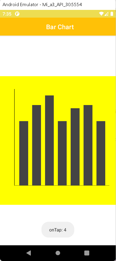
Now we will create a private function identifyClickItem() which will help to get position by clicking on chart whether its a no.(1,2,3...) or -1.
|
private fun getPositionFromAngle( |
Finally we will call our BarChart() function inside onCreate() function, we will use scaffold and TopAppBar for display the title in action bar.
|
class MainActivity : ComponentActivity() { |
Complete example code create Bar chart using Jetpack Compose
|
import android.graphics.Point class MainActivity : ComponentActivity() { private fun identifyCLickItem( @Composable val context = LocalContext.current Canvas( for (p in point) { |
Step 3. Add the following colors to your Color.kt file
import androidx.compose.ui.graphics.Color
|
val Purple200 = Color(0xFFBB86FC) |
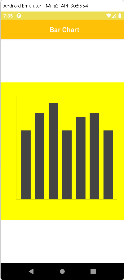
Step 4. Run the app in your emulator or real device and you will get the following output:
OUTPUT
 |
Tap on Bar
 |
Conclusion: In this article we have covered how to create Bar Chart using JetPack Compose.
Jetpack compose Chart Examples