How to create Jetpack compose textfield
Master Android Jetpack Compose TextField to allow users to enter and modify text, with features like placeholder text and text change events - RRTutors.
In this Jetpack compose tutorial we will learn how to create Textfield in Android application. TextField widely used for text input which can be created with a lot of style. Thanks to this tool, users will be able to write text in your app, for example, to fill out a form, use the search engine to carry out a specific search, messaging applications, among other options. If you want to customize the text field so that the user has a better experience when browsing your application, what you should do is very simple, you only have to set the color of the text background in case you want to change it. Also, you will have the option to choose a contrast color for the cursor in very simple step . This is the equivalent to EditText from the Android View system.
Different types of textfield
- Filled
- Outlined
Let's get started
Step 1: Create android application in android studio
Step 2: Follow step for setup Jetpack Compose with Android Studio
Step 3: Add Text Field in MainActivity.kt
A simple example looks like:
@Composable
fun TextFieldDemo() {
    Column(Modifier.padding(16.dp)) {
        val textState = remember { mutableStateOf(TextFieldValue()) }
        TextField(
            value = textState.value,
            onValueChange = { textState.value = it }
        )
    }
}
|
Handle changes to a TextField
In some cases, it’s useful to get the value of a textfield every time the text in a text field changes. For example, you might want to build a search screen with autocomplete functionality where you want to update the results as the user types.Here is an example how you can do it with Compose:
@Composable
fun TextFieldDemo() {
Column(Modifier.padding(16.dp)) {
val textState = remember { mutableStateOf(TextFieldValue()) }
TextField(
value = textState.value,
onValueChange = { textState.value = it }
)
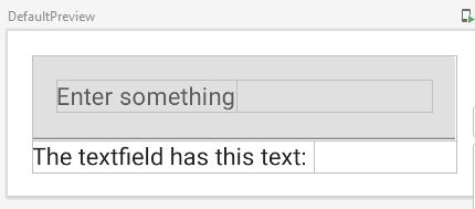
Text("The textfield has this text: " + textState.value.text)
}
}
|
The simplest approach is to supply an onValueChange() callback to a BaseTextField. Whenever the text changes, the callback is invoked.In this example, every time the TextField changes, the new text value will be saved in a state and set to the TextField and the Text.
Set place holder in TextField
TextField(
    // below line is used to get
    // value of text field,
    value = textState.value,
    // below line is used to get value in text field
    // on value change in text field.
    onValueChange = { textState.value = it },
    // below line is used to add placeholder
    // for our text field.
    placeholder = {
        Text(text = "Enter something")
    },
)
|
keyboard Options
keyboard Options is used to add capitalization in the data which is entered by user in text field, we can also specify auto correction option in this. We can specify the type of keyboard which we have to display such as (phone, text) and to display actions which can be performed from the keyboard itself.
TextField(
    // below line is used to get
    // value of text field,
    value = textState.value,
    // below line is used to get value in text field
    // on value change in text field.
    onValueChange = { textState.value = it },
    keyboardOptions = KeyboardOptions(
        // keyboard options is used to modify
        // the keyboard for text field.
        keyboardType = KeyboardType.Text,
        // below line is use for capitalization
        // inside our text field.
        capitalization = KeyboardCapitalization.Words,
        // below line is to enable auto
        // correct in our keyboard.
        autoCorrect = false
    ),
    // modifier is use to add padding
    // to our text field.
    modifier = Modifier
        .padding(all = 8.dp)
        .fillMaxWidth(),
)
|
textStyle
to add styling to the text entered by user. It is used to add font family, font size and styling to our text.
TextField(
    // below line is used to get
    // value of text field,
    value = textState.value,
    // below line is used to get value in text field
    // on value change in text field.
    onValueChange = { textState.value = it },

    // below line is use to give
    // max lines for our text field.
    maxLines = 4,
    // single line boolean is use to avoid
    // textfield entering in multiple lines.
    singleLine = false,
    textStyle = TextStyle(
        color = Color.Black,

        // below line is used to add font
        // below line is use to change font family.
        fontFamily = FontFamily.SansSerif
    ),
)
|
leading Icon
This method is use to add leading icon to our text input field. With this method we can also specify color(tint) for our icon.
TextField(
    value = textState.value,
    onValueChange = { textState.value = it },
    label = {
        Text(text = "Text Field With Leading Icon")
    },
    // leading icon is use to add icon
    // at the start of text field.
    leadingIcon = {
        // In this method we are specifying
        // our leading icon and its color.
        Icon(
            imageVector = Icons.Default.Email,
            contentDescription = "image",
            tint = Color.Blue
        )
    },
)
|
 |
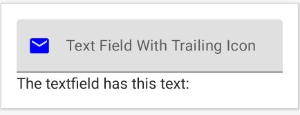
trailing Icon
This method is use to add trailing icon to our text input field. With this method we can also specify color(tint) for our icon.
TextField(
    value = textState.value,
    onValueChange = { textState.value = it },
    label = {
        Text(text = "Text Field With Trailing Icon")
    },
    //trailing icon is use to add icon
    // at the end of text field.
    trailingIcon = {
        // In this method we are specifying
        // our leading icon and its color.
        Icon(
            imageVector = Icons.Default.Email,
            contentDescription = "image",
            tint = Color.Blue
        )
    },
)
|
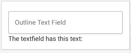
Outline text field example
val textState = remember { mutableStateOf(TextFieldValue()) }
OutlinedTextField(
    value = textState.value,
    onValueChange = {
        textState.value = it
    },
    label = {
        Text(text = "Outline Text Field")
    },
)
|
To handle the error input state, use isError parameter:
var text by rememberSaveable { mutableStateOf("") }
var isError by rememberSaveable { mutableStateOf(false) }

fun validate(text: String) {
    isError = text.count() < 5
}
TextField(
    value = text,
    onValueChange =
    {
        text = it
        isError = false

    },
    singleLine = true,
    label =
    { Text(if (isError) "Email*" else "Email") },
    isError = isError,
    keyboardActions = KeyboardActions
    { validate(text) },
    modifier = Modifier.semantics
    {
        // Provide localized description of the error
        if (isError) error("Email format is invalid.")
    }
)
|
Password Text Field example
val passwordState = remember { mutableStateOf(TextFieldValue()) }
val passwordVisibility = remember { mutableStateOf(true) }
OutlinedTextField(
    value = passwordState.value,
    onValueChange = {
        passwordState.value = it
    },
    label = {
        Text(text = "Password Text Field")
    },
    trailingIcon = {
        IconButton(onClick = {
            passwordVisibility.value = !passwordVisibility.value
        }) {
            Icon(
                imageVector = if (passwordVisibility.value) Icons.Default.VisibilityOff else Icons.Default.Visibility,
                contentDescription = "visibility",
                tint = Color.Blue
            )
        }
    },
    visualTransformation = if (passwordVisibility.value) PasswordVisualTransformation() else VisualTransformation.None
)
|
 |
Full Code:
import android.os.Bundle
import androidx.activity.ComponentActivity
import androidx.activity.compose.setContent
import androidx.compose.foundation.layout.*
import androidx.compose.foundation.text.KeyboardOptions
import androidx.compose.material.*
import androidx.compose.material.icons.Icons
import androidx.compose.material.icons.filled.Email
import androidx.compose.material.icons.filled.Visibility
import androidx.compose.material.icons.filled.VisibilityOff
import androidx.compose.runtime.Composable
import androidx.compose.runtime.mutableStateOf
import androidx.compose.runtime.remember
import androidx.compose.ui.Modifier
import androidx.compose.ui.graphics.Color
import androidx.compose.ui.text.TextStyle
import androidx.compose.ui.text.font.FontFamily
import androidx.compose.ui.text.font.FontWeight
import androidx.compose.ui.text.input.*
import androidx.compose.ui.tooling.preview.Preview
import androidx.compose.ui.unit.dp
class MainActivity : ComponentActivity() {
override fun onCreate(savedInstanceState: Bundle?) {
super.onCreate(savedInstanceState)
setContent {
MaterialTheme {
// A surface container using the 'background' color from the theme
Surface(color = MaterialTheme.colors.background) {
// at below line we are calling
// our function for text field.
TextFieldDemo()
}
}
}
}
}
//always start composable function using upper case
@Composable
fun TextFieldDemo() {
val padding = 16.dp
//Use Column to place items vertically on the screen.
Column(Modifier.padding(padding)) {
//The most basic way to display text is to use the Text widget
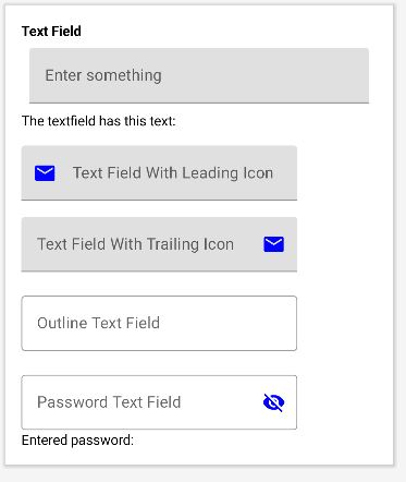
Text(
"Text Field", style = TextStyle(
fontWeight = FontWeight.Bold
)
)
// we are creating a variable for
// getting a value of our text field.
val textState = remember { mutableStateOf(TextFieldValue()) }
TextField(
// below line is used to get
// value of text field,
value = textState.value,
// below line is used to get value in text field
// on value change in text field.
onValueChange = { textState.value = it },
// below line is used to add placeholder
// for our text field.
placeholder = {
Text(text = "Enter something")
},
// keyboard options is used to modify
// the keyboard for text field.
keyboardOptions = KeyboardOptions(
// keyboard options is used to modify
// the keyboard for text field.
keyboardType = KeyboardType.Text,
// below line is use for capitalization
// inside our text field.
capitalization = KeyboardCapitalization.Words,
// below line is to enable auto
// correct in our keyboard.
autoCorrect = false
),
// modifier is use to add padding
// to our text field.
modifier = Modifier
.padding(all = 8.dp)
.fillMaxWidth(),
// below line is use to give
// max lines for our text field.
maxLines = 4,
// single line boolean is use to avoid
// textfield entering in multiple lines.
singleLine = false,
// below line is use to specify
// styling for our text field value.
textStyle = TextStyle(
color = Color.Black,
// below line is used to add font
// below line is use to change font family.
fontFamily = FontFamily.SansSerif
),
)
Text("The textfield has this text: " + textState.value.text)
Spacer(Modifier.size(padding))
val textState1 = remember { mutableStateOf(TextFieldValue()) }
TextField(
value = textState1.value,
onValueChange = {
textState1.value = it
},
label = {
Text(text = "Text Field With Leading Icon")
},
// leading icon is use to add icon
// at the start of text field.
leadingIcon = {
// In this method we are specifying
// our leading icon and its color.
Icon(
imageVector = Icons.Default.Email,
contentDescription = "image",
tint = Color.Blue
)
}
)
Spacer(Modifier.size(padding))
val textState2 = remember { mutableStateOf(TextFieldValue()) }
TextField(
value = textState2.value,
onValueChange = { textState2.value = it },
label = {
Text(text = "Text Field With Trailing Icon")
},
// leading icon is use to add icon
// at the start of text field.
trailingIcon = {
// In this method we are specifying
// our leading icon and its color.
Icon(
imageVector = Icons.Default.Email,
contentDescription = "image",
tint = Color.Blue
)
},
)
Spacer(Modifier.size(padding))
val textState3 = remember { mutableStateOf(TextFieldValue()) }
OutlinedTextField(
value = textState3.value,
onValueChange = {
textState3.value = it
},
label = {
Text(text = "Outline Text Field")
},
)
Spacer(Modifier.size(padding))
// we are creating a variable for
// getting a value of our text field.
val passwordState = remember { mutableStateOf(TextFieldValue()) }
val passwordVisibility = remember { mutableStateOf(true) }
OutlinedTextField(
value = passwordState.value,
onValueChange = {
passwordState.value = it
},
label = {
Text(text = "Password Text Field")
},
trailingIcon = {
IconButton(onClick = {
passwordVisibility.value = !passwordVisibility.value
}) {
Icon(
imageVector = if (passwordVisibility.value) Icons.Default.VisibilityOff else Icons.Default.Visibility,
contentDescription = "visibility",
tint = Color.Blue
)
}
},
visualTransformation = if (passwordVisibility.value) PasswordVisualTransformation() else VisualTransformation.None
)
Text("Entered password: " + passwordState.value.text)
}
}
@Preview(showBackground = true)
@Composable
fun DefaultPreview() {
TextFieldDemo()
}
|
Conclusion: In this Android Jetpack compose example we learn how to create Textfield, handle text change listeners, password visibility and error handling
Conclusion: In this Jetpack compose tutorial we covered how to work with Textfield, Handle text change events, add leading icon to textfield.