How do I create Badge In Jetpack Compose application

Last updated Aug 29, 2022

In This Jetpack compose tutorial we will cover about BadgeBox compose widget. Sometimes we may required to display notification,email,chat counts on the respected UI components. To display this type of count, compose given a widget called BadgeBox.

A BadgeBox is used to decorate content with a badge that can contain dynamic information, such as the presence of a new notification or a number of pending requests. Badges can be icon only or contain short text.


BadgeBox Properties:
badge - the badge to be displayed - typically a Badge
modifier - optional Modifier for this item
content - the anchor to which this badge will be positioned

@Composable
fun BadgedBox(
    badge: @Composable BoxScope.() -> Unit,
    modifier: Modifier = Modifier,
    content: @Composable BoxScope.() -> Unit,

In this sample we will create simple BadgeBox which will show the count when we tap on button click.

Let's get started

Step 1: Create Compose application in Android Studio, Pease refer how to create new Project in Android studio using Jetpack compose
Step 2: Create badge with Icon and Text

BadgedBox(badge ={Text("HERE our badge ",
                                color = Color.Red, fontSize = TextUnit(
                                20F, type = TextUnitType.Sp
                            )
                            )} ) {
                                Icon(
                                    Icons.Filled.MailOutline,
                                    tint = Color.Blue,
                                    contentDescription = "Favorite"
                                )
                            }


Step 3: Now add some functionality to set badge count
We are saving the badge count with create a varible with mutableState value
 var favCounter = remember {mutableStateOf(1)}

Update this value on button click

 Button(
            onClick = {
                favCounter.value++
            }
        ) {
            Text(text ="Update Badge")
        }


Step 4: Add value to badge by 

 BadgedBox(badge ={Text("${favCounter.value}",
                                color = Color.Red, fontSize = TextUnit(
                                20F, type = TextUnitType.Sp
                            )
                            )} )


Step 5: Now run application

You will see below outout

Jetpack Compose Badge creation


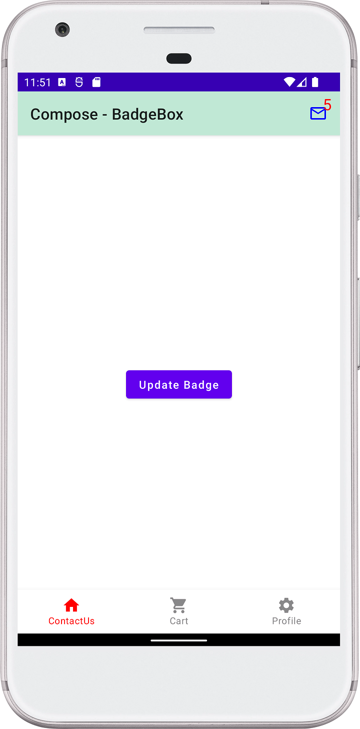
Complete example code for How do I create badge in Compose application
 

package com.rrtutors.compose_tutorials

import android.annotation.SuppressLint
import android.os.Bundle
import androidx.activity.ComponentActivity
import androidx.activity.compose.setContent
import androidx.compose.foundation.layout.Box
import androidx.compose.foundation.layout.Spacer
import androidx.compose.foundation.layout.fillMaxSize
import androidx.compose.foundation.layout.requiredWidth
import androidx.compose.material.*
import androidx.compose.material.SnackbarDefaults.backgroundColor
import androidx.compose.material.icons.Icons
import androidx.compose.material.icons.filled.*
import androidx.compose.runtime.Composable
import androidx.compose.runtime.MutableState
import androidx.compose.runtime.mutableStateOf
import androidx.compose.runtime.remember
import androidx.compose.ui.Alignment
import androidx.compose.ui.Modifier
import androidx.compose.ui.graphics.Color
import androidx.compose.ui.tooling.preview.Preview
import androidx.compose.ui.unit.ExperimentalUnitApi
import androidx.compose.ui.unit.TextUnit
import androidx.compose.ui.unit.TextUnitType
import androidx.compose.ui.unit.dp
import com.rrtutors.compose_tutorials.ui.theme.Compose_tutorialsTheme

class MainActivity : ComponentActivity() {
    @OptIn(ExperimentalUnitApi::class)
    @SuppressLint("UnusedMaterialScaffoldPaddingParameter")
    override fun onCreate(savedInstanceState: Bundle?) {
        super.onCreate(savedInstanceState)

        setContent {
            Compose_tutorialsTheme {
                // A surface container using the 'background' color from the theme
                Surface(
                    modifier = Modifier.fillMaxSize(),
                    color = MaterialTheme.colors.background
                ) {
                    var favCounter = remember {mutableStateOf(1)}
                    Scaffold(topBar = {
                        TopAppBar(
                        title = { Text(text = "Compose - BadgeBox")},
                        backgroundColor = Color(0xFFC0E8D5),
                        actions = {
                            BadgedBox(badge ={Text("${favCounter.value}",
                                color = Color.Red, fontSize = TextUnit(
                                20F, type = TextUnitType.Sp
                            )
                            )} ) {
                                Icon(
                                    Icons.Filled.MailOutline,
                                    tint = Color.Blue,
                                    contentDescription = "Favorite"
                                )
                            }

                            Spacer(modifier = Modifier.requiredWidth(12.dp))
                        }
                    )}, bottomBar = {

                        BottomNavigation(backgroundColor = Color.White) {


                            BottomNavigationItem(
                                selected = true,
                                label = {
                                    Text(text = "ContactUs")
                                },
                                onClick = {

                                },
                                icon = {
                                    Icon(Icons.Filled.Home, "")
                                },
                                selectedContentColor = Color.Red,
                                unselectedContentColor = Color.Gray
                            )
                            BottomNavigationItem(
                                selected = false,
                                label = {
                                    Text(text = "Cart")
                                },
                                onClick = {

                                },
                                icon = {
                                    Icon(Icons.Filled.ShoppingCart, "")
                                },
                                selectedContentColor = Color.Red,
                                unselectedContentColor = Color.Gray
                            )
                            BottomNavigationItem(
                                selected = false,
                                label = {
                                    Text(text = "Profile")
                                },
                                onClick = {

                                },
                                icon = {
                                    Icon(Icons.Filled.Settings, "")
                                },
                                selectedContentColor = Color.Red,
                                unselectedContentColor = Color.Gray
                            )
                        }
                    }) {
                    MainContent(favCounter)

                    }
                }
            }
        }
    }
}
@Composable
fun MainContent(favCounter: MutableState){
    Box(
        modifier = Modifier.fillMaxSize(),
        contentAlignment = Alignment.Center
    ){
        Button(
            onClick = {
                favCounter.value++
            }
        ) {
            Text(text ="Update Badge")
        }
    }
}


@Composable
fun Greeting(name: String) {
    Text(text = "Hello $name!")
}

@Preview(showBackground = true)
@Composable
fun DefaultPreview() {
    Compose_tutorialsTheme {
        Greeting("Android")
    }
}


Article Contributed By :
https://www.rrtutors.com/site_assets/profile/assets/img/avataaars.svg

584 Views