In this Jetpack compose tutorial we will learn how to create radio buttons in Android application.
RadioButton is a Jetpack Compose component to display radio buttons with a Text component to display the label.
Let's get started
Step 1: Create android application in android studio
Step 2: Follow step for setup Jetpack Compose with Android Studio
Step 3: Add Radio buttons in MainActivity.kt
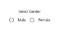
A simple example with male and female radio buttons:
|
@Composable
fun RadioButtonDemo() {
Column(
modifier = Modifier.fillMaxSize(),
verticalArrangement = Arrangement.Center,
horizontalAlignment = Alignment.CenterHorizontally
) {
val selectedGender = remember { mutableStateOf("") }
Text("Select Gender")
Spacer(modifier = Modifier.size(16.dp))
Row {
RadioButton(selected = selectedGender.value == Gender.male, onClick = {
selectedGender.value = Gender.male
})
Spacer(modifier = Modifier.size(16.dp))
Text(Gender.male)
Spacer(modifier = Modifier.size(16.dp))
RadioButton(selected = selectedGender.value == Gender.female, onClick = {
selectedGender.value = Gender.female
})
Spacer(modifier = Modifier.size(16.dp))
Text(Gender.female)
}
}
}
object Gender {
const val male = "Male"
const val female = "Female"
}
|
selected is a mandatory boolean parameter that determines the selected state of the RadioButton.
onClick is a lambda to trigger the functionality when it is selected and deselected.
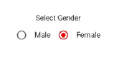
How to set color to radio button with compose
Radio button has a property colors, with this property we will set the color for radio button
colors — RadioButtonDefaults.colors will be used to resolve the color used for this Radio Button in different states.
|
RadioButton(selected = selectedGender.value == Gender.female, onClick = {
selectedGender.value = Gender.female
},
colors = RadioButtonDefaults.colors(Color.Red)
)
|
Full code
|
import android.os.Bundle
import androidx.activity.ComponentActivity
import androidx.activity.compose.setContent
import androidx.compose.foundation.layout.*
import androidx.compose.material.*
import androidx.compose.runtime.Composable
import androidx.compose.runtime.mutableStateOf
import androidx.compose.runtime.remember
import androidx.compose.ui.Alignment
import androidx.compose.ui.Modifier
import androidx.compose.ui.graphics.Color
import androidx.compose.ui.tooling.preview.Preview
import androidx.compose.ui.unit.dp
import com.example.jetpack.ui.theme.JetPackTheme
class MainActivity : ComponentActivity() {
override fun onCreate(savedInstanceState: Bundle?) {
super.onCreate(savedInstanceState)
setContent {
MaterialTheme {
// A surface container using the 'background' color from the theme
Surface(color = MaterialTheme.colors.background) {
RadioButtonDemo()
}
}
}
}
}
@Composable
fun RadioButtonDemo() {
Column(
modifier = Modifier.fillMaxSize(),
verticalArrangement = Arrangement.Center,
horizontalAlignment = Alignment.CenterHorizontally
) {
val selectedGender = remember { mutableStateOf("") }
Text("Select Gender")
Spacer(modifier = Modifier.size(16.dp))
Row {
RadioButton(selected = selectedGender.value == Gender.male, onClick = {
selectedGender.value = Gender.male
})
Spacer(modifier = Modifier.size(16.dp))
Text(Gender.male)
Spacer(modifier = Modifier.size(16.dp))
RadioButton(selected = selectedGender.value == Gender.female, onClick = {
selectedGender.value = Gender.female
},colors = RadioButtonDefaults.colors(Color.Red))
Spacer(modifier = Modifier.size(16.dp))
Text(Gender.female)
}
}
}
object Gender {
const val male = "Male"
const val female = "Female"
}
@Preview(showBackground = true)
@Composable
fun DefaultPreview() {
JetPackTheme {
RadioButtonDemo()
}
}
|
Conclusion: In this Jetpack Compose tutorial we covered how to create radio button with compose and set custom colors for radio button