How to show progress bar with jetpack compose?
How to create progressbar with Jetpack compose and custom progressabar
In this Jetpack compose tutorial we will learn how to show Progress Bar in Android application.
Progress Bar is a component which tells user about the current ongoing process such as downloading, processing, verifying, etc
Let's get started
Step 1: Create android application in android studio
Step 2: Follow step for setup Jetpack Compose with Android Studio
In Jetpack Compose, there are two types of Progress bar and they are as follows:
1. Linear Progress Bar
A Linear Progress Bar can be used to display a progress in linear line, also known as a progress bar.
There are two kinds:
Indeterminate
When you use the LinearProgressIndicator without the progress parameter, it will run forever.
@Composable
fun LinearProgressBarDemo() {
    Column(
        modifier = Modifier.fillMaxSize(),
        verticalArrangement = Arrangement.Center,
        horizontalAlignment = Alignment.CenterHorizontally
    ) {
        LinearProgressIndicator()
    }
}
|
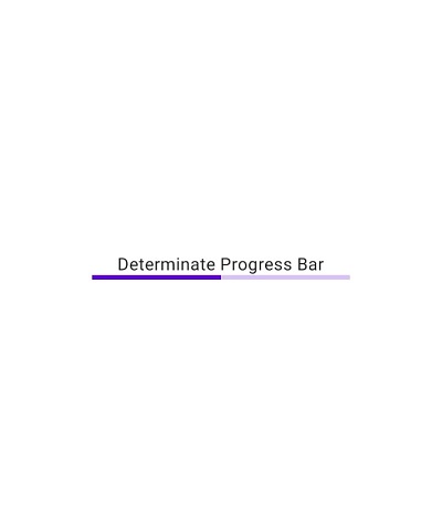
Determinate
When you set a value to the progress parameter, the indicator will be shown with that progress. E.g. a progress of 0.5f will fill it to the half.
@Composable
fun LinearProgressBarDemo() {
    Column(
        modifier = Modifier.fillMaxSize(),
        verticalArrangement = Arrangement.Center,
        horizontalAlignment = Alignment.CenterHorizontally
    ) {
        Text("Determinate Progress Bar")
        LinearProgressIndicator(
            progress = 0.5f
        )
    }
}
|
|
|
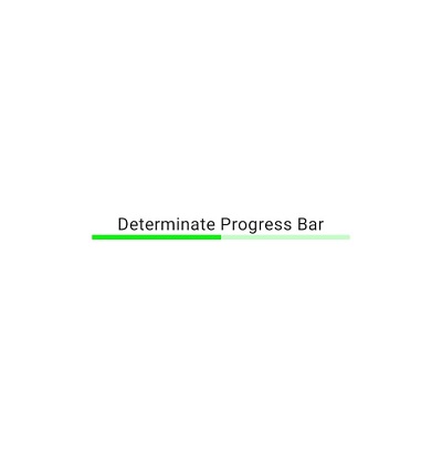
How to set color to Progressbar?
color attribute
it is used to color the progress indicator
@Composable
fun LinearProgressBarDemo() {
    Column(
        modifier = Modifier.fillMaxSize(),
        verticalArrangement = Arrangement.Center,
        horizontalAlignment = Alignment.CenterHorizontally
    ) {
        Text("Determinate Progress Bar")
        LinearProgressIndicator(
            progress = 0.5f,
            color = Color.Green
        )
    }
}
|
|
|
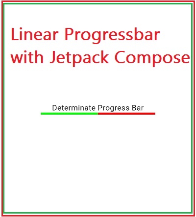
backgroundColor attribute
The background color stay visible only until the progress of the Linear Progress Indicator gets completed (reaches to very end).
|
|
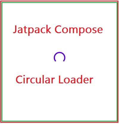
2. Circular Progress Bar
A CircularProgressIndicator can be used to display a progress in circular shape.
@Composable
fun CircularProgressBarDemo() {
    Column(
        modifier = Modifier.fillMaxSize(),
        verticalArrangement = Arrangement.Center,
        horizontalAlignment = Alignment.CenterHorizontally
    ) {
        CircularProgressIndicator()
    }
}
|
|
|
Attributes
@Composable
fun CircularProgressBarDemo() {
    Column(
        modifier = Modifier.fillMaxSize(),
        verticalArrangement = Arrangement.Center,
        horizontalAlignment = Alignment.CenterHorizontally
    ) {
        CircularProgressIndicator(
            progress = 0.5f,
            color = Color.Magenta,
            strokeWidth=12.dp,
        )
    }
}
|
Full Code
package com.example.jetpack
import android.os.Bundle
import androidx.activity.ComponentActivity
import androidx.activity.compose.setContent
import androidx.compose.foundation.layout.*
import androidx.compose.material.*
import androidx.compose.runtime.Composable
import androidx.compose.ui.Alignment
import androidx.compose.ui.Modifier
import androidx.compose.ui.graphics.Color
import androidx.compose.ui.tooling.preview.Preview
import androidx.compose.ui.unit.dp

class ProgressbarActivity : ComponentActivity() {

    override fun onCreate(savedInstanceState: Bundle?) {
        super.onCreate(savedInstanceState)
        setContent {
            MaterialTheme {
                // A surface container using the 'background' color from the theme
                Surface(color = MaterialTheme.colors.background) {
                    ProgressIndicatorDemo()

                }
            }
        }
    }
}

@Composable
fun ProgressIndicatorDemo() {
    Column(
        modifier = Modifier.fillMaxSize(),
        verticalArrangement = Arrangement.Center,
        horizontalAlignment = Alignment.CenterHorizontally
    ) {
        Text("Linear Progress Bar")
        Spacer(Modifier.size(16.dp))
        LinearProgressIndicator(
            color = Color.Green,
            backgroundColor = Color.Red,
        )
        Spacer(Modifier.size(16.dp))
        Text("Circular Progress Bar")
        Spacer(Modifier.size(16.dp))
        CircularProgressIndicator(
            color = Color.Magenta,
            strokeWidth = 12.dp,
        )
    }
}

@Preview(showBackground = true)
@Composable
fun DefaultPreview() {

        ProgressIndicatorDemo()

}
|
|
|

Conclusion: In this jetpack compose tutorial we have covered how to show progressbar, different types of progressbar and create custom progressbar with Jetpack compose