How to show Jetpack compose alert dialog?
Build an alert dialog in Jetpack Compose with positive and negative buttons. Customize dialog actions for better user interactions | RRTutors
In this Jetpack compose tutorial we will learn how to create alert dialog in Android application. Alert dialog is a Dialog which interrupts the user with urgent information, details or actions.
It shows the Alert message and gives the answer in the form of yes or no. Alert Dialog displays the message to warn you and then according to your response, the next step is processed. Android Alert Dialog is built with the use of three fields: Title, Message area, Action Button.
Let's get started
Step 1: Create android application in android studio
Step 2: Follow step for setup Jetpack Compose with Android Studio
Step 3: Alert dialog in MainActivity.kt
A simple example looks like:
AlertDialog(
    onDismissRequest = {
    },
    title = {
    },
    text = {
    },
    confirmButton = {
    },
    dismissButton = {
    }
)
|
onDismissRequest
Executes when the user tries to dismiss the Dialog by clicking outside or pressing the back button. This is not called when the dismiss button is clicked.
AlertDialog(
    // Dismiss the dialog when the user clicks outside the dialog or on the back
    // button. If you want to disable that functionality, simply use an empty
    // onCloseRequest.
    onDismissRequest = {
        openDialog.value = false
    },

    title = {
    },
    text = {
    },
    confirmButton = {
    },
    dismissButton = {
    },
)
|
modifier
Modifier to be applied to the layout of the dialog.
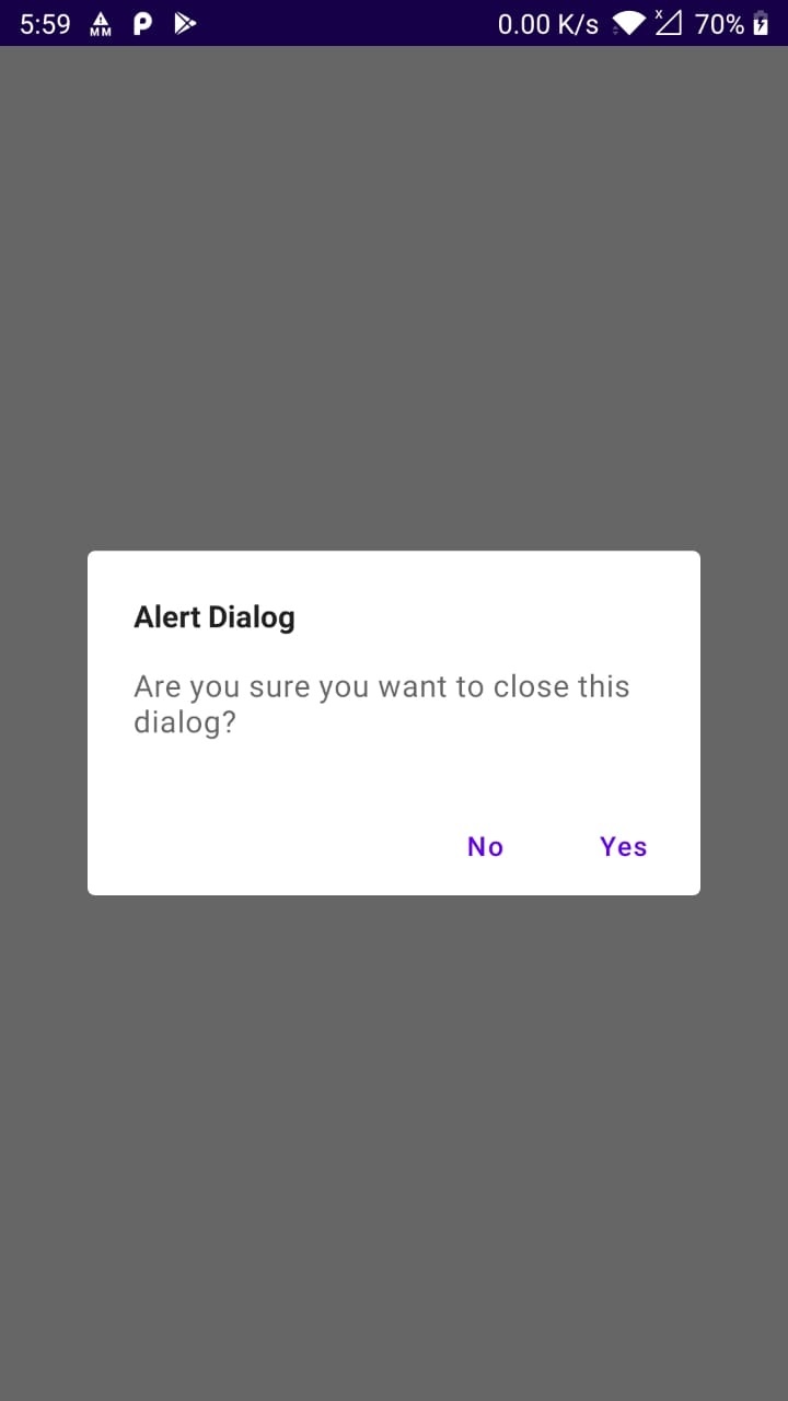
title
The title of the Dialog which should specify the purpose of the Dialog. The title is not mandatory, because there may be sufficient information inside the text. Provided text style will be Typography.h6.
AlertDialog(
    onDismissRequest = {
    },
    // below line is use to display title of our dialog
    // box and we are setting text color to white.
    title = {
        Text(text = "Alert Dialog", fontWeight = FontWeight.Bold,fontSize = 16.sp)
    },
    text = {
    },
    confirmButton = {
    },
    dismissButton = {
    }
)
|
text
The text which presents the details regarding the Dialog's purpose. Provided text style will be Typography.body1.
AlertDialog(
    onDismissRequest = {
    },

    title = {
    },
    // below line is use to display
    // description to our alert dialog.
    text = {
        Text("Are you sure you want to close this dialog?", fontSize = 16.sp)
    },
    confirmButton = {
    },
    dismissButton = {
    }
)
|
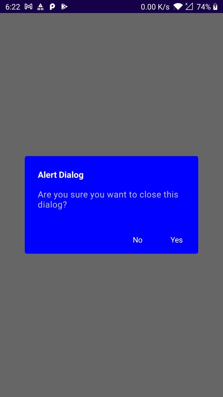
backgroundColor
The background color of the dialog.
AlertDialog(
    onDismissRequest = {
    },

    title = {
    },
    text = {
    },
    // below line is use to add background color to our alert dialog
    backgroundColor = Color.Red,
    confirmButton = {
    },
    dismissButton = {
    }
)
|
contentColor
The preferred content color provided by this dialog to its children.
AlertDialog(
    onDismissRequest = {
    },

    title = {
    },
    text = {
    },
    confirmButton = {
    },
    dismissButton = {
    },
    // below line is use to add content color for our alert dialog.
    contentColor = Color.White
)
|
Full code
import android.os.Bundle
import androidx.activity.ComponentActivity
import androidx.activity.compose.setContent
import androidx.compose.foundation.layout.*
import androidx.compose.material.*
import androidx.compose.runtime.Composable
import androidx.compose.runtime.mutableStateOf
import androidx.compose.runtime.remember
import androidx.compose.ui.Alignment
import androidx.compose.ui.Modifier
import androidx.compose.ui.graphics.Color
import androidx.compose.ui.text.TextStyle
import androidx.compose.ui.text.font.FontWeight
import androidx.compose.ui.tooling.preview.Preview
import androidx.compose.ui.unit.sp
import com.example.myapplication.ui.theme.MyApplicationTheme

class MainActivity : ComponentActivity() {

    override fun onCreate(savedInstanceState: Bundle?) {
        super.onCreate(savedInstanceState)
        setContent {
            MaterialTheme {
                // A surface container using the 'background' color from the theme
                Surface(color = MaterialTheme.colors.background) {
                    AlertDialogDemo()
                }
            }
        }
    }
}

@Composable
fun AlertDialogDemo() {
    val openDialog = remember { mutableStateOf(true) }
    Column(
        modifier = Modifier.fillMaxSize(),
        verticalArrangement = Arrangement.Center,
        horizontalAlignment = Alignment.CenterHorizontally
    ) {
        Button(onClick = { openDialog.value = true }) {
            Text(text = "Open Alert dialog")
        }
        if (openDialog.value) {
            // below line is use to
            // display a alert dialog.
            AlertDialog(
                // Dismiss the dialog when the user clicks outside the dialog or on the back
                // button. If you want to disable that functionality, simply use an empty
                // onCloseRequest.
                onDismissRequest = {
                    openDialog.value = false
                },
                // below line is use to display title of our dialog
                // box and we are setting text color to white.
                title = {
                    Text(text = "Alert Dialog", fontWeight = FontWeight.Bold, fontSize = 16.sp)
                },
                // below line is use to display
                // description to our alert dialog.
                text = {
                    Text("Are you sure you want to close this dialog?", fontSize = 16.sp)
                },
                // in below line we are displaying
                // our confirm button.
                confirmButton = {
                    TextButton(
                        onClick = {
                            openDialog.value = false
                        }) {
                        Text("Yes",style = TextStyle(color = Color.White))
                    }
                },
                // in below line we are displaying
                // our dismiss button.
                dismissButton = {
                    TextButton(
                        onClick = {
                            openDialog.value = false
                        }) {
                        Text("No",style = TextStyle(color = Color.White))
                    }
                },
                // below line is use to add background color to our alert dialog
                backgroundColor = Color.Blue,
                // below line is use to add content color for our alert dialog.
                contentColor = Color.White
            )
        }
    }

}

@Preview(showBackground = true)
@Composable
fun DefaultPreview() {
    MyApplicationTheme {
        AlertDialogDemo()
    }
}
|
Images
 |
 |
Conclusion: In our Jetpack Compose Tutorial we covered how to create Alert Dialog and handle events.