Design CardView with Centered Text in Android Studio
CardView is a rounded-corner widget that can be used to display any type of data. The CardView is primarily used to give the UI design
In this example tutorial, we will see how to make an CardView with a text in centre by using Kotlin in android studio.
What is CardView?
CardView is a rounded-corner widget that can be used to display any type of data. The CardView is primarily used to give the UI design
a rich feel and look. CardView can be used to add items to a listview or a Recycler View.
Implementation:
To begin, Create a new project in android studio with the name CardView Kotlin. Then press the Finish button.
Open the activity main.xml file and add the LinearLayout with orientation (Vertical or horizontal).
| <LinearLayout xmlns:android="http://schemas.android.com/apk/res/android" xmlns:tools="http://schemas.android.com/tools" android:orientation="vertical" android:layout_width="match_parent" android:layout_height="match_parent" android:gravity="center" android:background="#FACDC9" tools:context=".MainActivity"></LinearLayout> |
If you are using latest version of android studio, so it's provide the material design functionality by default, if not then add below dependency inside build.gradle(app)
|
implementation ‘com.google.android.material:material:1.2.1’ |
In activity_main.xml, insert an CardView inside a LinearLayout.
|
<androidx.cardview.widget.CardView |
Add color to cardview using the cardBackgroundColor property and change the corner radius using cardCornerRadius attribute.
|
app:cardCornerRadius="49dp" |
CardView has the following attributes:
id, padding, cardBackgroundColor,cardCornerRadius,background, layout_margin, layout_marginLeft, layout_marginRight, layout_marginEnd, layout margin, paddingLeft and so on....
| android:layout_marginRight="20dp" android:layout_marginLeft="20dp" android:padding="10dp" android:background="@drawable/facebook" app:cardCornerRadius="49dp" app:cardBackgroundColor="#4D2B7C" android:layout_margin="10dp" |
Add TextView inside CardView widget in activity_main.xml file
| <TextView android:layout_width="match_parent" android:layout_height="match_parent" android:text="CardView" android:textSize="21sp" android:gravity="center" android:textColor="@color/white"></TextView> |
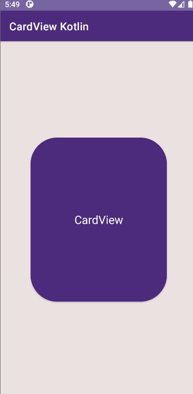
Run the application in emulator or real device, you will see the output shown below.
Output:
 |
Complete source code for Android CardView example:
activity_main.xml file
|
<?xml version="1.0" encoding="utf-8"?> <androidx.cardview.widget.CardView |
build.gradle(app) file
|
plugins { android { defaultConfig { testInstrumentationRunner "androidx.test.runner.AndroidJUnitRunner" buildTypes { dependencies { implementation 'androidx.core:core-ktx:1.7.0' |
Conclusion: We have covered the topic how to design a cardView with text in centre to Android by using Kotlin.