Custom Seekbar Android with Kotlin
Understand Android SeekBar widget for selecting values in a range by dragging. Learn how to use setProgress() for dynamic control at rrtutors.com
Android SeekBar is widget which will be used to choose values in a given range by drag feature. SeekBar is a sub class of Progressbar. SeekBar widget has the attribute to set the progress. We can set the progress value in xml file or by program of setProgress() property. In this post we will create custom SeekBar in Android example. To create custom SeekBar we need to create custom drawable to set the progress of the SeekBar . You can refer Android Circular SeekBar example here
SeekBar Construcor
public class SeekBar extends AbsSeekBar {
    public SeekBar(Context context) {
        super((Context)null);
        throw new RuntimeException("Stub!");
    }
|
Let's create custom SeekBar
Step 1: Create Android application in Android studio
Step 2: Add SeekBar widget in xml layout
<?xml version="1.0" encoding="utf-8"?>
<androidx.constraintlayout.widget.ConstraintLayout xmlns:android="http://schemas.android.com/apk/res/android"
    xmlns:app="http://schemas.android.com/apk/res-auto"
    xmlns:tools="http://schemas.android.com/tools"
    android:layout_width="match_parent"
    android:layout_height="match_parent"
    tools:context=".CustomSeekbar">

    <SeekBar
        android:id="@+id/seekBar"
        android:layout_width="300dp"
        android:layout_height="wrap_content"
        app:layout_constraintBottom_toBottomOf="parent"
        app:layout_constraintEnd_toEndOf="parent"
        app:layout_constraintStart_toStartOf="parent"
        app:layout_constraintTop_toTopOf="parent"
        android:max="100"
        android:progress="32"
        android:thumbTint="@color/red"
        />

    <TextView
        android:id="@+id/textView"
        android:layout_width="wrap_content"
        android:layout_height="wrap_content"
        android:layout_marginTop="200dp"
        android:textColor="@color/purple_500"
        android:textSize="32sp"
        app:layout_constraintEnd_toEndOf="parent"
        app:layout_constraintStart_toStartOf="parent"
        app:layout_constraintTop_toTopOf="parent" />
</androidx.constraintlayout.widget.ConstraintLayout>
|
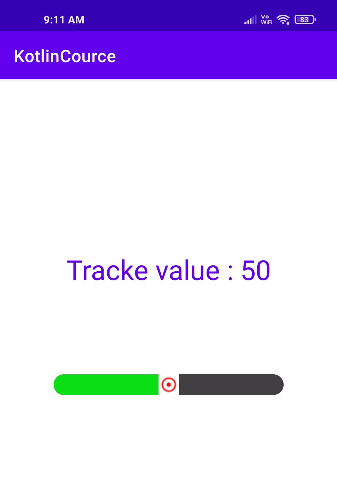
Now this default properties will show the SeekBar as normal theme. TO make custom SeekBar we need to create a customize drawable which we need to pass as android:progressDrawable.
Step 3: Create a drawable with shape and progress values
custom_drawable.xml
<?xml version="1.0" encoding="utf-8"?>
<layer-list xmlns:android="http://schemas.android.com/apk/res/android" >
    <item android:id="@android:id/background" android:height="24dp">
        <shape android:shape="rectangle" >
            <corners android:radius="15dp"/>
            <solid
                android:color="@color/grey" />
        </shape>
    </item>
    <item android:id="@android:id/progress" android:height="24dp">
        <clip>
            <shape android:shape="rectangle" >
                <corners android:radius="15dp"/>
                <solid
                    android:color="@color/green" />
            </shape>
        </clip>
    </item>
</layer-list>
|
Now set this drawable to seekbar to make custom progress style
<SeekBar
    android:id="@+id/seekBar"
    android:layout_width="300dp"
    android:layout_height="wrap_content"
    app:layout_constraintBottom_toBottomOf="parent"
    app:layout_constraintEnd_toEndOf="parent"
    app:layout_constraintStart_toStartOf="parent"
    app:layout_constraintTop_toTopOf="parent"
    android:max="100"
    android:progress="32"
    android:thumb="@drawable/ic_thumb"
    android:progressDrawable="@drawable/custom_drawable"
    android:thumbTint="@color/red"
    />
|
Step 4: Update MainActivity.kt to handle SeekBar events listeners
package com.rrtutors.kotlincource

import androidx.appcompat.app.AppCompatActivity
import android.os.Bundle
import android.widget.SeekBar
import android.widget.TextView

class CustomSeekbar : AppCompatActivity() {
    override fun onCreate(savedInstanceState: Bundle?) {
        super.onCreate(savedInstanceState)
        setContentView(R.layout.activity_custom_seekbar)
        val textView=findViewById<TextView>(R.id.textView);
        val seekBar=findViewById<SeekBar>(R.id.seekBar);
        seekBar.setOnSeekBarChangeListener( object :SeekBar.OnSeekBarChangeListener{
            override fun onProgressChanged(p0: SeekBar?, p1: Int, p2: Boolean) {
                textView.setText("Tracke value : "+p1)
            }

            override fun onStartTrackingTouch(p0: SeekBar?) {

            }

            override fun onStopTrackingTouch(p0: SeekBar?) {

            }
        })
    }
}
|
Step 5: Run application
 |
Tags: Custom Seekbar, Seekbar Example, Circular Seekbar