How to dynamically change the theme in Flutter - ThemeProvider
Learn how to dynamically change theme in Flutter using ThemeProvider. Follow step-by-step instructions to implement light and dark modes. Visit rrtutors.com.
Hello Guys, to day we are going to learn how to change the App theme runtime.
For this, we are using Providers to hanlde the state of the application
What is Provider?
Provider is a widget to maintain the State of Application.
This Provide widget will have the following classes.
- ChangeNotifier
- ChangeNotifierProvider
- Consumer
For this Example we are using the ChangeNotifierProvider.
For this we are using the provider plugin provider 3.1.0+1
This example we have below classes
- ThemeProvider
- MyApp
- AuthPage
- LoginPage
- SignUpPage
- Settings
Lets create Provider class
themeprovider.dart
|
class ThemeProvider with ChangeNotifier{ ThemeData get getThem set setTheme(val) |
The ThemeProvider class extends by ChangeNotifier.
It contains getThem,setTheme methods.
While calling the setTheme method Listner will call and update the theme of the Screens.
Lets create 3 themes for Light,Dark and Custom Themes. Now the final code for the
ThemeProvider class should be like below
import 'package:flutter/material.dart';

class ThemeProvider with ChangeNotifier{
  int theme;
  ThemeProvider({this.theme});

  ThemeData get getThem
  {
    print(theme);
    switch(theme)
    {
      case 0:
        return lightTheme;
        break;
      case 1:
        return darkTheme;
        break;
      case 2:
        return customTheme;
        break;
    }
  }

 set setTheme(val)
  {
    theme=val;
    notifyListeners();
  }

  final darkTheme = ThemeData(

      scaffoldBackgroundColor: Color(0xFF000000),
      appBarTheme: AppBarTheme(
        color: Colors.white,
        textTheme: TextTheme(
          title:  TextStyle(fontSize: 22, color: Colors.white),
        )
      ),
      brightness: Brightness.dark,
      backgroundColor: Color(0xFF000000),
      accentColor: Colors.white,
      accentIconTheme: IconThemeData(color: Colors.black),
      dividerColor: Colors.black54,

      accentTextTheme:TextTheme(
          headline:  TextStyle(fontSize: 35, color: Colors.white),
          title:  TextStyle(fontSize: 35, color: Colors.white),
          body1: TextStyle(fontSize: 35, color: Colors.white),
          subtitle: TextStyle(fontSize: 18, color: Colors.white),
          display1: TextStyle(fontSize: 35, color: Colors.white)
      ),
      inputDecorationTheme: InputDecorationTheme(
        focusedBorder: OutlineInputBorder(
            borderSide: BorderSide(color: Colors.white),
            borderRadius: BorderRadius.all(Radius.circular(10))),
        enabledBorder: OutlineInputBorder(
            borderSide: BorderSide(color: Colors.white),
            borderRadius: BorderRadius.all(Radius.circular(10))),
        errorBorder: OutlineInputBorder(
            borderSide: BorderSide(color: Colors.white),
            borderRadius: BorderRadius.all(Radius.circular(10))),
        focusedErrorBorder: OutlineInputBorder(
            borderSide: BorderSide(color: Colors.white),
            borderRadius: BorderRadius.all(Radius.circular(10))),
        border: OutlineInputBorder(
          borderSide: BorderSide(color: Colors.white),
          borderRadius: BorderRadius.all(Radius.circular(10)),
        ),
        labelStyle: TextStyle(
            color:  Colors.white,
            fontSize: 12.0
        ),
      ),
      buttonTheme: ButtonThemeData(
        shape:  new RoundedRectangleBorder(
            borderRadius: BorderRadius.all(Radius.circular(10.0)),
            side: BorderSide(color: Colors.white)),
      )
  );

  final lightTheme = ThemeData(
      scaffoldBackgroundColor: Color(0xFFFFFFFF),

      appBarTheme: AppBarTheme(
          color: Colors.white,
          textTheme: TextTheme(
            title:  TextStyle(fontSize: 22, color: Colors.black),
          )
      ),
      brightness: Brightness.light,
      backgroundColor: Color(0xFFE5E5E5),

      accentIconTheme: IconThemeData(color: Colors.white),


          textTheme:TextTheme(
          headline:  TextStyle(fontSize: 35, color: Colors.black),
          title:  TextStyle(fontSize: 35, color: Colors.black),
          body1: TextStyle(fontSize: 35, color: Colors.black),
          subtitle: TextStyle(fontSize: 18, color: Colors.black),
          display1: TextStyle(fontSize: 35, color: Colors.black)
      ),

    inputDecorationTheme: InputDecorationTheme(
          focusedBorder: OutlineInputBorder(
              borderSide: BorderSide(color: Colors.black),
              borderRadius: BorderRadius.all(Radius.circular(10))),
          enabledBorder: OutlineInputBorder(
              borderSide: BorderSide(color: Colors.black),
              borderRadius: BorderRadius.all(Radius.circular(10))),
          errorBorder: OutlineInputBorder(
              borderSide: BorderSide(color: Colors.black),
              borderRadius: BorderRadius.all(Radius.circular(10))),
          focusedErrorBorder: OutlineInputBorder(
              borderSide: BorderSide(color: Colors.black),
              borderRadius: BorderRadius.all(Radius.circular(10))),
          border: OutlineInputBorder(
              borderSide: BorderSide(color: Colors.black),
              borderRadius: BorderRadius.all(Radius.circular(10)),
          ),
          labelStyle: TextStyle(
              color:  Colors.black,
              fontSize: 12.0
          ),
    ),
    buttonTheme: ButtonThemeData(

      shape:  new RoundedRectangleBorder(
          borderRadius: BorderRadius.all(Radius.circular(10.0)),
          side: BorderSide(color: Colors.black)),
    )

   );

  final customTheme = ThemeData(
      scaffoldBackgroundColor: Color(0xFFFFFFFF),

      appBarTheme: AppBarTheme(
          color: Colors.deepPurple,
          textTheme: TextTheme(
            title:  TextStyle(fontSize: 22, color: Colors.deepPurple),
          )
      ),
      brightness: Brightness.light,
      backgroundColor: Color(0xFFFFFFFF),

      accentIconTheme: IconThemeData(color: Colors.white),

          textTheme:TextTheme(
          headline:  TextStyle(fontSize: 35, color: Colors.deepPurple),
          title:  TextStyle(fontSize: 35, color: Colors.deepPurple),
          body1: TextStyle(fontSize: 35, color: Colors.deepPurple),
          subtitle: TextStyle(fontSize: 18, color: Colors.deepPurple),
          display1: TextStyle(fontSize: 35, color: Colors.deepPurple)
      ),
    inputDecorationTheme: InputDecorationTheme(
          focusedBorder: OutlineInputBorder(
              borderSide: BorderSide(color: Colors.deepPurple),
              borderRadius: BorderRadius.all(Radius.circular(10))),
          enabledBorder: OutlineInputBorder(
              borderSide: BorderSide(color: Colors.deepPurple),
              borderRadius: BorderRadius.all(Radius.circular(10))),
          errorBorder: OutlineInputBorder(
              borderSide: BorderSide(color: Colors.deepPurple),
              borderRadius: BorderRadius.all(Radius.circular(10))),
          focusedErrorBorder: OutlineInputBorder(
              borderSide: BorderSide(color: Colors.deepPurple),
              borderRadius: BorderRadius.all(Radius.circular(10))),
          border: OutlineInputBorder(
              borderSide: BorderSide(color: Colors.deepPurple),
              borderRadius: BorderRadius.all(Radius.circular(10)),
          ),
          labelStyle: TextStyle(
              color:  Colors.deepPurple,
              fontSize: 12.0
          ),
    ),
    buttonTheme: ButtonThemeData(

      shape:  new RoundedRectangleBorder(
          borderRadius: BorderRadius.all(Radius.circular(10.0)),
          side: BorderSide(color: Colors.deepPurple)),
    )

   );


  }
|
Now create main.dart
|
import 'package:dynamic_theme/provides/themeprovider.dart'; import 'auth/auth_page.dart'; class MyApp extends StatelessWidget { |
here we are defines the Builder to set the Provider
|
ChangeNotifierProvider(builder: (_){ |
Now lets create signup,Login and settings pages.
In each widget we are added theme from the ThemeProvider class
AuthPage
import 'package:dynamic_theme/provides/themeprovider.dart';
import 'package:dynamic_theme/ui/settings.dart';
import 'package:flutter/material.dart';
import 'login_page.dart';
import 'signup_page.dart';

import 'package:provider/provider.dart';
class AuthPage extends StatefulWidget {
  @override
  State createState() {
    return _AuthpageState();
  }
}

class _AuthpageState extends State {
  GlobalKey _homeKey = GlobalKey(debugLabel: '_homeScreenkey');
  bool _isLogin = true;
  void changePage(bool isLogin) {
    setState(() {
      // print(isLogin);
      _isLogin = isLogin;
    });
  }


  @override
  Widget build(BuildContext context) {

    return SafeArea(

      child:Scaffold(
        key: _homeKey,

        body: Stack(
          children: [
            Center(
              child: SingleChildScrollView(

                child: Container(
                  padding: EdgeInsets.all(25),
                  child: Column(
                    crossAxisAlignment: CrossAxisAlignment.center,
                    children: [

                      Padding(padding: EdgeInsets.all(25),
                      child: Column(
                        children: [
                          Text("RRTutors",
 style: Theme.of(context).textTheme.headline,),
                          Text("Flutter - Kotlin - Java",
style: Theme.of(context).textTheme.subtitle,
                          ),
                        ],
                      ),),


                      _isLogin ? LoginPage(changePage) : SignUpPage(changePage),

                    ],
                  ),
                ),
              ),
            ),
            Positioned(
              right: 10,
              top: 10,
              child: InkWell(
                child: Padding(
                  padding: const EdgeInsets.all(8.0),
                  child: Icon(Icons.settings,),
                ),
                onTap: (){
                  Navigator.push(_homeKey.currentContext,
 MaterialPageRoute(builder: (ctx)
                  {
                    return Settings();
                  }));
                },
              ),
            )
          ],

        ),
      ),/* MaterialApp(
        theme: themeProvider.getThem,
        home:
      )*/
    );
  }
}
|
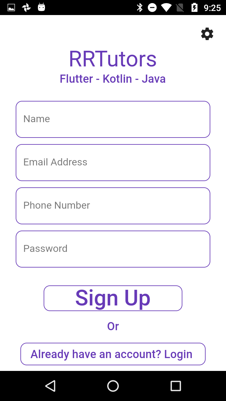
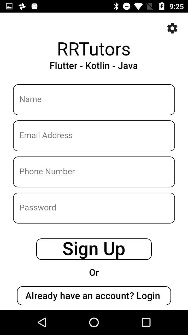
Signup Page
import 'package:flutter/material.dart';
import 'package:dynamic_theme/utils/utils.dart';

class SignUpPage extends StatelessWidget {
  final Function changePage;
  SignUpPage(this.changePage);

  @override
  Widget build(BuildContext context) {
    return _buildLoginWidget(context: context);
  }

  Column _buildLoginWidget({context: BuildContext}) {
    return Column(
      children: [
        TextField(
          style: TextStyle(color: Colors.white),
          keyboardType: TextInputType.text,
          decoration: InputDecoration(

          border: Theme.of(context).inputDecorationTheme.border,
          focusedBorder: Theme.of(context).inputDecorationTheme.focusedBorder,

          disabledBorder:  Theme.of(context).inputDecorationTheme.disabledBorder,

          hintText: "Name"
          ),
          onChanged: (String value) {
            // setState(() {});
          },
        ),
        _space(),
        TextField(
          style: TextStyle(color: Colors.white),
          textInputAction: TextInputAction.done,
          keyboardType: TextInputType.emailAddress,
          decoration:InputDecoration(

    border: Theme.of(context).inputDecorationTheme.border,
    focusedBorder: Theme.of(context).inputDecorationTheme.focusedBorder,

    disabledBorder:  Theme.of(context).inputDecorationTheme.disabledBorder,

    hintText: "Email Address"
    ),
          onChanged: (String value) {
            // setState(() {});
          },
        ),
        _space(),
        TextField(
          style: TextStyle(color: Colors.white),
          keyboardType: TextInputType.phone,
          decoration:InputDecoration(

          border: Theme.of(context).inputDecorationTheme.border,
          focusedBorder: Theme.of(context).inputDecorationTheme.focusedBorder,
          disabledBorder:
Theme.of(context).inputDecorationTheme.
disabledBorder,
          hintText: "Phone Number"
          ),
          onChanged: (String value) {
            // setState(() {});
          },
        ),
        _space(),
        TextField(
          style: TextStyle(color: Colors.white),
          keyboardType: TextInputType.emailAddress,
          decoration: InputDecoration(

          border: Theme.of(context).inputDecorationTheme.border,
          focusedBorder: Theme.of(context).inputDecorationTheme.
focusedBorder,
          disabledBorder:  Theme.of(context).inputDecorationTheme.
disabledBorder,
          hintText: "Password"
          ),
          onChanged: (String value) {
            // setState(() {});
          },
        ),
        SizedBox(
          height: 25,
        ),
        FlatButton(
          shape:Theme.of(context).buttonTheme.shape,
          padding: EdgeInsets.only(
            left: 50,
            right: 50,
          ),
          // color: Theme.of(context).buttonColor,
          textColor: Colors.white,
          child: Text('Sign Up',style: Theme.of(context).textTheme.title,),
          onPressed: () {
           // Navigator.pushNamed(context, '/home');
          },
        ),
        Container(
          margin: EdgeInsets.only(
            top: 10,
            bottom: 10,
          ),
          child: Text(
            'Or',
            style: Theme.of(context).textTheme.subtitle,
          ),
        ),
        FlatButton(
          child: Text(
            'Already have an account? Login ',
            style: Theme.of(context).textTheme.subtitle,
          ),
          onPressed: () {
            changePage(true);
          },
        ),
      ],
    );
  }

  Widget _space() {
    return SizedBox(
      height: 10,
    );
  }
}
|
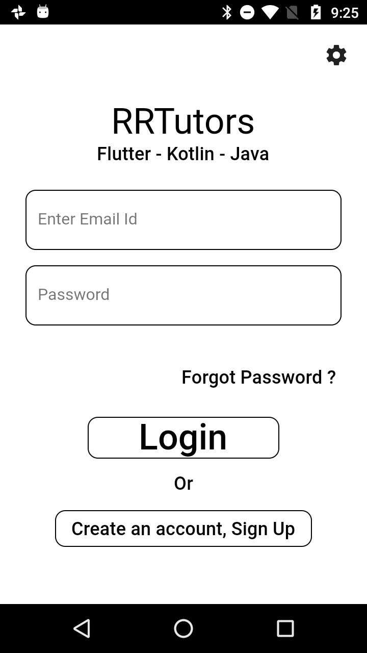
Login Page
import 'package:flutter/material.dart';

class LogInPage extends StatefulWidget{
  @override
  State createState() {
    // TODO: implement createState
    return _LogInPageState();
  }

}
class _LogInPageState extends State {

TextEditingController _emailController=TextEditingController();
TextEditingController _passwordController=TextEditingController();
final GlobalKey _formKeyOne = GlobalKey();
final GlobalKey _formKeyTwo = GlobalKey();
  @override
  Widget build(BuildContext context) {

    return Column(
      children: [
        Container(
          child: Padding(
              padding: EdgeInsets.only(top: 20.0),
              child: Column(
                mainAxisAlignment: MainAxisAlignment.center,
                children: [
                  Text(
                     "RRTutors",style: TextStyle(fontSize: 32),
                  ),
                  Text(
                      "Flutter,Kotlin,Java"
                  ),
                ],
              )),

        ),
        SizedBox(
          height: 20,
        ),
        Container(
          child: Padding(
            padding: EdgeInsets.only(left: 25.0, right: 25.0),
            child: IntrinsicWidth(

            ),
          ),

        ),
        SizedBox(
          height: 10,
        ),
        Container(
          child: Padding(
              padding: EdgeInsets.only
(left: 30.0, right: 30.0),
            child: _showSignIn(context),

        ),
        )],
    );
  }


  Widget _showSignIn(context) {
    return Column(
      crossAxisAlignment:
CrossAxisAlignment.stretch,
      children: [
        SizedBox(
          height: 20,
        ),
        Container(
          child: Padding(
            padding: EdgeInsets.only(),
            child: TextField(
              key: _formKeyOne,
              controller: _emailController,
              decoration: InputDecoration(
                hintText: "Enter Email",

                enabledBorder: UnderlineInputBorder(
                    borderSide: BorderSide(
                         width: 1.0)),
                focusedBorder: UnderlineInputBorder(
                    borderSide: BorderSide(
                         width: 1.0)),
                prefixIcon: const Icon(
                  Icons.email,

                ),
              ),
              obscureText: false,
            ),
          ),
        ),
        SizedBox(
          height: (20),
        ),
        Container(
          child: Padding(
            padding: EdgeInsets.only(),
            child: TextField(
              obscureText: true,
              key: _formKeyTwo,
              controller: _passwordController,
              decoration: InputDecoration(
                //Add th Hint text here.
                hintText: "Enter Password",

                enabledBorder: UnderlineInputBorder(
                    borderSide:
BorderSide(
                        width: 1.0)),
                focusedBorder:
UnderlineInputBorder(
                    borderSide: BorderSide(
                         width: 1.0)),
                prefixIcon: const Icon(
                  Icons.lock,

                ),
              ),
            ),
          ),
        ),
        SizedBox(
          height: (20),
        ),
        Container(
          child: Padding(
            padding: EdgeInsets.only(),
            child: RaisedButton(
              child: Row(
                children: [
                  Icon(Icons.email),
                  Expanded(
                    child: Text(
                      "SignIn",
                      textAlign: TextAlign.center,

                    ),
                  )
                ],
              ),

              onPressed: () =>
                  {},
            ),
          ),
        ),


        SizedBox(
          height: (10),
        ),
        Container( ),
      ],
    );
  }
}
|
Settings Page
import 'package:dynamic_theme/provides/themeprovider.dart';
import 'package:flutter/material.dart';
import 'package:provider/provider.dart';
import '../main.dart';

class Settings extends StatelessWidget {
  @override
  Widget build(BuildContext context) {
    final themeProvider = Provider.of(context);
    return Scaffold(

      appBar: AppBar(
        textTheme: Theme.of(context).appBarTheme.textTheme,
        backgroundColor: Theme.of(context).backgroundColor,
        title: Text("Settings"),

      ),
        body: Container(
          width:double.infinity,
          child: Column(
          mainAxisAlignment: MainAxisAlignment.center,
                crossAxisAlignment: CrossAxisAlignment.center,
                mainAxisSize: MainAxisSize.max,

                children: [
                    MaterialButton(

                        shape: Theme.of(context).buttonTheme.shape,
                        onPressed: ()
                            {
                                themeProvider.setTheme =  0 ;


                            },
                        child: Text("Light Theme",
style: Theme.of(context).textTheme.subtitle,),
                    ),
                  SizedBox(height: 40,),
                    MaterialButton(

                      shape: Theme.of(context).buttonTheme.shape,
                      onPressed: ()
                      {
                        themeProvider.setTheme =  1;


                      },
                      child: Text("Dark Theme",
style: Theme.of(context).textTheme.subtitle,),
                    ), SizedBox(height: 40,),
                    MaterialButton(

                      shape: Theme.of(context).buttonTheme.shape,
                      onPressed: ()
                      {
                        themeProvider.setTheme = 2;


                      },
                      child: Text("Custom Theme",
style: Theme.of(context).textTheme.subtitle,),
                    )
              ]
           ,
           ),
    ));
  }

}
|
Now lets run the code and change the thems of application instantly.