How to Use Chip Widget in Flutter
Chip widget in Flutter: Learn how to create chip message boxes to display multiple selectable or non-selectable items in your Flutter app. | RRTutors
Chip is a material design widget that comes built-in with flutter. It can simply be described as a compact element holding an icon and text, usually a rounded rectangle in the background. It can serve many purposes like it can be simply used as a button or any indicator that you want to show
So, in today's tutorial, we will see how chip widgets are used in Flutter.
Let's start
Step 1: Create a new Flutter Application.
Step 2: Now inside the body, we will take Column Widget and inside that, we will take Chip Widget
It has different properties
|
Chip({ Key? key, this.avatar, required this.label, this.labelStyle, this.labelPadding, this.deleteIcon, this.onDeleted, this.deleteIconColor, this.useDeleteButtonTooltip = true, this.deleteButtonTooltipMessage, this.side, this.shape, this.clipBehavior = Clip.none, this.focusNode, this.autofocus = false, this.backgroundColor, this.padding, this.visualDensity, this.materialTapTargetSize, this.elevation, this.shadowColor, }) : assert(label != null), assert(autofocus != null), assert(clipBehavior != null), assert(elevation == null || elevation >= 0.0), assert(useDeleteButtonTooltip != null), super(key: key); |
But the most commonly used property is label which shows the text inside rounded shape widget
for example
|
Chip( label: const Text( 'This is Chip', style: TextStyle(fontSize: 20), ), //Text ), |
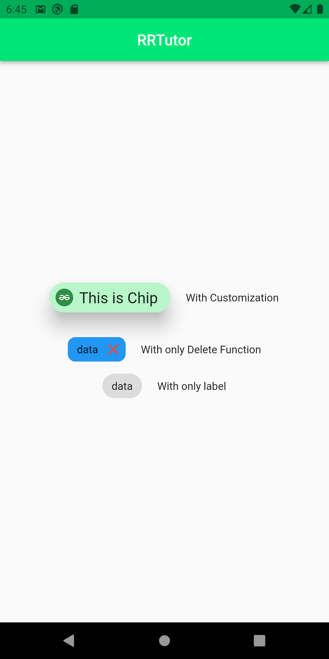
We can Customize it with different properties as we want using background color, adding icons or any Widget inside it.
for example
|
Chip( elevation: 20, padding: const EdgeInsets.all(8), backgroundColor: Colors.greenAccent[100], shadowColor: Colors.black, avatar: CircleAvatar( backgroundImage: NetworkImage( "https://images.pexels.com/photos/9647962/pexels-photo-9647962.jpeg?auto=compress&cs=tinysrgb&dpr=2&h=650&w=940"), //NetwordImage ), //CircleAvatar label: const Text( 'This is Chip', style: TextStyle(fontSize: 20), ), //Text ), |
you can also have different functions for the chip as onDelete which can be used to trigger a function when you click on the chip.
for example
|
Chip( onDeleted: () { print('Deleted'); }, backgroundColor: Colors.blue, deleteIcon: const Icon(Icons.close), deleteIconColor: Colors.red, shape: RoundedRectangleBorder( borderRadius: BorderRadius.circular(10)), label: Text('data'), ), |
Full Source Code to try
|
import 'package:flutter/material.dart';
//Material design library void main() { runApp( //widget tree starts here MaterialApp( debugShowCheckedModeBanner: false, home: Scaffold( appBar: AppBar( title: Text('RRTutor'), backgroundColor: Colors.greenAccent[400], centerTitle: true, ), //AppBar body: Column( mainAxisAlignment: MainAxisAlignment.center, children: [ Row( mainAxisAlignment: MainAxisAlignment.center, children: [ Chip( elevation: 20, padding: const EdgeInsets.all(8), backgroundColor: Colors.greenAccent[100], shadowColor: Colors.black, avatar: CircleAvatar( backgroundImage: NetworkImage( "https://images.pexels.com/photos/9647962/pexels-photo-9647962.jpeg?auto=compress&cs=tinysrgb&dpr=2&h=650&w=940"), //NetwordImage ), //CircleAvatar label: const Text( 'This is Chip', style: TextStyle(fontSize: 20), ), //Text ), const SizedBox( width: 20, ), Text('With Customization') ], ), const SizedBox( height: 20, ), Row( mainAxisAlignment: MainAxisAlignment.center, children: [ Chip( onDeleted: () { print('Deleted'); }, backgroundColor: Colors.blue, deleteIcon: const Icon(Icons.close), deleteIconColor: Colors.red, shape: RoundedRectangleBorder( borderRadius: BorderRadius.circular(10)), label: Text('data'), ), const SizedBox( width: 20, ), const Text('With only Delete Function') ], ), Row( mainAxisAlignment: MainAxisAlignment.center, children: const [ Chip( label: Text('data'), ), SizedBox( width: 20, ), Text('With only label') ], ) ], ), //Center ), //Scaffold ), //MaterialApp ); }
|
Output:
 |
Conclusion: In this way, we have learned how you can use Chip widget in Flutter.