Flutter ExpansionTile - Expandable Listview
Flutter ExpansionTile: Create Expandable ListView with ExpansionTile and ExpansionPanelList. Learn to build expandable lists on rrtutors.com. Start coding.
In Many Applications, there is a requirement like display expand and collapse items.
We have two ways of creating an expandable view in flutter.
- ExpansionTile
- ExpansionPanelList & ExpansionPanel
Today we are going to implement this expandable view by ExpansionTile widget
We make Listview expansion by ExpansionTile widget which is provided by Flutter.
Create a flutter application and remove all code from main.dart file and it would be like below
import 'package:flutter/material.dart';void main() {
  runApp(MyApp());
}
class MyApp extends StatelessWidget {
  @override
  Widget build(BuildContext context) {
    return MaterialApp(
      title: 'Flutter Expansion View',
      theme: ThemeData(
        primarySwatch: Colors.blue,
      ),
      home: Home(),
    );
  }
}
|
ExpansionTile:
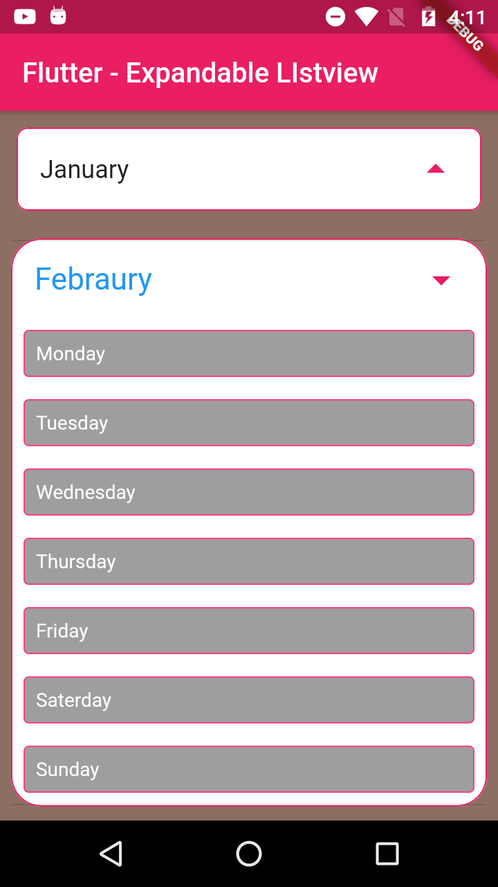
It is a simple and useful widget. This widget lets you create a collapse or expansion view with features similar to ListTile. It is like a ListTile which will expand on tapping the title.
ExpansionTile has the following attributes similar to List Tile:
Properties:
backgroundColor: set the background color to the widget .
children: This property is used for add child widget
initiallyExpanded: if we set true, child will expands default
onExpansionChanged: To handle the expansion event
title: set the header of the item.
|
ExpansionTile( child: Text("Header",style: TextStyle(fontSize: 18),), |
We can handle the Expansion listener with OnExpanstionChanged () function
Example code
main.dart
import 'dart:core';
import 'package:flutter/material.dart';
import 'list_item.dart';
class MyApp extends StatelessWidget {
// This widget is the root of your application.
@override
Widget build(BuildContext context) {
return MaterialApp(
title: 'Flutter Demo',
theme: ThemeData(
primarySwatch: Colors.blue,
),
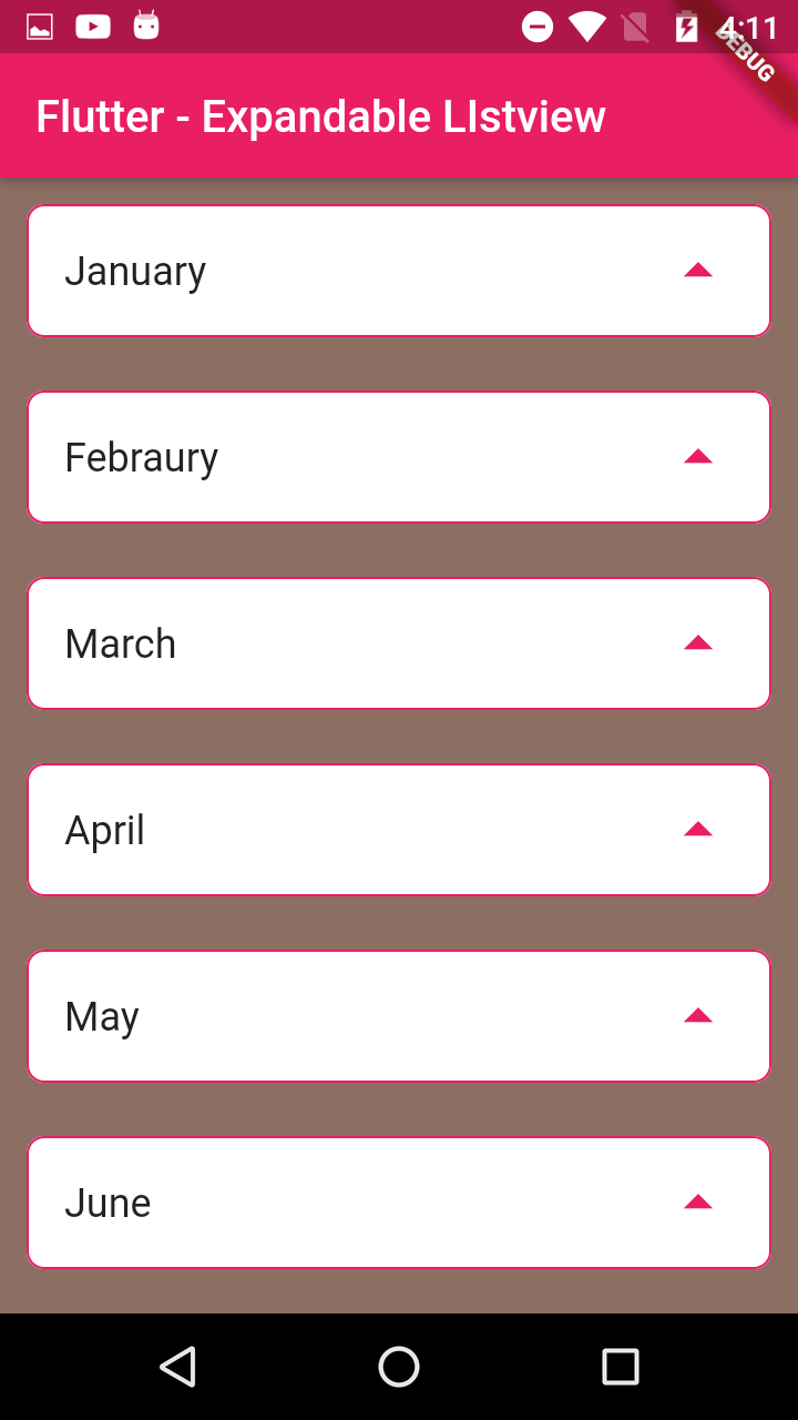
home: MyHomePage(title: 'Flutter - Expandable LIstview'),
);
}
}
class MyHomePage extends StatefulWidget {
MyHomePage({Key key, this.title}) : super(key: key);
final String title;
@override
_MyHomePageState createState() => _MyHomePageState();
}
class _MyHomePageState extends State {
List>list_product;
@override
void initState() {
super.initState();
list_product=new List();
for(var k=1;k<=12;k++)
{
Map map=Map();
map.putIfAbsent(getMonth(k), ()=>getWeeks());
list_product.add(map);
}
list_product.map((s){
}).map((list)=>list).toList();
}
@override
Widget build(BuildContext context) {
Listlist=List();
return Scaffold(
backgroundColor: Colors.brown[400],
appBar: AppBar(
backgroundColor: Colors.pink,
title: Text(widget.title),
),
body: Center(
child: ListView(
children: [
for(final map in list_product)
for(final keys in map.keys)
ListItem(keys,map[keys].toList())
,
],
)
),
);
}
String getMonth(int month)
{
switch(month)
{
case 1:
return "January";
case 2:
return "Febraury";
case 3:
return "March";
case 4:
return "April";
case 5:
return "May";
case 6:
return "June";
case 7:
return "July";
case 8:
return "August";
case 9:
return "September";
case 10:
return "October";
case 11:
return "November";
case 12:
return "December";
}
}
List getWeeks()
{
return ["Monday","Tuesday","Wednesday","Thursday","Friday","Saterday","Sunday",].toList();
}
}
|
list_item.dart
|
import 'package:flutter/material.dart'; class ListItem extends StatefulWidget{ ListlistItems; ListItem(this.headerTitle,this.listItems); @override child: Text(this.widget.headerTitle,style: TextStyle(fontSize: (isExpand!=true)?18:22),)),
), |
ExpansionPanelList & ExpansionPanel
on the second way to achieve the expansion/collapse view is by using ExpansionPanelList & ExpansionPanel widgets.
ExpansionPanelList has the following attributes similar to List Tile:
- AnimationDuration: This property is used to define the time required to expand/collapse.
- Children: This property takes the ExpansionPanel as a parameter which means ExpansionPanel will be used to create a hidden view and header.
- ExpansionCallback: This property works wherever the view expands/collapses.
ExpansionPanel has the following attributes similar to List Tile:
- HeaderBuilder: This property is used to design the visible part of the list or title of the list/row.
- Body: This property take the widget, we can have any widget to expand and collapse.
- IsExpanded: This property indicates whether the panel is expanded or not
Tags: Expandable Listview, Flutter, Listview