SliverAppBar Flutter How to make Scrollable AppBar or Collapsible AppBar
Sliver is Custom Scrollable area Slivers are more usable when we wants to put all widgets inside scrollable area. SliverAppBar, SliverList SliverGrid,SliverToBoxAdapter
In this flutter tutorial example we will cover what is SliverAppBar and How to create Collapsible Appbar in flutter application. SliverAppBar is a Flutter Material widget which will be acts like AppBar. With using SliverAppBar we can make Scrollable appbar or Collapsible AppBar.
Before going to implement SliverAppBar first we should know about what is Sliver, Sliver is Custom Scrollable area Slivers are more usable when we wants to put all widgets inside scrollable area.
Flutter provided different types of Slivers.
- SliverAppBar
- SliverList
- SliverGrid
- SliverToBoxAdapter
 |
How to Use Slivers in Flutter?
If we want to use Slivers we should always put slivers inside CustomScrollView widget and we can add multiple slivers to make them scrollable together.
Here we talking about CustomScrollView, so What is CustomScrollView?
In Flutter CustomScrollView is a widget which will give option to make scrollable content in different ways like list, grid, appbar...
const CustomScrollView({ Key? key, Axis scrollDirection = Axis.vertical, bool reverse = false, ScrollController? controller, bool? primary, ScrollPhysics? physics, ScrollBehavior? scrollBehavior, bool shrinkWrap = false, Key? center, double anchor = 0.0, double? cacheExtent, this.slivers = const <Widget>[], int? semanticChildCount, DragStartBehavior dragStartBehavior = DragStartBehavior.start, ScrollViewKeyboardDismissBehavior keyboardDismissBehavior = ScrollViewKeyboardDismissBehavior.manual, String? restorationId, Clip clipBehavior = Clip.hardEdge, }) |
This widget has property call sliver which we can pass different types of slivers like SliverList,SliverGrid, SliverAppbar, SliverToBoxAdapter
SliverAppBar Constructor
SliverAppBar({ Key? key, this.leading, this.automaticallyImplyLeading = true, this.title, this.actions, this.flexibleSpace, this.bottom, this.elevation, this.shadowColor, this.forceElevated = false, this.backgroundColor, this.foregroundColor, this.brightness, this.iconTheme, this.actionsIconTheme, this.textTheme, this.primary = true, this.centerTitle, this.excludeHeaderSemantics = false, this.titleSpacing, this.collapsedHeight, this.expandedHeight, this.floating = false, this.pinned = false, this.snap = false, this.stretch = false, this.stretchTriggerOffset = 100.0, this.onStretchTrigger, this.shape, this.toolbarHeight = kToolbarHeight, this.leadingWidth, this.backwardsCompatibility, this.toolbarTextStyle, this.titleTextStyle, this.systemOverlayStyle, }) |
Properties of SliverAppBar
- actions: The actions property will be used to create widgets right of the appBar title. Most of the time we will use Icons to do actions like share,notifications...
- title: This title property will be used to set the title to the SliverAppBar. It will be like AppBar title to give the name of the application.
- leading: This leading property will be used to define a widget on left side. Generally, we will add icons like back button, Menu Drawer widget.
- backgroundColor: This property will be used to set a background color to the sliver app bar.
- bottom: The bottom property will be used to set the space form the bottom of the title
- expandedHeight: If we want to set a respected heigh to expand our widgets then we will use expandedHeight property which we specify the maximum height to the app bar that can be expanded while scrolling
- floating: The floating property will tell the users to whether the app bar will be visible or not when scrolls towards the app bar.
- flexibleSpace: The flexibleSpace property will be used to set a widget which is stacked behind the toolbar and the tab bar. The height of the flexibleSpace is the same as the app bar height
SliverList
This SliverList is one the Sliver widget which will arange the list of items in linear ways.
Constructor
const SliverList({ Key? key, required SliverChildDelegate delegate, }) |
This SliverList widget has propery called delegate where we will set the child items. We can set the childresn to the SliverList by using SliverChildBuilderDelegate or SliverChildListDelegate
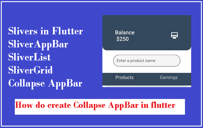
In this example we will create a simple collapse appbar with SliverAppbar and SliverList widgets.
Step 1: Create Flutter Application
Step 2: Add below code
import 'package:flutter/cupertino.dart'; import 'package:flutter/material.dart'; void main() => runApp(MyApp()); class MyApp extends StatelessWidget { @override Widget build(BuildContext context) { final title = 'RRTutors'; return MaterialApp( home: SafeArea( child: Scaffold( body: CustomScrollView( slivers: <Widget>[ SliverAppBar(expandedHeight: 20,backgroundColor: Color(0XFF34495e ),), SliverAppBar( snap: false, pinned: false, floating: false, expandedHeight: 120, flexibleSpace:Container( margin: EdgeInsets.only(bottom:20 ), decoration: BoxDecoration( color: Color(0XFF34495e ), borderRadius: BorderRadius.vertical(bottom:Radius.circular(20)) ), child: Padding( padding: const EdgeInsets.all(8.0), child: FlexibleSpaceBar( centerTitle: true, title: Padding( padding: const EdgeInsets.symmetric(horizontal: 32.0,vertical: 8), child: Row( mainAxisAlignment: MainAxisAlignment.spaceBetween, children: [ Text("Balance \n \$250",style: TextStyle(fontSize: 16,color: Colors.white),), Icon(Icons.wallet_membership,color: Colors.white,) ], ), ), ), ), ), //FlexibleSpaceBar backgroundColor: Colors.white, ), SliverAppBar( snap: false, pinned: false, floating: false, expandedHeight:80, flexibleSpace:FlexibleSpaceBar( centerTitle: true, title: Padding( padding: const EdgeInsets.symmetric(horizontal: 32.0,vertical: 8), child: Container( height: 35, child: TextField( decoration: InputDecoration( hintText: 'Enter a product name ', hintStyle: TextStyle(fontSize: 12), border: OutlineInputBorder( borderRadius: BorderRadius.circular(32), borderSide: BorderSide( width: 0, style: BorderStyle.solid, ), ), filled: true, contentPadding: EdgeInsets.symmetric(horizontal: 10), ), ), ), ), ), //FlexibleSpaceBar backgroundColor: Colors.white, ), SliverAppBar( backgroundColor: Color(0XFF34495e ), pinned: true, flexibleSpace: FlexibleSpaceBar( centerTitle: true, title: DefaultTabController( initialIndex: 0, length: 2, child: TabBar( indicatorSize: TabBarIndicatorSize.label, indicator: BoxDecoration( border: Border.all(width: 0) ), labelColor: Colors.white, labelStyle: TextStyle(fontSize: 20,), tabs: [ Padding( padding: const EdgeInsets.all(8.0), child: Text("Products"), ), Padding( padding: const EdgeInsets.all(8.0), child: Text("Earnings"), ), ]), ), //Text //Images.network ), ),//SliverAppBar SliverList( delegate: SliverChildBuilderDelegate( (context, index) => ListTile( tileColor: (index % 2 == 0) ? Colors.white : Colors.green[50], title: Column( children: [ Divider( height: 0.0, color: Colors.grey, thickness: 1.0, ), Row( children: [ Expanded( child: Padding( padding: EdgeInsets.all(16.0), child: Column( children: [ Text('Date'), FittedBox( child: Text( '20/20', style: TextStyle( fontSize: 18.0, fontWeight: FontWeight.w600, ), ), ) ], ), ), ), Expanded( child: Padding( padding: EdgeInsets.all(16.0), child: Column( children: [ Text('Time'), FittedBox( child: Text( '9.00PM', style: TextStyle( fontSize: 18.0, fontWeight: FontWeight.w600, ), ), ) ], ), ), ), Expanded( child: Padding( padding: EdgeInsets.all(16.0), child: Column( children: [ Text('Price'), FittedBox( child: Text( '\$20.00', style: TextStyle( fontSize: 18.0, fontWeight: FontWeight.w600, ), ), ) ], ), ), ),] ), Container( width: double.infinity, height: 50, color: Colors.blue, child: Center( child: InkWell( child: Text( 'Add Products', style: TextStyle( color: Colors.white, fontSize: 18.0, fontWeight: FontWeight.bold, ), ), onTap: () { print('Add Products'); }, ), ), ), ], ), //Center ), //ListTile childCount: 51, ), //SliverChildBuildDelegate ) //SliverList ], //<Widget>[] ) //CustonScrollView ), ), //Scaffold debugShowCheckedModeBanner:false, // Remove debug banner for proper // view of setting icon ); //MaterialApp } } |
Step 3: Run application
.jpg) |
.jpg)