Flutter Date Picker - How to show Date Picker Dialog in Flutter?
Discover how to show a date picker dialog in your Flutter app to allow users to select a date in form templates using the Flutter DatePicker widget - RRTutors.
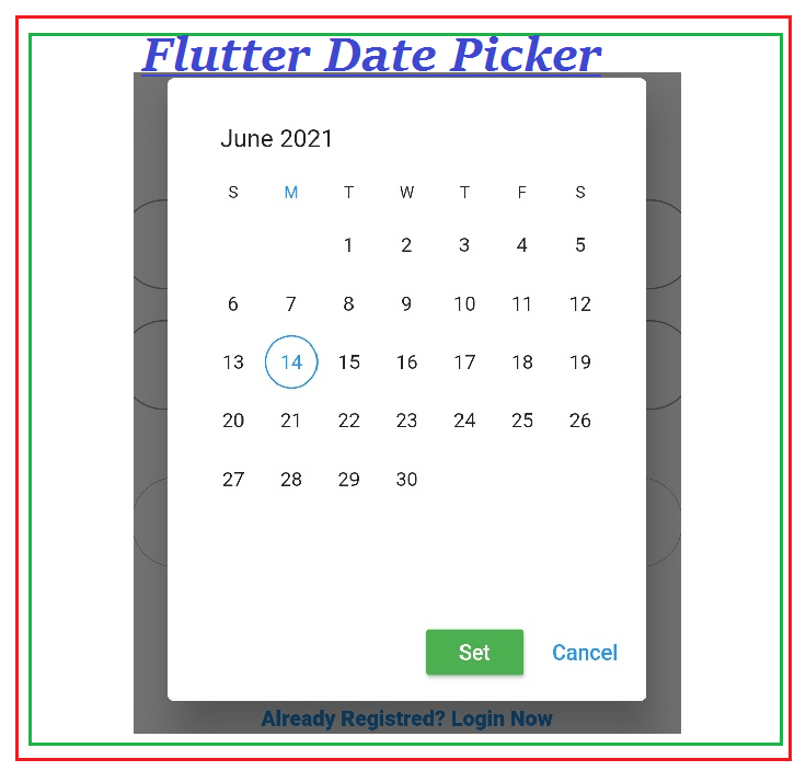
In this flutter example we will learn how to select date from date picker and how to show date picker dialog in flutter application. In any flutter form templates there is a requirement to select the date. To select a date we need to use date picker widget. In this flutter date picker example we will use syncfusion_flutter_datepicker widget. This widget has different features like select a single date, select a date range between two dates, select multiple dates options. So let's start how to display date picker dialog and select date from it.
Step 1: Create a flutter application
Step 2: Add required dependencies in pubspec.yaml file
Step 3: Now we need to create a screen which contains a email, password and date fields. Here we are using the Textfield widgets to enter email, password. To select a date we need to add SfDateRangePicker widget.
SfDateRangePicker({
  Key? key,
  DateRangePickerView view = DateRangePickerView.month,
  this.selectionMode = DateRangePickerSelectionMode.single,
  this.headerHeight = 40,
  this.todayHighlightColor,
  this.backgroundColor,
  DateTime? initialSelectedDate,
  List<DateTime>? initialSelectedDates,
  PickerDateRange? initialSelectedRange,
  List<PickerDateRange>? initialSelectedRanges,
  this.toggleDaySelection = false,
  this.enablePastDates = true,
  this.showNavigationArrow = false,
  this.confirmText = 'OK',
  this.cancelText = 'CANCEL',
  this.showActionButtons = false,
  this.selectionShape = DateRangePickerSelectionShape.circle,
  this.navigationDirection = DateRangePickerNavigationDirection.horizontal,
  this.allowViewNavigation = true,
  this.navigationMode = DateRangePickerNavigationMode.snap,
  this.enableMultiView = false,
  this.controller,
  this.onViewChanged,
  this.onSelectionChanged,
  this.onCancel,
  this.onSubmit,
  this.headerStyle = const DateRangePickerHeaderStyle(),
  this.yearCellStyle = const DateRangePickerYearCellStyle(),
  this.monthViewSettings = const DateRangePickerMonthViewSettings(),
  this.monthCellStyle = const DateRangePickerMonthCellStyle(),
  DateTime? minDate,
  DateTime? maxDate,
  DateTime? initialDisplayDate,
  double viewSpacing = 20,
  this.selectionRadius = -1,
  this.selectionColor,
  this.startRangeSelectionColor,
  this.endRangeSelectionColor,
  this.rangeSelectionColor,
  this.selectionTextStyle,
  this.rangeTextStyle,
  this.monthFormat,
  this.cellBuilder,
})
|
This widget has different properties like select single date, select date range , select multiple dates.
To choose a type of we will use selectionMode property.
Single date
selectionMode: DateRangePickerSelectionMode.single
Multiple date selection
selectionMode: DateRangePickerSelectionMode.multiple
Date Range selection
selectionMode: DateRangePickerSelectionMode.range,
d
In this example we are showing date picker dialog with single date selection
Here is the complete code
import 'package:flutter/material.dart';
import 'package:intl/intl.dart';
import 'package:syncfusion_flutter_datepicker/datepicker.dart';

void main() {
  return runApp(MyApp());
}


class MyApp extends StatelessWidget {
  // This widget is the root of your application.
  @override
  Widget build(BuildContext context) {
    return MaterialApp(
      title: 'Flutter Demo',
      theme: ThemeData(
        primarySwatch: Colors.blue,
      ),
      home: MyHomePage(),
    );
  }
}
class MyHomePage extends StatefulWidget {
  @override
  _MyHomePageState createState() => _MyHomePageState();
}
class _MyHomePageState extends State<MyHomePage> {

  bool showProgress = false;
  String email="", password="";
  String date_of_birth="";
  int year=0;
  int day=0;
  int month=0;

  TextEditingController date_controller=new TextEditingController();
  @override
  Widget build(BuildContext context) {
    return Scaffold(
      appBar: AppBar(
        title: Text("Flutter Date Picker"),
      ),
      body: SingleChildScrollView(
        child: Padding(
          padding: const EdgeInsets.all(8.0),
          child: Column(
            mainAxisAlignment: MainAxisAlignment.center,
            children: <Widget>[
              SizedBox(
                height: 20.0,
              ),
              Text(
                "Registration Page",
                style: TextStyle(fontWeight: FontWeight.w800, fontSize: 20.0),
              ),
              SizedBox(
                height: 50.0,
              ),
              TextField(
                keyboardType: TextInputType.emailAddress,
                textInputAction: TextInputAction.next,
                textAlign: TextAlign.center,
                onChanged: (value) {
                  email = value; //get the value entered by user.
                },

                decoration: InputDecoration(
                    hintText: "Enter your Email",
                    border: OutlineInputBorder(
                        borderRadius: BorderRadius.all(Radius.circular(32.0)))),
              ),
              SizedBox(
                height: 20.0,
              ),
              TextField(
                obscureText: true,
                textAlign: TextAlign.center,
                onChanged: (value) {
                  password = value; //get the value entered by user.
                },
                decoration: InputDecoration(
                    hintText: "Enter your Password",
                    border: OutlineInputBorder(
                        borderRadius: BorderRadius.all(Radius.circular(32.0)))),
              ),
              SizedBox(
                height: 20.0,
              ),
              TextButton(
                onPressed: () {
                  var parts = date_of_birth.split('/');
                  if(parts.length>=2)
                    {

                      year = int.parse(parts[2].trim());
                      month = int.parse(parts[1].trim());
                      day = int.parse(parts[0].trim());
                    }


                  showDialog(

                      context: context, builder: (context){
                    return AlertDialog(
                      backgroundColor: Colors.white,
                        actions: <Widget>[
                          Container(
                            height: 30,
                            child: MaterialButton(
                              color: Colors.green,
                              child: Text('Set',style: TextStyle(color: Colors.white),),
                                onPressed: () {
                                  setState(() {
                                    date_of_birth=date_controller.text;
                                  });

                                    Navigator.of(context).pop();
                                    },
                              ),
                          ),
                          TextButton(
                            child: Text('Cancel'),
                            onPressed: () {
                              setState(() {
                                date_controller.text=date_of_birth;
                              });

                              Navigator.of(context).pop();
                            },
                          ),
                      ],
                      content: Container(

                        height: 300,
                        width:300,
                        child: SfDateRangePicker(
                          initialSelectedDate: DateTime(year,month,day),
                          onSelectionChanged: _onSelectionChanged,
                          selectionMode: DateRangePickerSelectionMode.single,

                        ),
                      ),
                    );
                  });
                },
                child: Column(
                  children: [
                    Text("Select DOB"),
                    TextField(
                      textAlign: TextAlign.center,
                      controller: date_controller,
                      enableInteractiveSelection: false,
                        enabled: false,
                        focusNode: FocusNode(),

                      decoration: InputDecoration(
                          hintText: "Date Of Birth",
                          border: OutlineInputBorder(
                              borderRadius: BorderRadius.all(Radius.circular(32.0)))),
                    ),
                  ],
                ),
              ),
              SizedBox(
                height: 20.0,
              ),
              Material(
                elevation: 5,
                color: Colors.lightBlue,
                borderRadius: BorderRadius.circular(32.0),
                child: MaterialButton(
                  onPressed: () async {


                  },
                  minWidth: 200.0,
                  height: 45.0,
                  child: Text(
                    "Register",
                    style:
                    TextStyle(fontWeight: FontWeight.w500, fontSize: 20.0),
                  ),
                ),
              ),
              SizedBox(
                height: 15.0,
              ),
              GestureDetector(
                onTap: () {

                },
                child: Text(
                  "Already Registred? Login Now",
                  style: TextStyle(
                      color: Colors.blue, fontWeight: FontWeight.w900),
                ),
              )
            ],
          ),
        ),
      ),
    );
  }
  void _onSelectionChanged(DateRangePickerSelectionChangedArgs args) {
    /// The argument value will return the changed date as [DateTime] when the
    /// widget [SfDateRangeSelectionMode] set as single.
    ///
    /// The argument value will return the changed dates as [List<DateTime>]
    /// when the widget [SfDateRangeSelectionMode] set as multiple.
    ///
    /// The argument value will return the changed range as [PickerDateRange]
    /// when the widget [SfDateRangeSelectionMode] set as range.
    ///
    /// The argument value will return the changed ranges as
    /// [List<PickerDateRange] when the widget [SfDateRangeSelectionMode] set as
    /// multi range.
    setState(() {
      if (args.value is PickerDateRange) {

      } else if (args.value is DateTime) {
        date_controller.text=      DateFormat('dd/MM/yyyy')
            .format(args.value)
            .toString();;
      } else if (args.value is List<DateTime>) {

      } else {

      }
    });
  }
}
|
Step 4: Run application
 |