Flutter Responsive Admin Template
Last updated Feb 09, 2020
Flutter Responsive Admin Template
Hello Guys, In this post we are going to create Flutter Responsive Admin dashboard with Flutter

Let's Start
Step 1: Create flutter project in android studio
Step 2: Create AdminPage widget
class AdminPage extends StatelessWidget {
@override
Widget build(BuildContext context) {
return MaterialApp(
title: 'Flutter Template',
debugShowCheckedModeBanner: false,
theme: ThemeData(
fontFamily: 'Quicksand',
appBarTheme: AppBarTheme(
color: Color(0xffEDEDED),
),
primaryTextTheme: TextTheme(
title: TextStyle(
color: Color(0xff73879C),
fontWeight: FontWeight.bold,
),
)
),
home: DashboardWidget(),
);
}
}
|
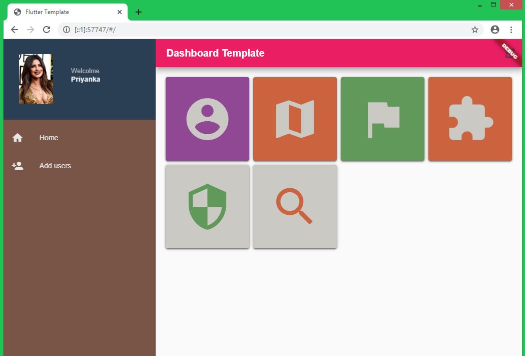
Step 3: DashBoard Widget
Our Dashboard widget contains Sidebar and details page of each items
class DashboardWidget extends StatefulWidget {
@override
_DashboardWidgetState createState() => _DashboardWidgetState();
}
class _DashboardWidgetState extends State {
int _currentPage = 0;
final List _pages = [
HomePage(),
ReceiptForm(),
];
@override
Widget build(BuildContext context) {
// TODO: implement build
return Row(
children: [
Container(),
Expanded(),
]
);
}
}
|
Step 4: Navigation Bar
Container(
color: Colors.brown,
child:
Drawer(
child:
Container(
color: Colors.brown,
child: ListView(
children: [
DrawerHeader(
//padding: EdgeInsets.zero,
padding: EdgeInsets.symmetric(vertical: 15.0, horizontal: 15.0),
child: Column(
children: [
Row(
children: [
SizedBox(
height: 130,
),
ClipRRect(
borderRadius: BorderRadius.circular(25.0),
child: Image.network(
"https://i.pinimg.com/originals/43/1d/ae/431daea0125bd1d216f7066f99b5d193.jpg",
width: 100,
height:100,
),
),
SizedBox(
width: 20,
),
Flexible(
child: Stack(
children: [
Row(
children: [
Text('Welcolme',
style: TextStyle(
fontSize: 13,
color: Color(0xffBAB8B8))),
],
),
Row(
children: [
SizedBox(
height: 48,
),
Text(
'Priyanka',
style: TextStyle(
fontWeight: FontWeight.bold,
color: Color(0xffECF0F1)),
),
],
)
],
),
)
],
),
],
),
decoration: BoxDecoration(
color: Color(0xff2A3F54),
),
),
ListTile(
leading: const Icon(Icons.home, color: Color(0xffE7E7E7),),
title: Text('Home', style: TextStyle(color: Color(0xffE7E7E7), fontSize: 14,),),
onTap: () {
// HomePage();
setState(() {
_currentPage = 0;
});
},
),
ListTile(
leading: const Icon(Icons.person_add, color: Color(0xffE7E7E7)),
title: Text('Add users',style: TextStyle(color: Color(0xffE7E7E7), fontSize: 14,) ),
onTap: () {
// HomePage();
setState(() {
_currentPage = 1;
});
},
),
],
),
),
),
)
|
Add above code inside Container of Dashboard widget
Step 5: Details Page
Expanded(
child: Scaffold(
appBar: AppBar(
backgroundColor: Colors.pink,
automaticallyImplyLeading:
MediaQuery.of(context).size.width < 600,
title: Text(' Dashboard Template',style: TextStyle(color: Colors.white),),
actions: [IconButton(
icon: const Icon(Icons.exit_to_app, color: Color(0xff2A3F54),),
tooltip: 'Logout',
onPressed: () {
},
),],
),
body: _pages[_currentPage],
),
)
|
Add above code inside Expand of Dashboard widget
Step 6: HomePage
class _HomePageState extends State {
@override
Widget build(BuildContext context) {
return Padding(
padding: const EdgeInsets.all(8.0),
child: Scaffold(
body: Padding(
padding: const EdgeInsets.all(8.0),
child: GridView(gridDelegate: SliverGridDelegateWithFixedCrossAxisCount(crossAxisCount: 4,mainAxisSpacing: 0,crossAxisSpacing: 0,childAspectRatio: 1),
scrollDirection: Axis.vertical,
children: [
Stack(
children: [
Card(
color: Colors.purple,
child: Center(child: Icon(Icons.account_circle,color: Colors.white,size: 100,)),
),
Card(
color: Color(0X667C786A),
child: Center(child: Text("",style: TextStyle(color: Colors.white),)),
)
],
),
Stack(
children: [
Card(
color: Colors.deepOrange,
child: Center(child: Icon(Icons.map,color: Colors.white,size: 100,)),
),
Card(
color: Color(0X667C786A),
child: Center(child: Text("",style: TextStyle(color: Colors.white),)),
)
],
),
Stack(
children: [
Card(
color: Colors.green,
child: Center(child: Icon(Icons.flag,color: Colors.white,size: 100,)),
),
Card(
color: Color(0X667C786A),
child: Center(child: Text("",style: TextStyle(color: Colors.white),)),
)
],
),
Stack(
children: [
Card(
color: Colors.deepOrange,
child: Center(child: Icon(Icons.extension,color: Colors.white,size: 100,)),
),
Card(
color: Color(0X667C786A),
child: Center(child: Text("",style: TextStyle(color: Colors.white),)),
)
],
),
Stack(
children: [
Card(
color: Colors.white,
child: Center(child: Icon(Icons.security,color: Colors.green,size: 100,)),
),
Card(
color: Color(0X667C786A),
child: Center(child: Text("",style: TextStyle(color: Colors.white),)),
)
],
),
Stack(
children: [
Card(
color: Colors.white,
child: Center(child: Icon(Icons.search,color: Colors.deepOrange,size: 100,)),
),
Card(
color: Color(0X667C786A),
child: Center(child: Text("",style: TextStyle(color: Colors.white),)),
)
],
),
],)
)
,
),
);
}
}
|
Step 7: ReceiptForm
class ReceiptForm extends StatefulWidget {
ReceiptForm({Key key}) : super(key: key);
@override
_ReceiptFormState createState() => _ReceiptFormState();
}
class _ReceiptFormState extends State {
@override
Widget build(BuildContext context) {
return Scaffold(
body: SingleChildScrollView(
child:
Column(
children: [
Center(child: Text('Add users page')),
],
),),
);
}
}
|
Handle Mouse Pointer and MouseOver Events
To hanlde Mouse Pointer a we need to create Extension
Step 8: Extension widget
extension HoverExtensions on Widget {
// Get a regerence to the body of the view
static final appContainer =
html.window.document.getElementById('app-container');
Widget get showCursorOnHover {
return MouseRegion(
child: this,
// When the mouse enters the widget set the cursor to pointer
onHover: (event) {
appContainer.style.cursor = 'pointer';
},
// When it exits set it back to default
onExit: (event) {
appContainer.style.cursor = 'default';
},
);
}
}
|
here
html.window.document.getElementById('app-container'); will get the body of the page
So update you index.html file with below code
Now update widget where we want to hanlde the mouse pointer
Card(color: Color(0X667C786A),
child: Center(child: Text("",style: TextStyle(color: Colors.white),)),
).showCursorOnHover
|
Step 9: Handle MouseOver events
Create Transulate Animation
class TranslateOnHover extends StatefulWidget {
final Widget child;
// You can also pass the translation in here if you want to
TranslateOnHover({Key key, this.child}) : super(key: key);
@override
_TranslateOnHoverState createState() => _TranslateOnHoverState();
}
class _TranslateOnHoverState extends State {
final nonHoverTransform = Matrix4.identity()..translate(0, 0, 0);
final hoverTransform = Matrix4.identity()..translate(0, 250, 0);
bool _hovering = false;
@override
Widget build(BuildContext context) {
return MouseRegion(
onEnter: (e) => _mouseEnter(true),
onExit: (e) => _mouseEnter(false),
child: AnimatedContainer(
duration: const Duration(milliseconds: 200),
child: widget.child,
transform: _hovering ? hoverTransform : nonHoverTransform,
),
);
}
void _mouseEnter(bool hover) {
setState(() {
_hovering = hover;
});
}
}
|
and add below widget in HoverExtension widget
Widget get moveUpOnHover {
return TranslateOnHover(
child: this,
);
}
|
Then add below code for which widget we want to animate on the mousehover
Card(
color: Color(0X667C786A),
child: Center(child: Text("",style: TextStyle(color: Colors.white),)),
).showCursorOnHover.moveUpOnHover,
|
That's it, now run the application and you will get the Output.
If you have any quries please comment in the below
Article Contributed By :
|
|
|
2343 Views
|